Social Network Analysis
Social network analysis (SNA) is the study of networks formed because of connections among objects. These objects could be people and the connections could be relationships among those people. But SNA isn’t limited to people. Researchers have used these types of analyses to test the reliability of electric grids (Chassin and Posse 2005), to find structure between gene expression profiles (Langfelder and Horvath 2008), to detect spam emails (Golbeck and Hendler 2004), and to find efficient hubs for air transportation (Guimera et al. 2005). Even Google’s origin involves a study of citation networks which later became the basis of PageRank (Page et al. 1999).
As you can see from these examples, SNA allows us to study the influential objects as well as their connections in networks. Through numbers and graphs, something that seems unfathomable can be understood and, more importantly, used in a practical application. Michael Kimmelman wrote an article in The New York Times on Mark Lombardi’s network maps on financial networks. He said, “I happened to be in the Drawing Center when the Lombardi show was being installed and several consultants to the Department of Homeland Security came in to take a look. They said they found the work revelatory, not because the financial and political connections he mapped were new to them, but because Lombardi showed them an elegant way to array disparate information and make sense of things, which they thought might be useful to their security efforts.”
“[…] several consultants to the Department of Homeland Security came in to take a look. They said they found the work revelatory, […] because Lombardi showed them an elegant way to array disparate information and make sense of things, which they thought might be useful to their security efforts.”
— Michael Kimmelman
You often hear that fundraising is all about relationships. Good fundraisers know or uncover the relationships among donors or potential prospects and then use these relationships to further the non-profit’s cause. A few vendors such as RelSci and Prospect Visual have made it easy to uncover these various relationships among our volunteers, donors, and prospective donors. This chapter will provide you with recipes to create such networks using your own data, but first let’s go through a few key concepts that are useful in this field.
Key Concepts
This is a quick introduction to SNA for our purposes; you should read Scott (2017) and Newman (2010) for more in-depth knowledge.
Node: The object of analysis is a node. It is also called as a vertex, actor, or an individual. Let’s say that John is a potential donor. He will be a node in our analysis then.

Edge: An edge is the connection between two nodes. It is also called a line, relationship, or link. Let’s say that Jane, our volunteer, is a friend of John. This friendship now forms an edge between John and Jane.

We also know that Jesse sits on a board with John, but Jesse doesn’t know Jane. Therefore, we won’t see any connection between Jesse and Jane.

Degree: Degree is a measure of connectedness of a node (that is, the number of edges a node has). As you can guess, this is a very helpful measure because we can determine the nodes with the highest connections. Nodes with high degree are great connectors. In our made-up example, John has two degrees and both Jesse and Jane only one.
Betweenness centrality: Betweenness centrality measures the number of edges for which a node is between other nodes. This measure is helpful to find out the gatekeepers in a network. Let’s say that Jack is a friend of Jane, and Jack is also a friend of Jesse. 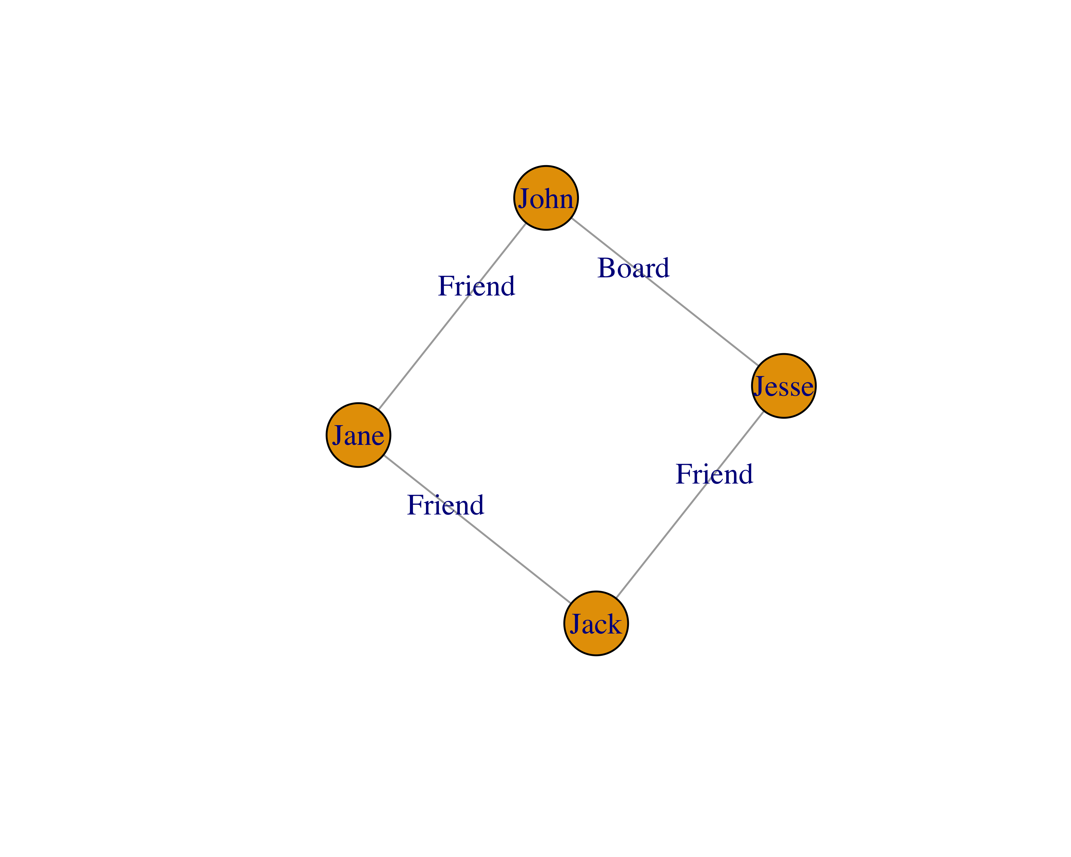
In this example, all of the nodes have two degrees, because everyone knows two people. Also, all of the nodes have a betweenness of 0.5, because every node has two connections and there are four nodes, namely, 2/4. The math to calculate this measure gets complicated quickly with many nodes and edges. For more information, you can read these lecture slides by Donglei Du at the University of New Brunswick.
Communities: Communities are groups of the most interconnected nodes. A simple example of a community would be if you and I knew each other: my group of friends would form one community and your group of friends would form another.
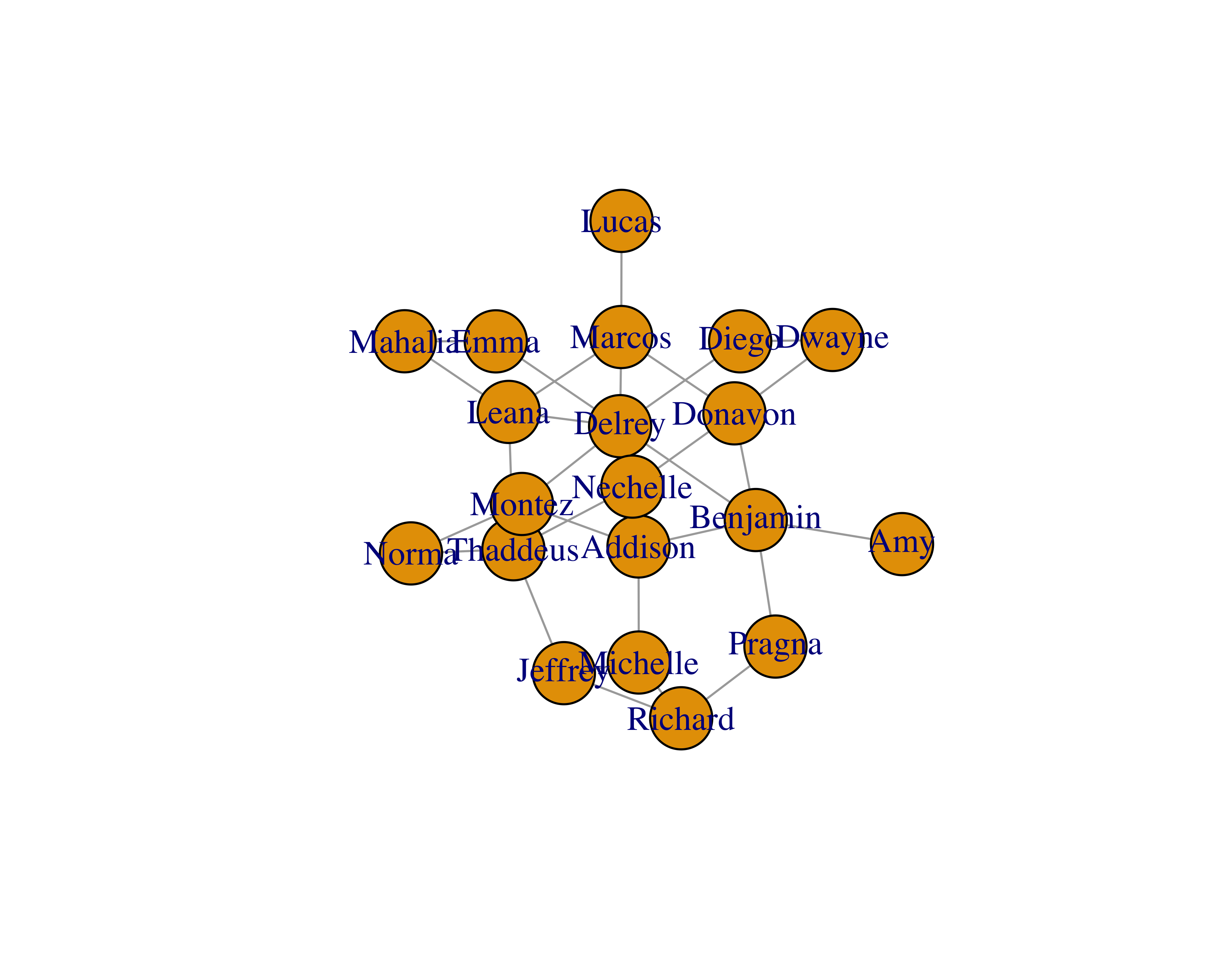
Layouts: Layout algorithms help us see the networks and their characteristics. This is an active research field and researchers have provided many types of algorithms (Jacomy et al. 2014). Some common ones are random layout, circular layout, and Fruchterman Reingold layout. Figure 15.1 shows a sample network with three different layouts.
Data Structure
Relationships between two nodes is the easiest format to use for SNA in R using the igraph library. You could provide the data in two different ways.
- Edges or relationships only
- Edges and vertices separately
If you provide edges-only data and provide the vertex names along with it, igraph will figure everything out for us. This data will produce a table as shown in Table 15.1.
TABLE 15.1: Edges-only data
| Mahalia |
Emma |
| Thaddeus |
Leana |
| Mahalia |
Leana |
| Dwayne |
Diego |
| Thaddeus |
Jeffrey |
| Richard |
Jeffrey |
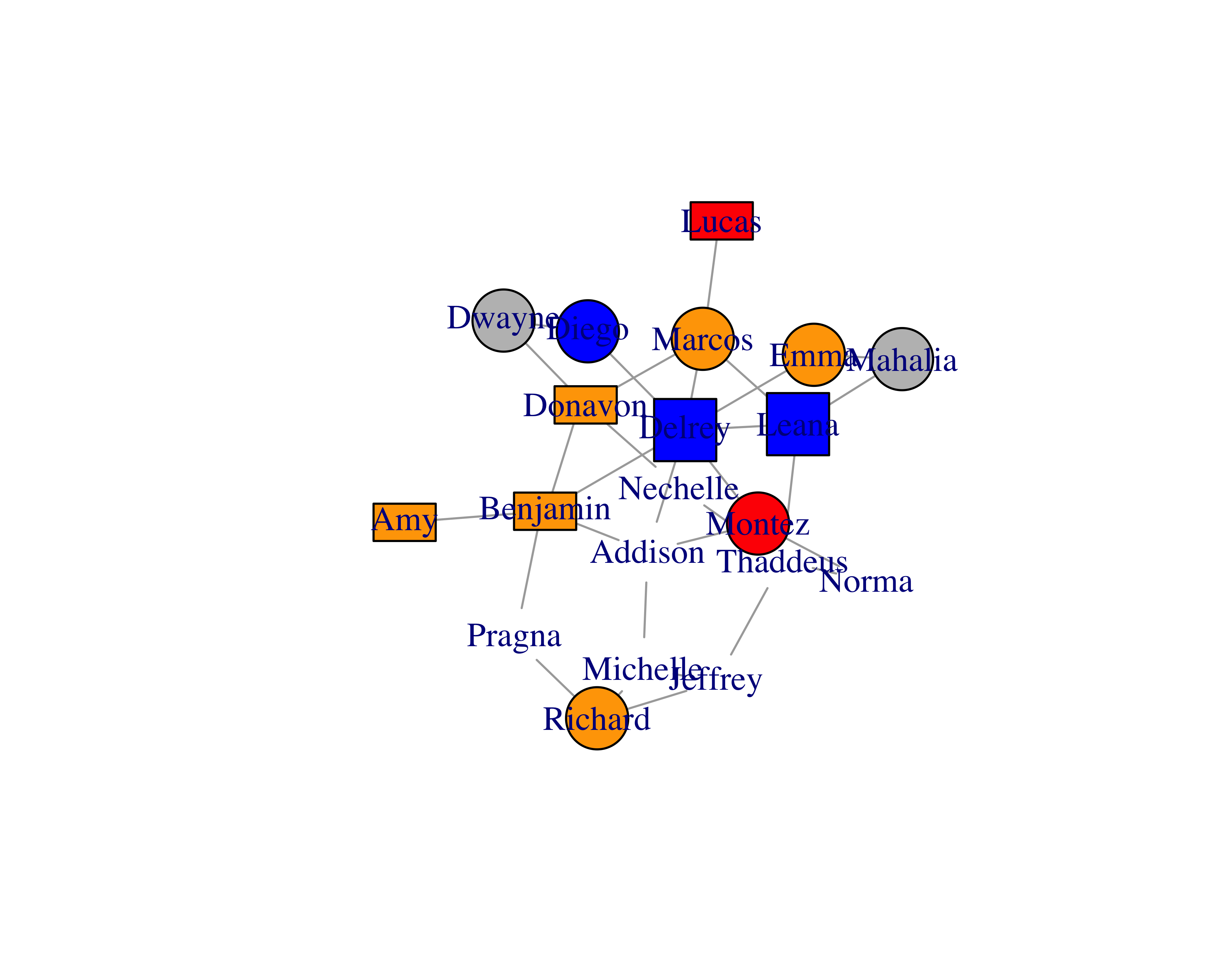
With this approach, you can’t easily change the vertex properties, such as colors, shapes, and others. But if you were to provide edges and vertices separately, you could also provide vertex properties along with it, as shown in Table 15.2; you can see the graph this data created in Figure 15.2. Providing vertex data separately also helps when you have large data sets.
TABLE 15.2: Edge and vertex data
| 1 |
3 |
| 1 |
5 |
| 1 |
6 |
| 3 |
10 |
| 9 |
10 |
| 4 |
11 |
|
| 1 |
Jacob |
burlywood1 |
circle |
| 3 |
Danny |
burlywood1 |
circle |
| 9 |
Samantha |
burlywood1 |
circle |
| 4 |
Breyanna |
orange |
square |
| 5 |
Nathan |
orange |
square |
| 6 |
Amira |
orange |
square |
| 10 |
Briana |
tomato |
rectangle |
| 11 |
Marioly |
tomato |
rectangle |
|
You can write simple SQL statements to extract such data from your databases.
To get the edges you can write the following.
SELECT RELATED_ID, RELATED_TO_ID, RELATIONSHIP_TYPE as LABEL
FROM RELATIONSHIPS
To get the vertex properties you can write the following.
SELECT C.ID, C.NAME, C.CONSTITUENT_TYPE
FROM CONSTITUENT C
WHERE EXISTS
  (SELECT 0
  FROM RELATIONSHIPS R
  WHERE R.RELATED_ID = C.ID OR R.RELATED_TO_ID = C.ID)
You can then use the vertex properties to assign shapes or colors.
Creating Your First Network
Enough talk. Let’s create a simple network using the sample data. It is a simple, randomly generated network data set with 20 nodes. Let’s read the data.
library(readr)

sample_network_d <- read_csv("data/sample_network.csv")
head(sample_network_d)
#> # A tibble: 6 x 2
#>       from      to
#>      <chr>   <chr>
#> 1  Mahalia    Emma
#> 2 Thaddeus   Leana
#> 3  Mahalia   Leana
#> 4   Dwayne   Diego
#> 5 Thaddeus Jeffrey
#> 6  Richard Jeffrey
Let’s use the igraph library to create a network using this data.
library(igraph)

sample_network_g <- graph_from_data_frame(d = sample_network_d,
                                          directed = FALSE)
To plot this graph, simply use the plot function.

You will see that the size of the vertices is small. You can adjust that by using the vertex.size parameter.
plot(sample_network_g, vertex.size = 25)
You can also play with different layouts to improve readability. Check all the different layouts by writing ?layout_ in your R console.
#Check out all layouts: https://stackoverflow.com/a/15365407

plot(sample_network_g, vertex.size = 25, layout = layout_with_fr)

Since our sample data only had edges, we can create a separate data frame with vertex properties.
#Check out all shapes: https://stackoverflow.com/a/7429938

sample_vertices <- data.frame(
  name = unique(c(sample_network_d$from, sample_network_d$to)),
  label = unique(c(sample_network_d$from, sample_network_d$to)),
  color = sample(x = c("orange", "tomato", "burlywood1", "grey"),
                 size = 20, replace = TRUE),
  shape = sample(x = c("circle", "square", "rectangle", "none"),
                 size = 20, replace = TRUE))
head(sample_vertices)
#>       name    label  color  shape
#> 1  Mahalia  Mahalia   grey circle
#> 2 Thaddeus Thaddeus orange   none
#> 3   Dwayne   Dwayne   grey circle
#> 4  Richard  Richard orange circle
#> 5  Addison  Addison tomato   none
#> 6  Jeffrey  Jeffrey tomato   none
Use this vertex data to create the graph.
sample_network_g <- graph_from_data_frame(d = sample_network_d,
                                          directed = FALSE,
                                          vertices = sample_vertices)
plot(sample_network_g, vertex.size = 25, layout = layout_with_fr)
Creating a Game of Thrones™ Network
Beveridge and Shan (2016) created a dataset using the book A Storm of Swords. You can find the dataset and many other fascinating applications and insights on their research page.
Let’s read this dataset.
library(dplyr)
library(readr)

got_edges <- read_csv(
  file = "http://bit.ly/2Fc4RrO",
  col_names = c("from", "to", "weight"),
  skip = 1)
glimpse(got_edges)
#> Observations: 352
#> Variables: 3
#> $ from   <chr> "Aemon", "Aemon", "Aerys", "Ae...
#> $ to     <chr> "Grenn", "Samwell", "Jaime", "...
#> $ weight <int> 5, 31, 18, 6, 5, 8, 5, 5, 11, ...
got_nodes <- data.frame(
  label = unique(c(got_edges$from, got_edges$to)),
  stringsAsFactors = FALSE)
glimpse(got_nodes)
#> Observations: 107
#> Variables: 1
#> $ label <chr> "Aemon", "Aerys", "Alliser", "A...
Let’s build the network.
got_network_igraph <- graph_from_data_frame(d = got_edges,
                                            directed = FALSE,
                                            vertices = got_nodes)
plot(got_network_igraph)
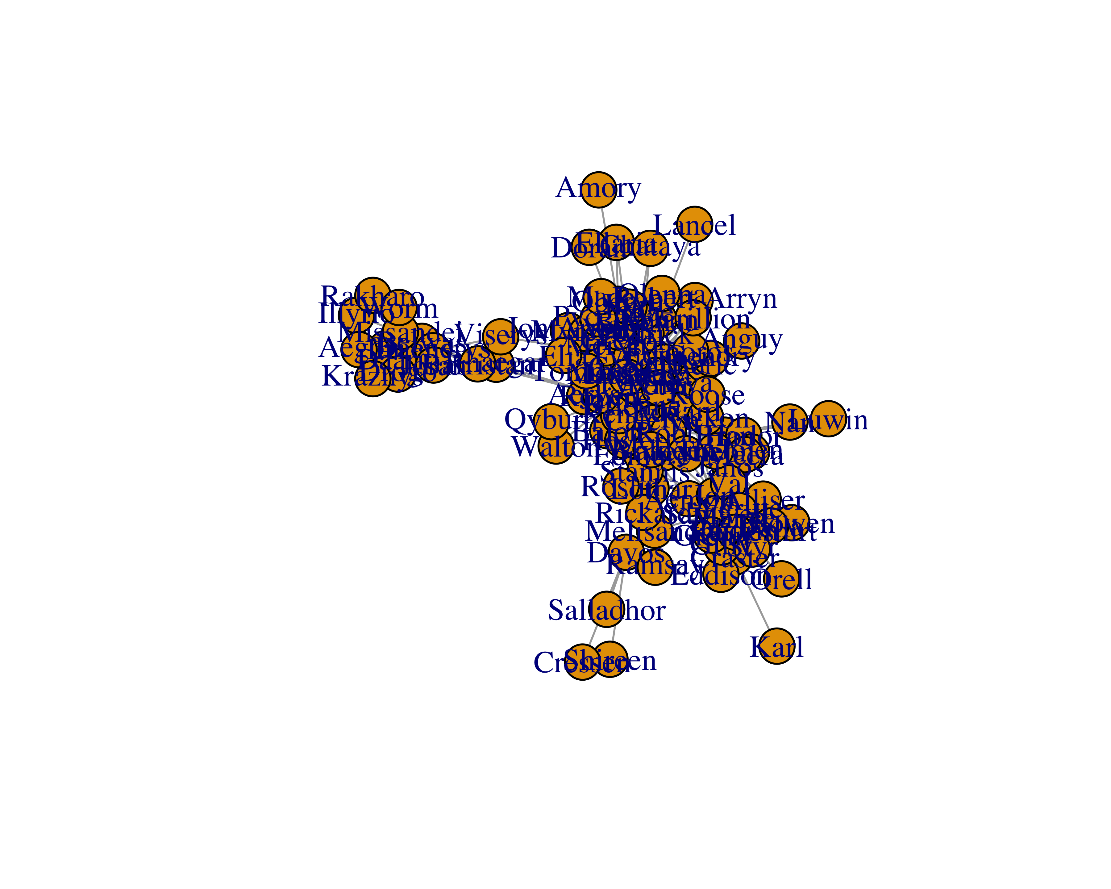
You can’t really see many of the names and groups. Let’s try different layouts.
plot(got_network_igraph, layout = layout_with_fr)
plot(got_network_igraph, layout = layout_in_circle)
plot(got_network_igraph, layout = layout_with_kk)
plot(got_network_igraph, layout = layout_with_lgl)
plot(got_network_igraph, layout = layout_with_mds)
plot(got_network_igraph, layout = layout_nicely)
plot(got_network_igraph, layout = layout_as_star)
plot(got_network_igraph, layout = layout_on_sphere)
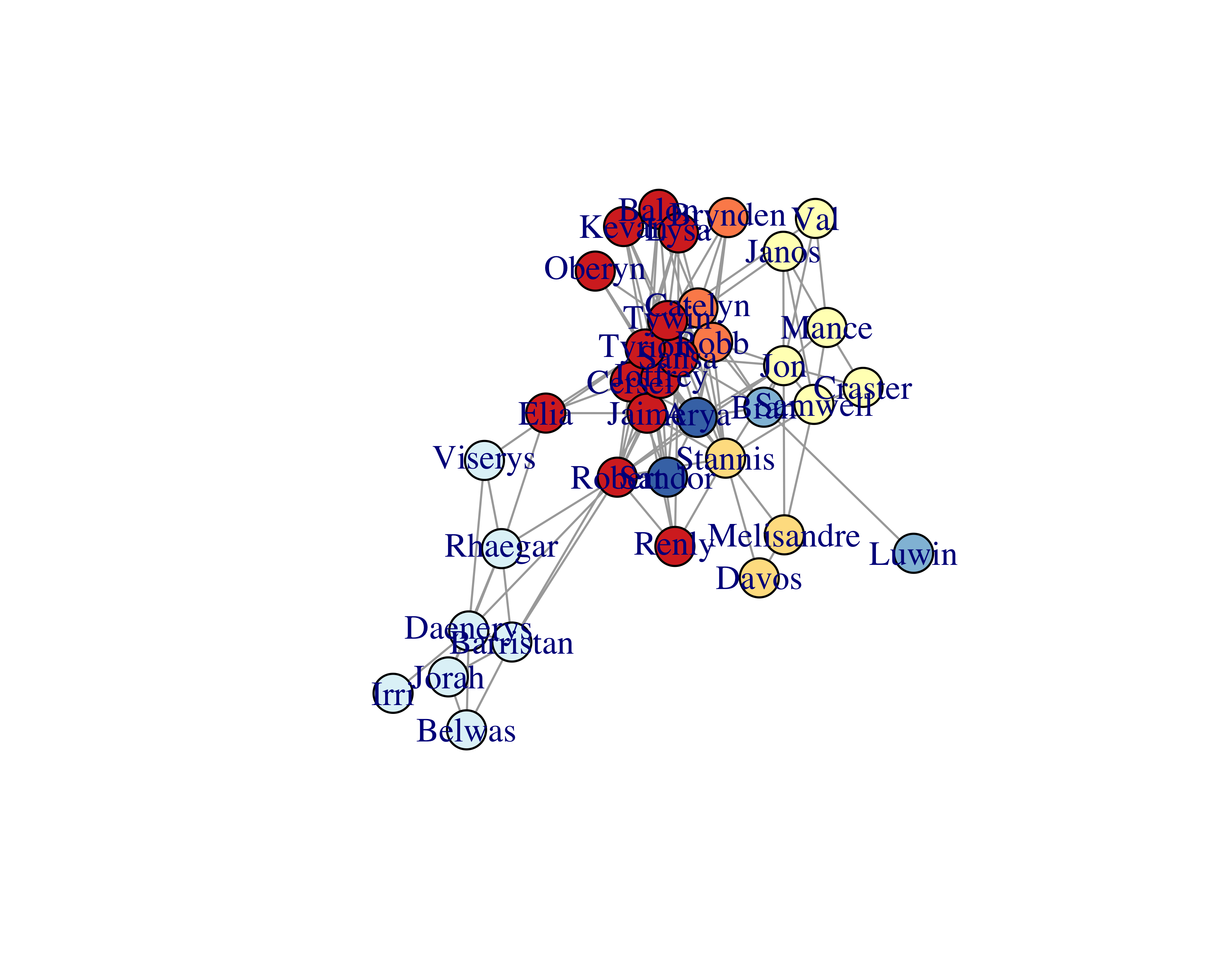
None of the layouts seem to improve the readability. We can improve the graph by deleting some of the nodes and their edges. To do so, we will need to calculate different measures.
Let’s find the communities for each of the nodes using the cluster_fast_greedy function.
membs_fc <- cluster_fast_greedy(got_network_igraph)
Then let’s assign colors based on these communities.
library(RColorBrewer)
membs_cols <- brewer.pal(n = max(membership(membs_fc)),
                         name = 'PiYG')
got_nodes$color <- membs_cols[membership(membs_fc)]
Let’s plot the graph again with these colors.
got_network_igraph <- graph_from_data_frame(d = got_edges,
                                            directed = FALSE,
                                            vertices = got_nodes)
plot(got_network_igraph, layout = layout_with_fr)

Now, although you can’t see the names clearly at this resolution, you can see the different communities by their colors. We can easily find the most connected and most “in-between” characters.
Let’s find the most connected characters.
got_degrees <- degree(got_network_igraph)
got_nodes$degrees <- got_degrees
head(sort(got_degrees, decreasing = TRUE))
#> Tyrion    Jon  Sansa   Robb  Jaime  Tywin
#>     36     26     26     25     24     22
Let’s remove all nodes (and their edges) with the number of degrees less than 10. We will also make the node labels smaller and add curves to the edges.
got_network_igraph <- graph_from_data_frame(d = got_edges,
                                            directed = FALSE,
                                            vertices = got_nodes)
got_network_igraph <- delete_vertices(
  graph = got_network_igraph,
  v = which(degree(got_network_igraph)<10))
plot(got_network_igraph,
     vertex.label.cex = 0.9,
     edge.curved = TRUE)

Let’s find the most “in-between” characters.
got_network_igraph <- graph_from_data_frame(d = got_edges,
                                            directed = FALSE,
                                            vertices = got_nodes)
got_betdegrees <- betweenness(got_network_igraph)
head(sort(got_betdegrees, decreasing = TRUE))
#>  Robert  Tyrion     Jon Stannis   Sansa Catelyn
#>    1166    1164     922     697     684     598
Let’s plot the graph with vertices which have betweenness values over 99.
plot(delete_vertices(graph = got_network_igraph,
                     v = betweenness(got_network_igraph) < 100))
Adding Interactivity
You can uncover many facts using numbers and graphs, but you can find the real power of SNA through interactive visualizations. The visNetwork library makes it very easy to create interactive networks.
Let’s use the same Game of Thrones™ dataset and create an interactive network. First, let’s prepare the data again, since visNetwork expects data in a slightly different format.
library(visNetwork)
library(dplyr)
got_edges <- read_csv(
  file = "http://bit.ly/2Fc4RrO")
got_nodes <- data.frame(label = unique(c(got_edges$Source,
                                         got_edges$Target)),
                        stringsAsFactors = FALSE) %>%
  mutate(id = row_number())
got_edges <- mutate(
  got_edges,
  from = inner_join(got_edges,
                    got_nodes,
                    by = c("Source" = "label"))$id,
  to = inner_join(got_edges,
                  got_nodes,
                  by = c("Target" = "label"))$id)

got_nodes$value <- degree(
  graph_from_data_frame(d = got_edges,
                        directed = FALSE,
                        vertices = got_nodes))
membs_fc <- cluster_fast_greedy(got_network_igraph)
membs_cols <- brewer.pal(n = max(membership(membs_fc)),
                         name = 'RdYlBu')
got_nodes$color <- membs_cols[membership(membs_fc)]
Once the data is ready, visNetwork commands can be chained similar to dplyr, thus making it very easy to make changes as well as increasing readability. Let’s see this code line by line.
visNetwork: Creates a network for the specified size using the nodes and edges data frames.visEdges: Adds black edges and arrowheads from where the edge originates.visNodes: Adds circle-shaped nodes with some relative scaling of the circle sizes.visInteraction: Adds interaction to the network and enables navigation buttons.visOptions: Highlights the neighbors of a selected node.visLayout: Provides a seed to keep the final layout similar at every run.
got_network <- visNetwork(got_nodes,
                          got_edges,
                          height = "800px",
                          width = "100%") %>%
  visEdges(arrows = "from", color = "black") %>%
  visNodes(shape = "circle",
           value = 50,
           scaling = list(min = 40, max = 70) ) %>%
  visInteraction(navigationButtons = TRUE) %>%
  visOptions(highlightNearest = TRUE) %>%
  visLayout(randomSeed = 123)


visSave(file = "got_network.html", graph = got_network)
visExport(graph = got_network)
This interactive graph, when opened in a browser, will look similar to Figure 15.11.
If you’re enjoying this book, consider sharing it with your network by running source("http://arn.la/shareds4fr") in your R console.
— Ashutosh and Rodger
Chassin, David P, and Christian Posse. 2005. “Evaluating North American Electric Grid Reliability Using the Barabási–Albert Network Model.” Physica A: Statistical Mechanics and Its Applications 355 (2). Elsevier: 667–77.
Langfelder, Peter, and Steve Horvath. 2008. “WGCNA: An R Package for Weighted Correlation Network Analysis.” BMC Bioinformatics 9 (1). BioMed Central: 559.
Golbeck, Jennifer, and James A Hendler. 2004. “Reputation Network Analysis for Email Filtering.” In CEAS.
Guimera, Roger, Stefano Mossa, Adrian Turtschi, and LA Nunes Amaral. 2005. “The Worldwide Air Transportation Network: Anomalous Centrality, Community Structure, and Cities’ Global Roles.” Proceedings of the National Academy of Sciences 102 (22). National Acad Sciences: 7794–9.
Scott, John. 2017. Social Network Analysis. Sage.
Newman, Mark. 2010. Networks: An Introduction. Oxford University Press.
Jacomy, Mathieu, Tommaso Venturini, Sebastien Heymann, and Mathieu Bastian. 2014. “ForceAtlas2, a Continuous Graph Layout Algorithm for Handy Network Visualization Designed for the Gephi Software.” PloS One 9 (6). Public Library of Science: e98679.
Beveridge, Andrew, and Jie Shan. 2016. “Network of Thrones.” Math Horizons 23 (4). JSTOR: 18–22.
Chapter 15 Social Network Analysis
Social network analysis (SNA) is the study of networks formed because of connections among objects. These objects could be people and the connections could be relationships among those people. But SNA isn’t limited to people. Researchers have used these types of analyses to test the reliability of electric grids (Chassin and Posse 2005), to find structure between gene expression profiles (Langfelder and Horvath 2008), to detect spam emails (Golbeck and Hendler 2004), and to find efficient hubs for air transportation (Guimera et al. 2005). Even Google’s origin involves a study of citation networks which later became the basis of PageRank (Page et al. 1999).
As you can see from these examples, SNA allows us to study the influential objects as well as their connections in networks. Through numbers and graphs, something that seems unfathomable can be understood and, more importantly, used in a practical application. Michael Kimmelman wrote an article in The New York Times on Mark Lombardi’s network maps on financial networks. He said, “I happened to be in the Drawing Center when the Lombardi show was being installed and several consultants to the Department of Homeland Security came in to take a look. They said they found the work revelatory, not because the financial and political connections he mapped were new to them, but because Lombardi showed them an elegant way to array disparate information and make sense of things, which they thought might be useful to their security efforts.”
You often hear that fundraising is all about relationships. Good fundraisers know or uncover the relationships among donors or potential prospects and then use these relationships to further the non-profit’s cause. A few vendors such as RelSci and Prospect Visual have made it easy to uncover these various relationships among our volunteers, donors, and prospective donors. This chapter will provide you with recipes to create such networks using your own data, but first let’s go through a few key concepts that are useful in this field.
15.1 Key Concepts
This is a quick introduction to SNA for our purposes; you should read Scott (2017) and Newman (2010) for more in-depth knowledge.
Node: The object of analysis is a node. It is also called as a vertex, actor, or an individual. Let’s say that John is a potential donor. He will be a node in our analysis then.
Edge: An edge is the connection between two nodes. It is also called a line, relationship, or link. Let’s say that Jane, our volunteer, is a friend of John. This friendship now forms an edge between John and Jane.
We also know that Jesse sits on a board with John, but Jesse doesn’t know Jane. Therefore, we won’t see any connection between Jesse and Jane.
Degree: Degree is a measure of connectedness of a node (that is, the number of edges a node has). As you can guess, this is a very helpful measure because we can determine the nodes with the highest connections. Nodes with high degree are great connectors. In our made-up example, John has two degrees and both Jesse and Jane only one.
Betweenness centrality: Betweenness centrality measures the number of edges for which a node is between other nodes. This measure is helpful to find out the gatekeepers in a network. Let’s say that Jack is a friend of Jane, and Jack is also a friend of Jesse.
In this example, all of the nodes have two degrees, because everyone knows two people. Also, all of the nodes have a betweenness of 0.5, because every node has two connections and there are four nodes, namely, 2/4. The math to calculate this measure gets complicated quickly with many nodes and edges. For more information, you can read these lecture slides by Donglei Du at the University of New Brunswick.
Communities: Communities are groups of the most interconnected nodes. A simple example of a community would be if you and I knew each other: my group of friends would form one community and your group of friends would form another.
Layouts: Layout algorithms help us see the networks and their characteristics. This is an active research field and researchers have provided many types of algorithms (Jacomy et al. 2014). Some common ones are random layout, circular layout, and Fruchterman Reingold layout. Figure 15.1 shows a sample network with three different layouts.
FIGURE 15.1: Different layouts for networks
15.2 Data Structure
Relationships between two nodes is the easiest format to use for SNA in
Rusing theigraphlibrary. You could provide the data in two different ways.If you provide edges-only data and provide the vertex names along with it,
igraphwill figure everything out for us. This data will produce a table as shown in Table 15.1.With this approach, you can’t easily change the vertex properties, such as colors, shapes, and others. But if you were to provide edges and vertices separately, you could also provide vertex properties along with it, as shown in Table 15.2; you can see the graph this data created in Figure 15.2. Providing vertex data separately also helps when you have large data sets.
FIGURE 15.2: Customized vertex options
You can write simple SQL statements to extract such data from your databases.
To get the edges you can write the following.
To get the vertex properties you can write the following.
You can then use the vertex properties to assign shapes or colors.
15.3 Creating Your First Network
Enough talk. Let’s create a simple network using the sample data. It is a simple, randomly generated network data set with 20 nodes. Let’s read the data.
Let’s use the
igraphlibrary to create a network using this data.To plot this graph, simply use the
plotfunction.You will see that the size of the vertices is small. You can adjust that by using the
vertex.sizeparameter.You can also play with different layouts to improve readability. Check all the different layouts by writing
?layout_in yourRconsole.Since our sample data only had edges, we can create a separate data frame with vertex properties.
Use this vertex data to create the graph.
15.4 Creating a Game of Thrones™ Network
Beveridge and Shan (2016) created a dataset using the book A Storm of Swords. You can find the dataset and many other fascinating applications and insights on their research page.
Let’s read this dataset.
Let’s build the network.
You can’t really see many of the names and groups. Let’s try different layouts.
FIGURE 15.3: Fruchterman-Reingold layout
FIGURE 15.4: Circle layout
FIGURE 15.5: Kamada-Kawai layout
FIGURE 15.6: Large graph layout
FIGURE 15.7: Multi-dimensional scaling layout
FIGURE 15.8: Auto layout
FIGURE 15.9: Star-shaped layout
FIGURE 15.10: Sphere layout
None of the layouts seem to improve the readability. We can improve the graph by deleting some of the nodes and their edges. To do so, we will need to calculate different measures.
Let’s find the communities for each of the nodes using the
cluster_fast_greedyfunction.Then let’s assign colors based on these communities.
Let’s plot the graph again with these colors.
Now, although you can’t see the names clearly at this resolution, you can see the different communities by their colors. We can easily find the most connected and most “in-between” characters.
Let’s find the most connected characters.
Let’s remove all nodes (and their edges) with the number of degrees less than 10. We will also make the node labels smaller and add curves to the edges.
Let’s find the most “in-between” characters.
Let’s plot the graph with vertices which have betweenness values over 99.
15.5 Adding Interactivity
You can uncover many facts using numbers and graphs, but you can find the real power of SNA through interactive visualizations. The
visNetworklibrary makes it very easy to create interactive networks.Let’s use the same Game of Thrones™ dataset and create an interactive network. First, let’s prepare the data again, since
visNetworkexpects data in a slightly different format.Once the data is ready,
visNetworkcommands can be chained similar todplyr, thus making it very easy to make changes as well as increasing readability. Let’s see this code line by line.visNetwork: Creates a network for the specified size using the nodes and edges data frames.visEdges: Adds black edges and arrowheads from where the edge originates.visNodes: Adds circle-shaped nodes with some relative scaling of the circle sizes.visInteraction: Adds interaction to the network and enables navigation buttons.visOptions: Highlights the neighbors of a selected node.visLayout: Provides a seed to keep the final layout similar at every run.This interactive graph, when opened in a browser, will look similar to Figure 15.11.
FIGURE 15.11: Game of Thrones™ interactive network