Chapter 10 Data Visualization
10.1 Creating Better Charts
Data is the most critical aspect of any project: It’s with data that decisions get made. It’s hard to make sense of a heap of data, and in that form, it is useless. No matter how technology shapes the data that we collect and analyze, we will make decisions based on simple, understandable data points.
Nobody, except you, cares that your predictive models have 99% accuracy, but your boss does care when you say, “Product X will lose 83% of sales in the next six months unless we increase activity A by 23%.” Data visualization gives such information quickly. That’s why creating effective data visualizations is a must.
With careful planning, you can provide decision-makers clear and understandable information that tells a story and also make them remember the objective.
Key elements include accessibility and using the right type of chart as well as not getting distracted by colors or crazy formats. It’s easy to confuse pretty with useful.
Too much information is rarely useful: Strive for simplicity.
10.2 Understanding Perception
Because data visualization tools make creating charts easy, we may create charts that manipulate the understanding of the data or trends. A dramatic rise or shift in the chart will trigger a response from the reader. That is the whole point of data visualization, to either increase the understanding of the data or raise questions about it. Incorrect chart types or scales can manipulate this perception.
For example, consider the two graphs shown in Figure 10.1 from a study on graph interpretation (Zacks and Tversky 1999). Some participants in the study saw data represented as a bar graph and others saw the data as a trend-line graph. In both charts, two variables were compared: Age and height.
The age variable was broken in two groups, shown on the X axis, and the average height was shown on the Y axis.
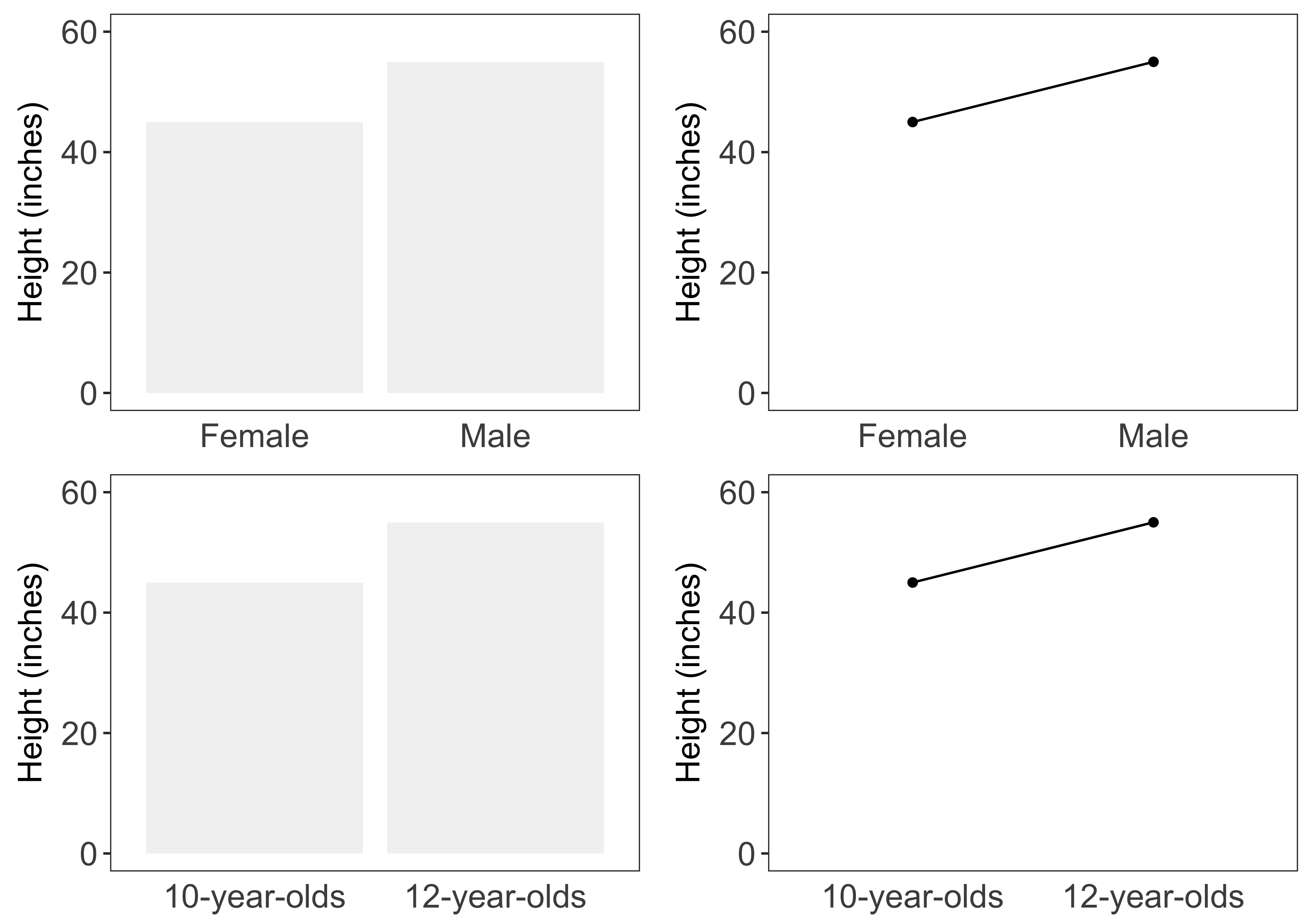
FIGURE 10.1: Bar and line graphs testing (Zacks and Tversky 1999)
The participants were asked to record their observations. By studying these observations, the researchers concluded that the chart type influenced readers‘ understanding of the data.
Some observations of the bar chart observations were:
- Males’ height is higher than that of females’
- The average male is taller than the average female
- Twelve-year-olds are taller than ten-year-olds
Some observations of the trend assessments are listed below.
- The graph shows a positive correlation between a child’s increases in age and height between the ages of 10 and 12
- Height increases with age (from about 46 inches at 10 to 55 inches at 12)
- The more male a person is, the taller he/she is
Read the last one again: The more male a person is, the taller he/she is.
What difference do you notice between the two assessments?
The trend-line is unsuitable for numeric values on the X axis, while bar graphs make sense for these types of data. And, because the trend-line chart type is unsuitable for this data, it leads to wrong and hilarious conclusions.
In a similar study, researchers gave participants various frames with data on the risk of gum disease using the current toothpaste and an improved formula (Chua, Yates, and Shah 2006).
The participants saw two frames: A graphical one and a numeric one, as shown in Figure 10.2.
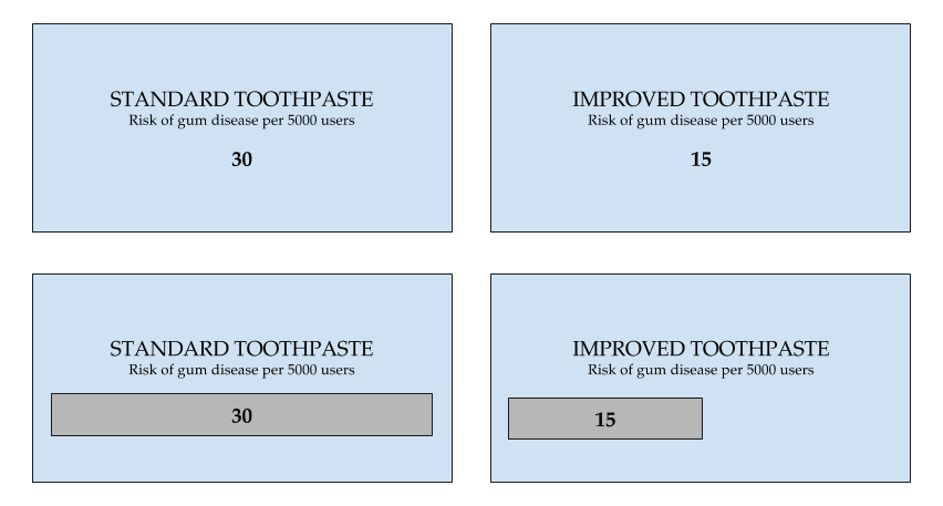
FIGURE 10.2: Bar and line graphs testing (Chua, Yates, and Shah 2006)
The participants were then asked to enter the price they were willing to pay for the improved toothpaste.
Some were shown the graphical frame and some were shown the numerical frame.
Can you guess in which frame the participants were willing to pay a higher price?
The participants were willing to pay significantly more for the safer product when the chances of harm were displayed graphically than when they were displayed numerically.
That’s a big conclusion, and worth repeating: People were willing to pay more when the chances of risk were shown graphically instead of numerically.
People’s tolerance for assessing and avoiding risk is heavily influenced by whether they’re seeing information graphically or numerically. Seeing data presented in graphical format can make people less likely to take risks (Chua, Yates, and Shah 2006).
Another very popular example, Anscombe’s quartet, is perhaps the one that gave birth to the idea of modern statistical data visualization.
Anscombe’s quartet is made up of four data sets that have nearly identical mean, variance, and linear regression equations, yet they appear very different when graphed. Each data set consists of eleven (x, y) points. The statistician Anscombe constructed these sets in 1973 to show both the importance of graphing data before analyzing it and the effect of outliers on statistical properties. See the box plots shown in the Figure 10.3. Although the median values for both the variables look similar, you can notice the outliers.
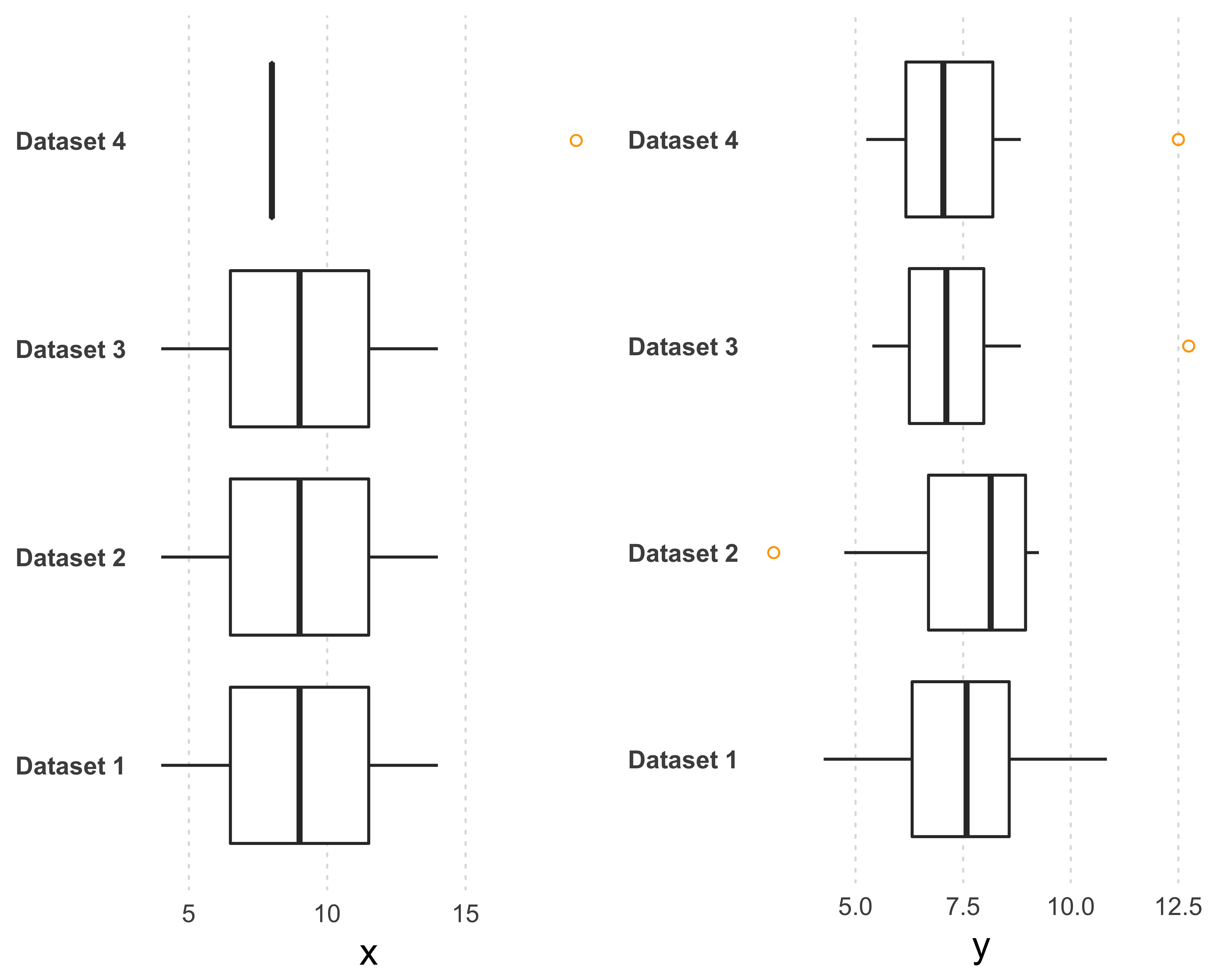
FIGURE 10.3: Anscombe’s quartet: four different data sets with similar statistical distributions
When you plot the variables as a scatter plot, as shown in Figure 10.4, you can clearly see that the correlation between the two variables is very different, but the linear regression equation lines are exactly the same.
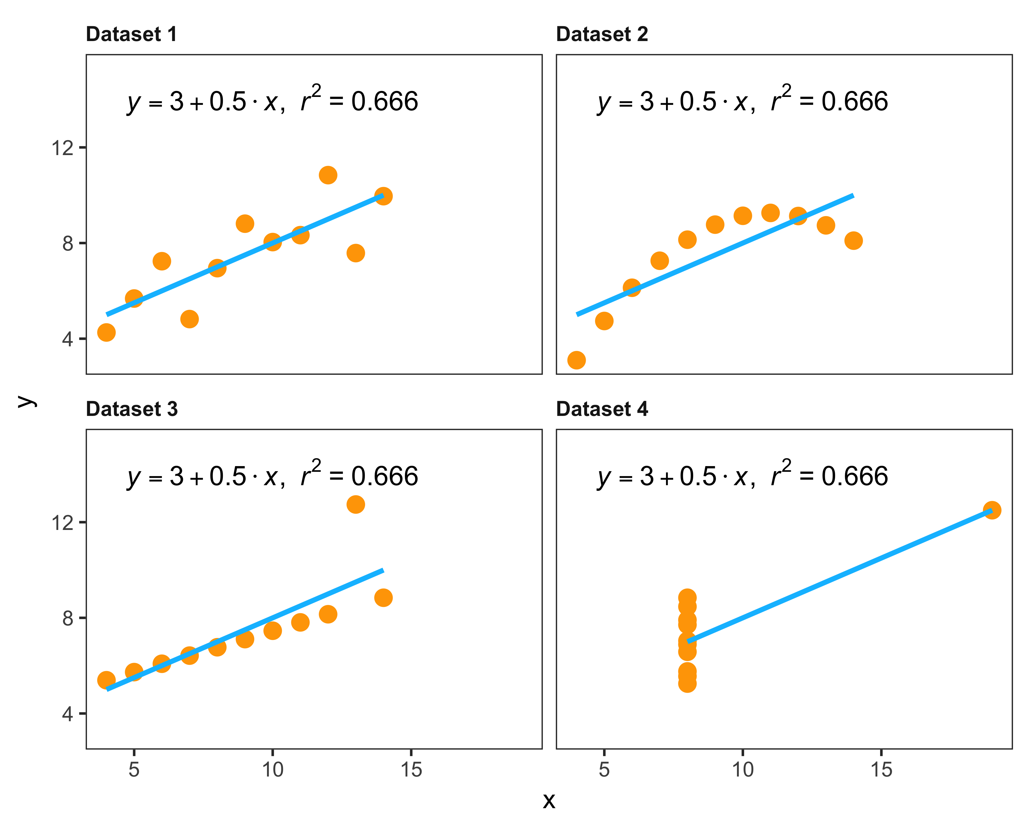
FIGURE 10.4: Anscombe’s quartet: four different data sets with similar statistical properties
Matejka and Fitzmaurice (2017) extended the Anscombe principle further and created a dataset with similar statistical properties, but very different looking shapes. Figure 10.5 shows three of those shapes and Table 10.1 shows the statistical properties.
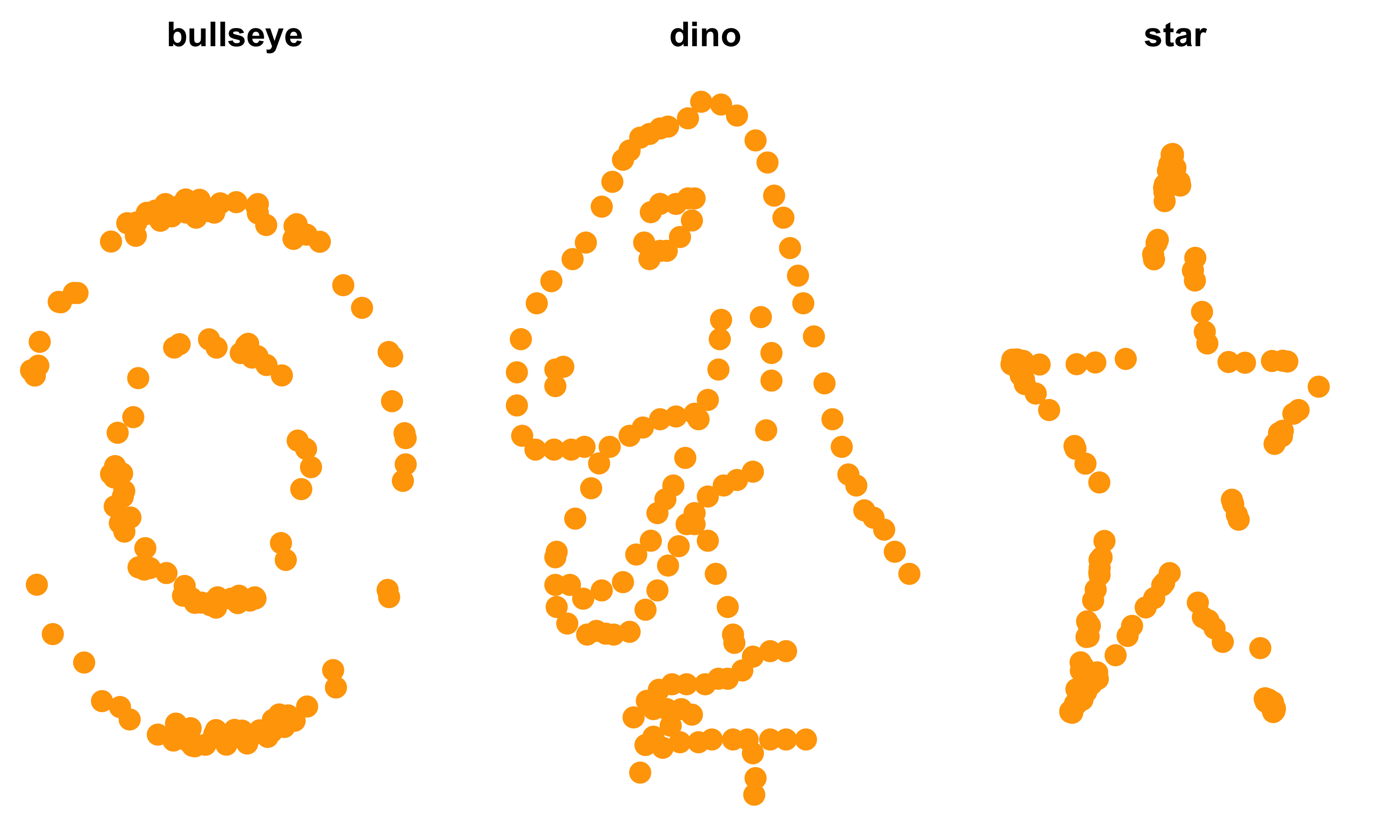
FIGURE 10.5: Same statistical properties datasets but different shapes (Matejka et al. 2017)
| dataset | meanx | meany | sdx | sdy | cor |
|---|---|---|---|---|---|
| bullseye | 54.3 | 47.8 | 16.8 | 26.9 | -0.069 |
| dino | 54.3 | 47.8 | 16.8 | 26.9 | -0.064 |
| star | 54.3 | 47.8 | 16.8 | 26.9 | -0.063 |
This should settle the “why data visualization is important” question. Let’s see what makes data visualization effective.
10.3 Process
We can understand charts by measuring the distance of a shape from the origin.
Think of the number line.
We know that the number five is five “units” away from zero.
Now, think of a bar chart: It is a rectangle that shows the distance in units between its origin and the observation.
You can replace the rectangle with a line or a dot and you will get the exact same information, but the speed of grasping the information might be different.
Often, we want to compare multiple “distances”—but there’s perhaps no best way to show these distances.
Statisticians and scientists, therefore, devised various ways to show this comparison.
If there are various ways to show the same information, what makes a visualization effective?
It is simple: A visualization is effective when it helps the viewer speed up his or her understanding of the presented information.
Many times, analysts get stuck in thinking about the “how” of data visualization. They may see a cool chart and immediately they ask, “How do I create such a chart?” This distracts them from thinking whether this chart shows the patterns or insights they want to share.
Worse, it can distract them from considering whether this chart is actually needed.
Noah Iliinsky, a data visualization expert and author of Beautiful Visualization (Steele and Iliinsky 2010), says this about the process:
- What do I care about?
- What actions do I need to inform?
- What questions need answering?
- What data matters?
- What graph do I use?
10.3.1 Chart Junk
When a chart is not thought out carefully, we create “chart junk.”
Ask yourself: Do you add unnecessary parts to a machine? Then why add unnecessary pieces to a graphic?
Sometimes graphics take up a lot of space but give very little information.
For example, check out the graphic on this page. It shows the top 10 and bottom 10 states according to the expenditure. It shows this information by including a flagpole of each state, and the height of the flagpole represents the dollar amount. Imagine how much time a designer spent placing all those flags, captions, and more. This information can easily be shown by a simple dot chart as seen in Figure 10.6.
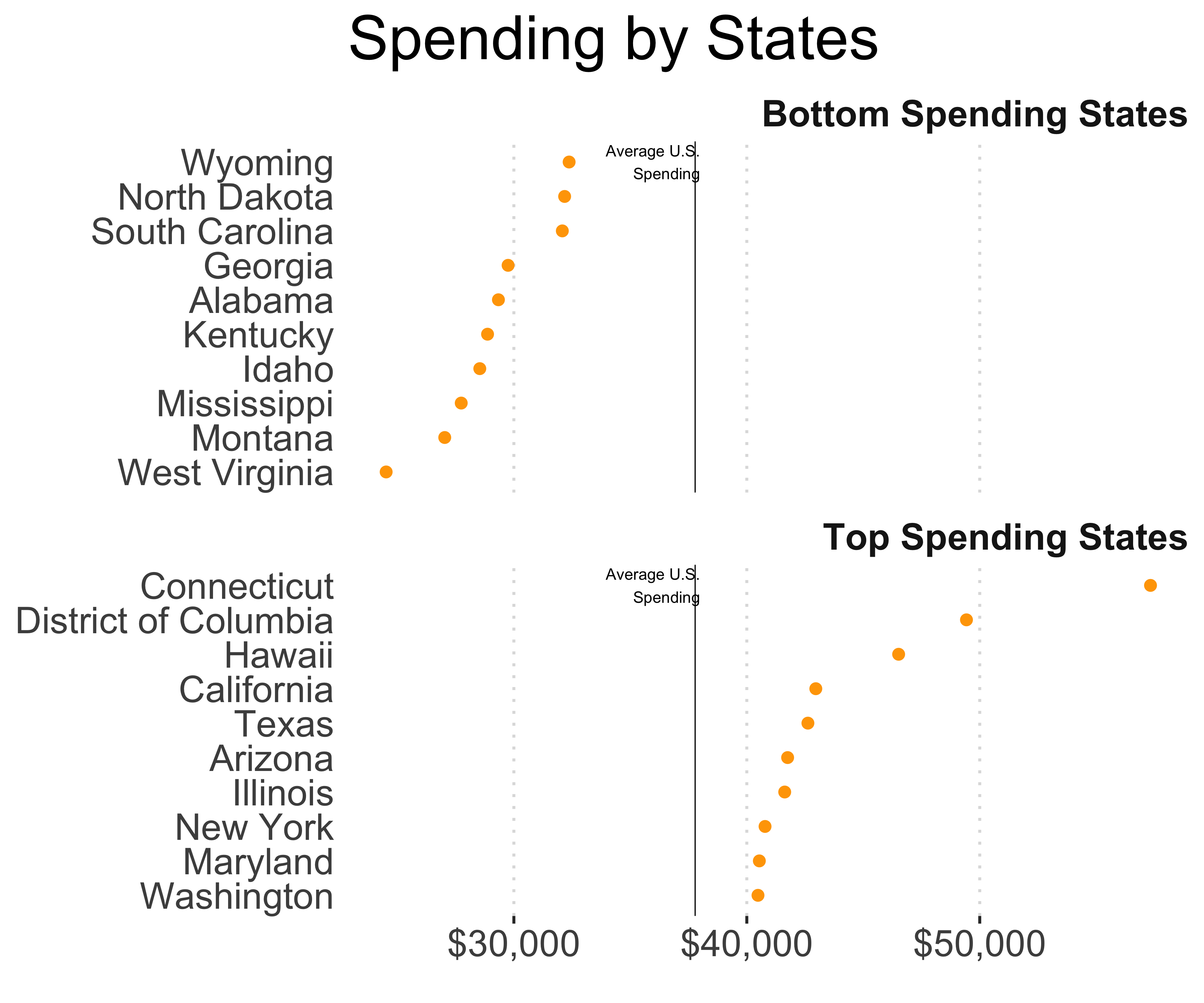
FIGURE 10.6: Redesigned chart on state spending
Sure, infographics can be cute, but as Edward Tufte encouraged, we need to maximize the information-to-pixel ratio (Tufte 2001).
Tufte also said, “Show data variation, not design variation.” Similarly, when performing data visualization work, our objective is not to show our craftsmanship but, as Noah Iliinsky said, “to inform or persuade.”
10.3.2 Critical Thinking
Critical thinking is essential when creating visualizations or conducting analysis based upon them. When coming up with ideas, delay your judgment. There’s a neat trick from design thinking that applies well here: diverge and converge.
The approach is this: First, come up with as many ideas as possible (diverge), then select a few that make the most sense (converge).
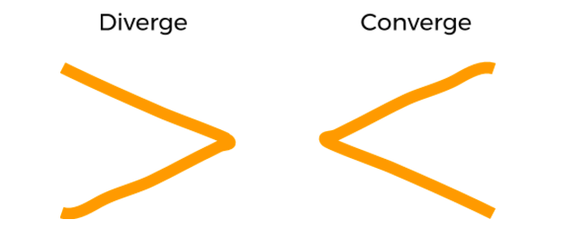
FIGURE 10.7: Idea-generation framework
My process for creating new graphs or reports starts with a blank piece of paper. I draw approximate versions of visualizations I would like to see based on my data.
At times I get excited about illustrating some trends that would show gaps, but when I create the visualization using real-world data, I realize that the data doesn’t support such trends. I grab some more paper and start again.
As you evaluate ideas, decide and remember the objective of your graphic: To inform or to persuade, like Noah Iliinsky suggests.
Does the audience care? Is the information required?
Instead of applying the prettiest graph in your toolbox, remember: you must use the most effective graph for your data. Don’t lose sight of the objective of the graphic (inform or persuade).
And as important it is to maximize the information-to-pixel ratio, you should pay special attention to maximizing the information-to-time ratio and lead the reader to actionable insights.
In analysis and in data visualization, the process is more important than the result. Progress without process leads to collapse. Remember to kick-off with why and begin with “so what.”
You will improve your visualizations by asking yourself the following questions:
- What do you want to show?
- Why is it important?
- What does your audience know?
- What’s the best way to represent that information?
- Are you hoping to inform or persuade?
- What type of data do you need?
10.4 Improving Effectiveness of Visuals
You can make your charts more effective using four C’s: Clarity, context, concision, and compression.
- Clarity lets the readers understand the charts quicker. When you remove all distractions, you achieve clarity.
- Context lets the readers compare. When you add key information using reference lines or legends, you provide context to the single graph.
- Concision keeps the readers focused. When you show something using as few pixels as possible, you don’t lose the reader’s attention.
- Compression makes the visualizations smaller but not smaller than they need to be. When you achieve all the three C’s above and can still make the graphs smaller, you make the graphs accessible.
10.4.1 Design Principles
Golombisky and Hagen (2016), in their book White Space is Not Your Enemy, describe four main graphic design principles. Every aspiring data analyst should become familiar with these principles. They are easy to understand and will improve your charts dramatically. They are easy to remember also as the acronym is actually the opposite of the results they achieve: CRAP.
- C: Contrast
- R: Repetition
- A: Alignment
- P: Proximity
Here’s a short summary of these principles. Read their book for more information.
Contrast lets us see and compare. Good contrast between the foreground and the background makes the foreground stand out and/or readable. White and black forms the best contrast, but reading a white text on a black background causes eye strain. I prefer black or light foreground objects on a white background. Try these tools to find colors with good contrast: https://webaim.org/resources/contrastchecker/ and https://app.contrast-finder.org.
Repetition trains the reader to quickly get used to the design and find things easily.
Alignment creates order in your graphic. As you see particular objects aligned with each other, you assume some relationship.
Proximity of the objects, like the other principles, lets your mind know to expect some sort of relationship between those objects and provides a structure.
10.4.2 Clarity
To help readers draw appropriate conclusions from your charts, you must provide clarity. If you are very careful with the process, chances are you are creating something useful.
Noah Iliinsky said, “Data visualizations are not art, they’re advertisements.”
A good example of clarity is the Wall Street Journal graphic on the story of Chick-fil-A and its opposition to gay marriage. This graphic works because it is neutral and removes anything that could distract the reader, including excessive grid lines, labels, background colors, and axis tick-marks.11
It focuses on the message.
In the graph, the size of the circle denotes the number of restaurants. The circles are color coded for regions. You can further explore the regions and the general opinions on gay marriage in that area, as shown in very simple pie charts.
10.4.3 Format
As you think of clarity, choose the right format for your data, and encode your data accurately.
An infamous example is an old Fox News pie chart. All the parts of a pie chart should add up to 100%, but instead, this one showed what percentage of the population supported each candidate. The pieces of the pie added up to more than 100%.

The appropriate format for presenting this information is a bar chart.
The right format is directly dependent on your objective.
Some chart components work better for certain projects. For example, color is useful for showing categories of data but not so effective for illustrating relationships.
Charts where changes in size or position of an element are good for demonstrating relationships don’t work so well for quantitative data.
10.4.4 Color
Although colors often make graphics come alive, it’s important to avoid excessive use of color. Use color for distinguishing and not for “prettifying.”
As Dona Wong, Edward Tufte’s student and the Wall Street Journal’s graphics editor, wrote in her book, “Admit colors into charts gracefully, as you would receive in-laws into your home.” (Wong 2013)
If you want to use color in your charts, use a single color with different gradients. Also, important to note is to avoid light text on a dark background. This combination results in a good contrast; however, it also proves challenging to read.
Here’s a quick test for your chart: Print a black-and-white copy. Can you still differentiate your data points?
Online tools like ColorBrewer can be useful in developing effective color palettes. Based on data type and color scheme, users can get an idea of good choices for adding color appropriately to charts.
10.4.5 Distractions
Visual distractions like legends, 3D, shadow, too many grid lines, or a busy background can interfere with a viewer’s ability to accurately view and assess information in graphical form.
While it is important to highlight key trends or areas, it’s vital to make the information on the chart very accessible to the reader. One caveat—legends may sometimes be necessary and, in those cases, be sure to place them right next to the data item. If that’s not possible, place them below the chart.
10.4.6 Accessibility
It is our duty to make visuals easy to read and understand.
Two quick ways to do so are:
- Don’t make your reader guess or calculate.
- Don’t cause neck pain: turn the axis labels.
When planning your data visualization, it helps the reader when you provide labels when needed, remove background, add captions explaining key items about the graphic, and highlight key trends or areas.
A good example of creating accessible data visualizations is from Time magazine. The magazine published a story on why medical bills are killing us. Although healthcare costs are hard to understand, they made all the numbers very accessible. Here’s how they did it:
- They provided context with their graphs.
- They added descriptions and captions explaining key things about the graph.
- They added reference lines to help the reader understand the graph.
10.4.7 Incorrect Encoding
When the Washington Post blog posted a chart using circles of different sizes to compare WhatsApp’s acquisition by Facebook for $19 billion, it included the acquisition costs for Snapchat ($3 billion) and Instagram ($1 billion). All the radii of the circles were proportionate to the acquisition value. Then somebody commented on Twitter that the proportion should be by area and not by radii.
I confess that when I looked at this the first time I thought the proportions, whether by radius or by area, should still be the same. But when you actually calculate the ratio by radius, $19 billion is 39% bigger than $1 billion, and when you look by area, $19 billion is 5.33% bigger than $1 billion, as shown in Figure 10.8.
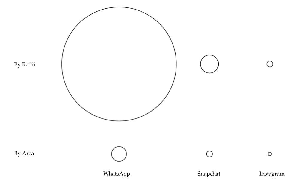
FIGURE 10.8: Encoding of circle sizes by radius and area
Tufte called this “lying with charts.” You take this risk when you encode data incorrectly.
10.4.8 Aspect Ratio and Axis Values
The aspect ratio, which is the ratio of width to height, of a chart can significantly alter reader’s conclusions. If the aspect ratio is large, we risk squishing the trends. And if it is small, we risk overstating the trends. Similarly, adjusting the minimum and maximum values of axes can alter the perspective of the data. For example, take a look at the different aspect ratios shown in the Figures 10.9, 10.10, and 10.11. Doesn’t the rise look more dramatic with an aspect ratio of 5? With an aspect ratio of 0.4, the growth doesn’t look as dramatic. Similarly, when you start the Y axis at zero as in Figure 10.12, the growth doesn’t look as dramatic compared to Figure 10.13.
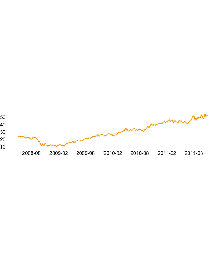
FIGURE 10.9: Apple performance with an aspect ratio of 5
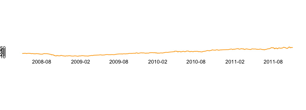
FIGURE 10.10: Apple performance with an aspect ratio of 1
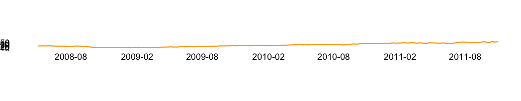
FIGURE 10.11: Apple performance with an aspect ratio of 0.4
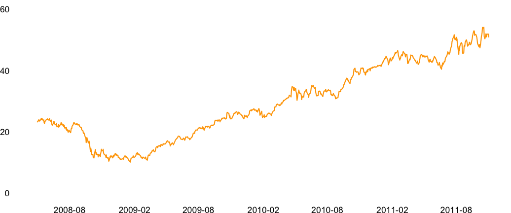
FIGURE 10.12: Apple performance with the Y axis starting at 0
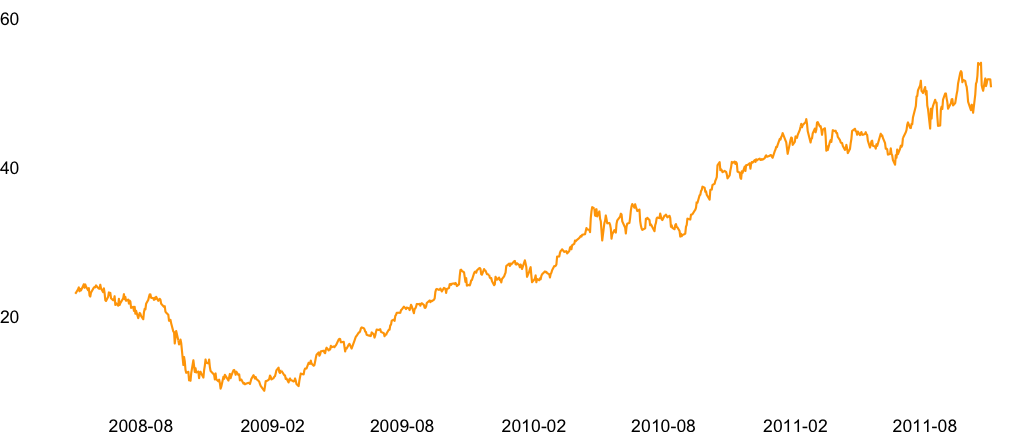
FIGURE 10.13: Apple performance with the Y axis starting at 10
10.4.9 Context
After creating your graph, you should provide context. Compare items or provide information. Use labels or other descriptive tools to offer viewers some framework for understanding what you’re trying to tell them.
10.5 Choosing the Right Chart Types
Now that we’ve seen some principles of effective data visualizations, let’s look at various chart types to visualize our data.
10.5.1 Tables
People are very familiar with tables where data is presented in rows and columns. Headers along the top or side provide context. Tables can accommodate both small and large data sets.
Pros: Tables report information with precision and clarity. Tables can also show variables from multiple dimensions. Imagine trying to show multiple variables, such as population, income, and education levels, about U.S. states using a graph. We can achieve that, but the readers will have to spend a good amount of time understanding everything that’s shown on the graph. Placing that same information in a table can make it easier for the reader to view and use the data.
Cons: Although tables do show data with the greatest accuracy, people just don’t get excited over tables (that is, tables don’t get shared over social media). Tables also sometimes hide the magnitude of differences. Sure, we can know that $100 million is larger than $50 million, but a graph just makes that difference look “real.”
Alternatives: If your data has only two variables, a bar chart (for discrete values), a line chart (for time series), or a scatter plot (to show relationships) are good choices. If you have multiple related variables, faceted plots, or plots by group will be effective.
10.5.2 Simple Bar Charts
A simple bar chart presents data graphically, with a series of lines standing in for a series of numbers—either horizontally or vertically. Bar charts enable quick comparison among data points.
- Pros: Because of their similarity to number lines, bar charts are easy to create and understand. Horizontal bar charts are typically easier to assess than vertical bar charts, a.k.a. column charts.
- Cons: There is a risk of misrepresentation of information when vertical bar charts don’t start at zero.
Alternatives: Instead of a simple bar graph, information can be presented through a dot plot or dot chart. A dot chart will show the exact same information as a bar chart, but will take up less space. Circle plots are an option, but there is a risk of losing the main advantage of a bar graph—the ability to easily compare data elements. Depending on the size of the data set, a table may be a good choice, too.
10.5.3 Line Charts
Line charts are often used for trends and time-series data. Data is plotted along the X and Y axes. A line is drawn that connects data points from left to right.
Pros: Line charts are very helpful in understanding trends or data that reflects changes over time. They are also simple by design. Line charts can accommodate multiple concurrent data sets.
Cons: Overlapping data series can make it harder to study trends. Individual data points are hidden. Line charts with discrete scales can result in wrong conclusions. Labeling data points runs the risk of making the chart look very busy; the same can happen when attempting to highlight key data points through content boxes. Be mindful, however, of the aspect ratio. Instead of legends, clearly place labels over lines. Avoid too many lines. If appropriate, use panels or facets while comparing data.
Alternatives: Depending on the data set, a simple bar chart may be a usable alternative. It could be possible to plot multiple data sets as long as there’s no overlap and data sets are layered carefully to avoid confusion. Also, remember our good friend, the table.
10.5.4 Pie Charts
There may be no other chart type more disputed than the pie chart. In fact, the debate over its efficacy goes back decades (Croxton and Stryker 1927), yet they remain very popular and commonplace—so commonplace that I saw the banner shown in Figure 10.14 in a hotel elevator.

FIGURE 10.14: Meeting = pie chart
You may disagree on the efficacy of a pie chart, but everyone will agree that pie charts are only for showing proportions, and the pieces of the pie should always add up to 100%.
According to Wong (2013), pie charts are often read like a clock, so in order to be most effective, the largest slice goes to the right of 12 o’clock, followed by the second-largest slice to the left of 12 o’clock, and progressing by ever-smaller slices in a counterclockwise direction.
- Pros: Very recognizable. Many managers actually prefer pie charts. If your data distribution is simple, you can explain the proportions very quickly.
- Cons: Pie charts with too many slices can be difficult to read. Also, some slices may be so thin compared to others that they’re barely visible.
Alternatives: Like a pie chart, a sorted bar chart will show the proportion of each category as well as letting you compare the proportions. You can convert the raw values to percentages if you would like. This is a good alternative as you don’t need to use multiple colors for each category.
A tree map is an alternative, but it faces the same challenges as a pie chart. The biggest difference is the proportions are shown with a rectangle rather than a slice of pie. Some may argue that rectangles are more effective.
A dot chart is a great alternative because the magnitude of differences is clearly visible.
And, of course, our trusted hombre, the table.
10.5.5 Stacked Bar Charts
Stacked bar charts are similar to line charts, except instead of individual lines, data points are measured by rectangles that are stacked on top of/adjacent to each other, making a longer vertical or horizontal bar.
Pros: It shows the total as well as the distribution of categories in a bar, allowing us to compare the totals and individual areas. Stacked bar charts can also help the viewer determine proportions for a given element.
Cons: If you have too many categories, you really can’t figure out the differences. We try to overcome these problems by using different colors or placing text labels, but that actually worsens the problem. If we do need to place text labels, why should we use the graph in the first place? Worse, we can’t compare one rectangle of one bar to another rectangle of a different bar. While these types of charts are helpful in seeing the proportions of each category better than a pie chart, we really don’t see the difference in proportions if there are too many categories or the proportions are too small or too similar. These charts become worse when you have to compare two or more stacked bar charts. Can you really compare one category from a stacked bar to another category from another bar? Most likely, no.
Alternatives: Dot plots with groups are a great alternative. They achieve the same goals with greater efficacy by showing individual proportions as well as allowing us to compare with other categories.
Pie charts are also a satisfactory alternative. You can try side-by-side bar charts as groups, and that may work better than a stacked bar chart. But, you still have too many colors and labels to compare.
May I mention our cool, but shy friend, the table?
10.5.6 Scatter Plots
Scatter plots show the correlation between two variables. Typically, we use a dot as the shape for the data points. But dots can be replaced with text or other shapes for better readability and comparison.
Here’s a story of scatter plots gone wrong:
In Happisburgh (pronounced “haze-bruh”, a village in the English county of Norfolk), some scientists discovered fossilized hominin footprints in a newly uncovered sediment layer on a beach. These fossils were destroyed by the tide shortly afterwards.
Luckily for us, though, the scientists took 3D scans and models. They found approximately 50 footprints; 12 were largely complete and 2 showed details of the toes. The footprints of approximately 5 individuals have been identified, including adults and children. Here’s the best part: They are more than 800,000 to 1 million years old, making them the oldest known hominin footprints outside Africa.
Such an amazing discovery, but in their research paper, Ashton et al. (2014) included the scatter plot shown in Figure 10.15. Now you try mapping every foot number to the picture above the plot.
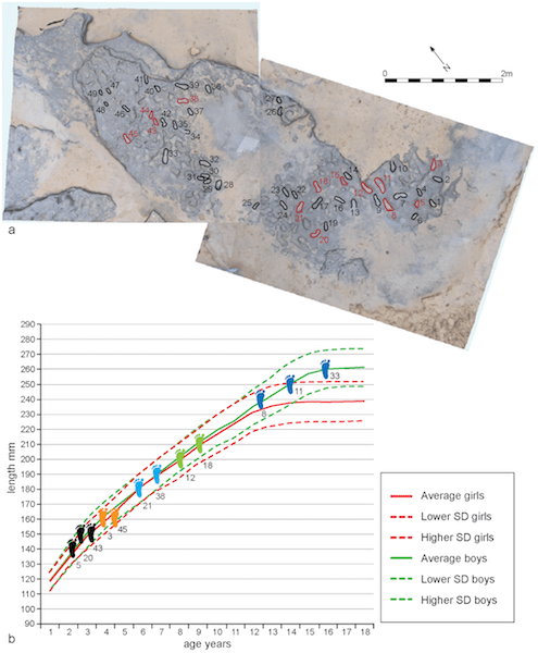
FIGURE 10.15: Scatter plot of age and length (Ashton et al. 2014)
Pros: After bar plots, scatter plots are perhaps the easiest to understand. As long as the variables and scales on the axes make sense, the chart should come out A-OK. This is the best plot for understanding any relationship between two variables. With a scatter plot, we get many properties to play with: colors of the dots, sizes and shapes of the dots, and text labels.
Cons: If you have too many data points, then learning about one single data point becomes harder. If you do want to show a point, then you can use the principles of contrast and direct labeling. So, you may want to make all the other data points a lighter color and the point of interest a darker color. Of course, with great power comes great responsibility. If you use too many variations, you risk losing the reader. It is best to highlight one or two plot properties with care.
Alternatives: If you are trying to show a lot of data, you risk losing the reader. It is best to create separate, multiple charts, whether it’s multiple scatter plots or another kind of chart.
10.5.7 Maps
Data on maps is very powerful. There are a few ways to show data on a map. Individual points of interest are represented as dots or circles. They could be as granular as an address level or as big as a country level. Alternatively, data could be represented by filled maps with different colors, a.k.a. choropleth maps. These could go from a zipcode level to a country or continent level.
Pros: Maps are easy to understand if created carefully. They are very useful for looking at big trends or patterns.
Cons: If there are too many colors or patterns, they are hard to see. We don’t gain any benefit from showing the data on a map.
Alternatives: A sorted bar graph or a dot chart is a good alternative to a map, depending on the data.
10.6 Creating Data Visualizations with ggplot
Hadley Wickham (2009) completely changed the way R users plotted graphs. Although base R graphics are very customizable, finding all the right options can be challenging. Wickham used the principles of grammar of graphics (Wilkinson 2006) to create the ggplot library. Like the grammar of a language, charts can be broken into individual components. We can use these components to add or remove layers on a chart. Using a consistent way of referencing these components, you can create great-looking charts in minutes. You can create a graph using ggplot like this:
ggplot(data = <your_data>,
       aes(x = <your_x_var>,
           y = <your_y_var>,
           size = <your_size_var>,
           color = <your_color_var>)) + geom_<of_your_choice>
Here are the main components that you need to learn before you begin your journey to awesomeness.
10.6.1 geom
A geometric object or geom tells ggplot which plot we want to see. Some of the most common geom objects are:
geom_bar: Adds a frequency bar graph layer by default, unless you pass an already calculated column and specifyidentity = TRUEgeom_line: Adds a line graph layer.geom_point: Adds a scatter plot layer in which the X-axis variable doesn’t need to be a continuous variable.geom_text: Adds a text layer, which is very useful for annotation or name plots.
See the full list of geom objects on the ggplot’s documentation site.
10.6.2 Aesthetics (aes) Mapping
The aesthetics mapping tells ggplot which variable to use for plotting on the axes and for choosing colors, sizes, and shapes. There are two ways to assign the variable: in the ggplot function or in the geom_* function. If you assign the aesthetics in the ggplot function, the code following the initial ggplot call will use those same mappings unless you explicitly supply other values. However, if you assign the aesthetics in the geom_* function, you can limit the mappings to that geom. Mapping the aesthetics in the geom_* call becomes very useful when you have multiple geom objects. Figures 10.16 and 10.17 show examples of mapping both ways resulting in the same graph.
require(ggplot2)
require(dplyr)
#We will use the mpg dataset that comes with the ggplot package
?mpg #see the documentation for this dataset
glimpse(mpg) #see the data
#> Observations: 234
#> Variables: 11
#> $ manufacturer <chr> "audi", "audi", "audi", ...
#> $ model        <chr> "a4", "a4", "a4", "a4", ...
#> $ displ        <dbl> 1.8, 1.8, 2.0, 2.0, 2.8,...
#> $ year         <int> 1999, 1999, 2008, 2008, ...
#> $ cyl          <int> 4, 4, 4, 4, 6, 6, 6, 4, ...
#> $ trans        <chr> "auto(l5)", "manual(m5)"...
#> $ drv          <chr> "f", "f", "f", "f", "f",...
#> $ cty          <int> 18, 21, 20, 21, 16, 18, ...
#> $ hwy          <int> 29, 29, 31, 30, 26, 26, ...
#> $ fl           <chr> "p", "p", "p", "p", "p",...
#> $ class        <chr> "compact", "compact", "c...
ggplot(data = mpg, aes(x = cyl, y = hwy, color = manufacturer)) +
  geom_point()
FIGURE 10.16: Aesthetics mapping using ggplot
ggplot() +
  geom_point(data = mpg, aes(x = cyl, y = hwy, color = manufacturer))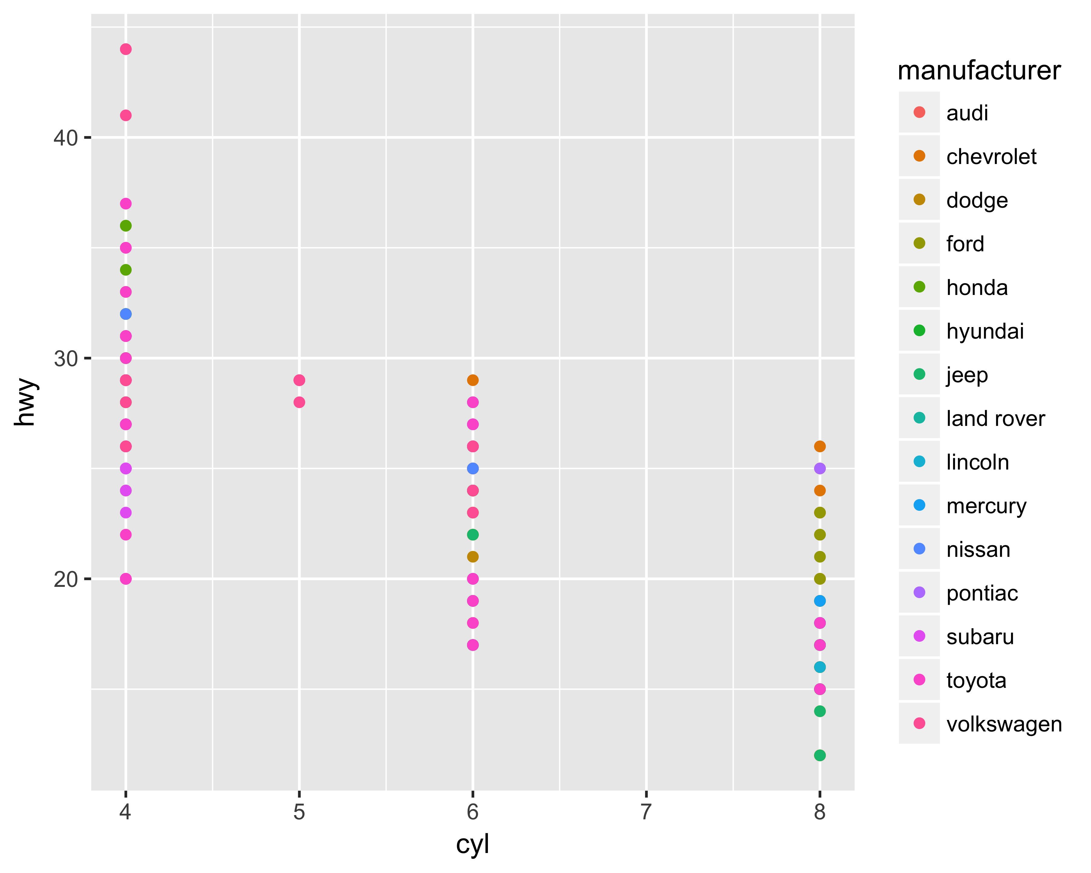
FIGURE 10.17: Aesthetics mapping using geom
10.6.3 Using Scales Functions
You can use the different scale functions to control how you want the axes and data points on the graphics to look. You can change the format of the axes to discrete, continuous, date, or other transformed axes. Similarly, you can change the look and feel of the graphed data points by changing the colors, sizes, or shapes. There are many options, which are best explored by going through the documentation. The following are some common scales:
scale_x_continuousorscale_y_continuous: This tellsggplotthat the variable plotted on the axis is a continuous variable. We can specify the position of the gridlines, axis tic kmark labels, range of possible values of the axis, and other controls.scale_color_*orscale_fill_*: This tellsggplothow and which color schemes to use for the plotted data points. You usescale_color_*for coloring unfillablegeomobjects such asgeom_lineandgeom_text. You usescale_fill_*for filling other fillablegeomobjects such asgeom_barandgeom_area.
Figure 10.18 shows how to limit the Y-axis range, whereas Figure 10.19 shows the Y-axis gridlines by breaking the axis at every 10 units.
ggplot(data = mpg, aes(x = cyl, y = hwy, color = manufacturer)) +
  geom_point() + scale_y_continuous(limits = c(0, 60))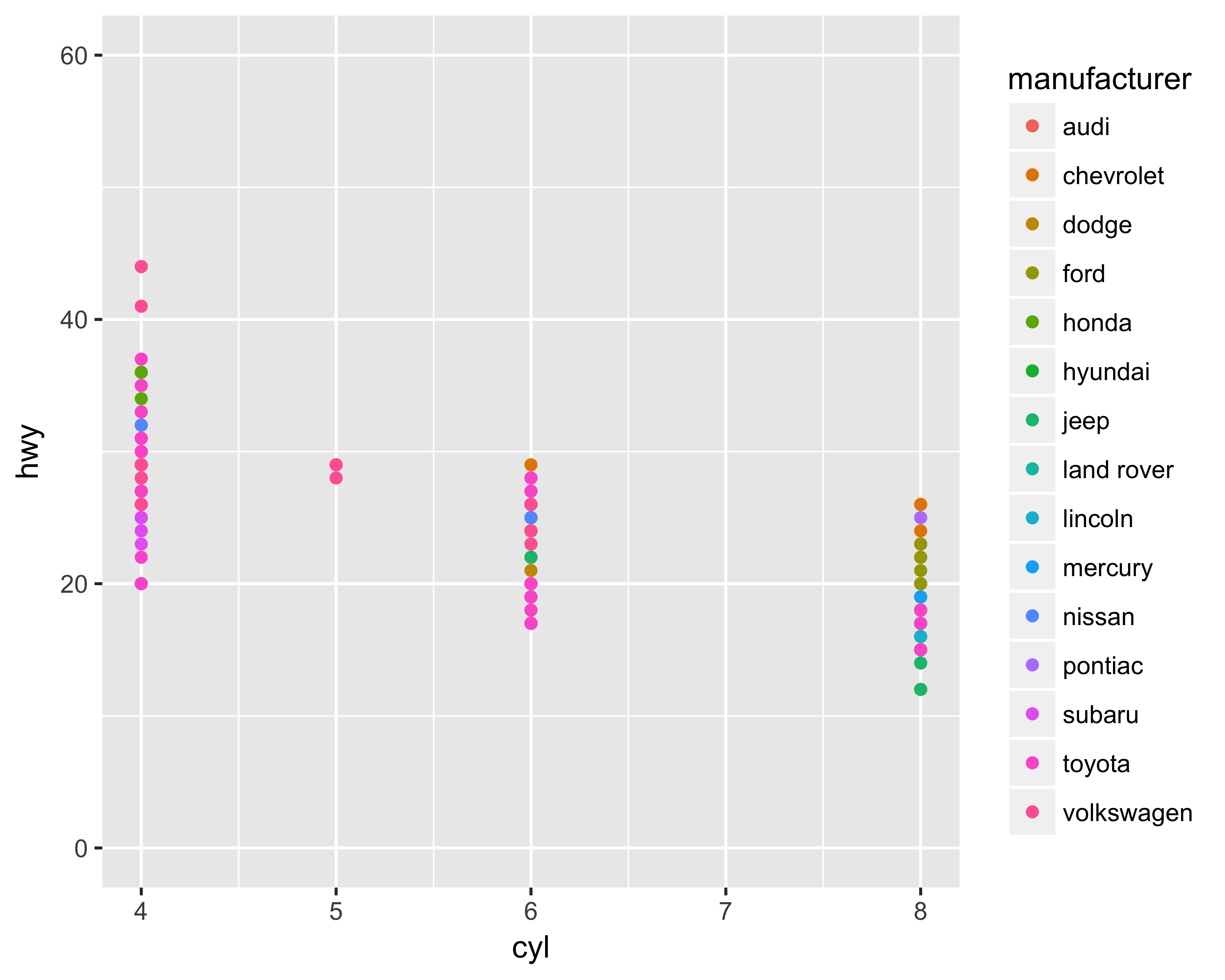
FIGURE 10.18: Y-axis limits changed
ggplot(data = mpg, aes(x = cyl, y = hwy, color = manufacturer)) +
  geom_point() +
  scale_y_continuous(limits = c(0, 60),
                     breaks = seq(from = 0, to = 60, by = 10))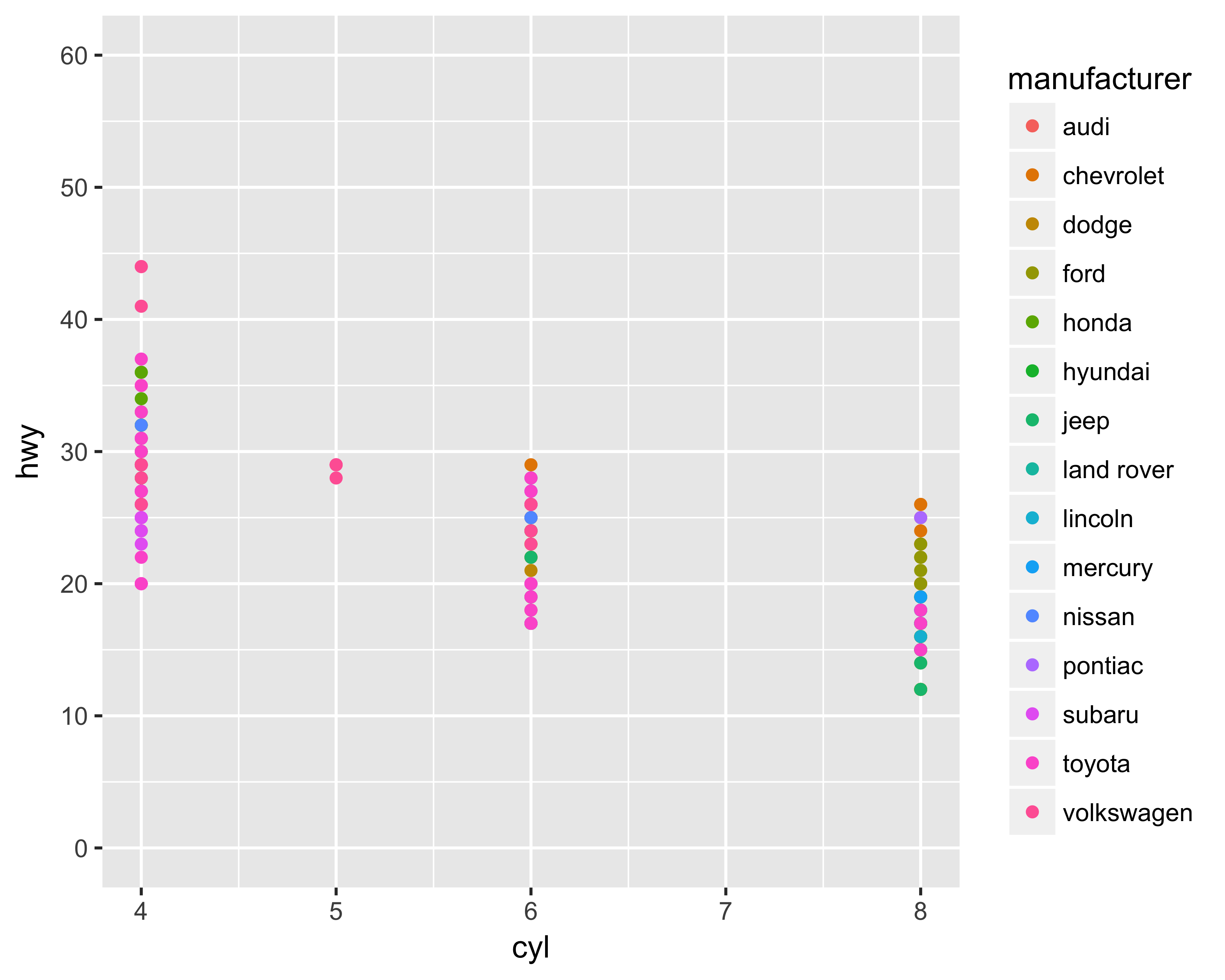
FIGURE 10.19: Y-axis gridlines changed
We can also transform the axis value by supplying a transform function. ggplot provides convenient function wrappers for the most common transformations, such as scale_*_log10 and scale_*_sqrt. Figure 10.20 shows the Y axis transformed using the square root of the Y values.
ggplot(data = mpg, aes(x = cyl,
                       y = hwy,
                       color = manufacturer)) +
  geom_point() +
  scale_y_sqrt(limits = c(0, 60),
               breaks = seq(from = 0, to = 60, by = 10))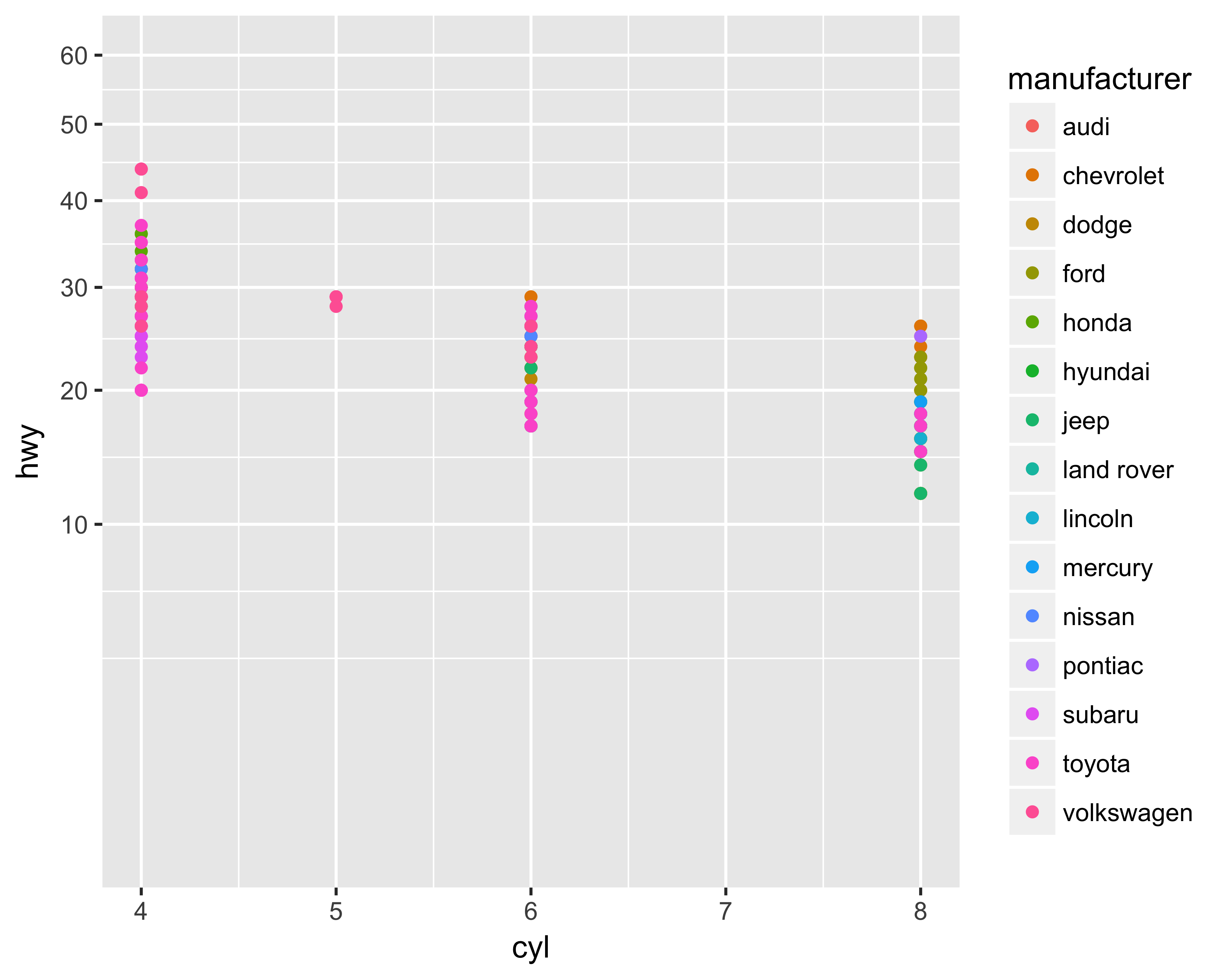
FIGURE 10.20: Y axis transformed with a square root
10.6.4 Use theme to Control the Look and Feel
The theme option provides the user with great flexibility to control various plot elements. You can change the axis text sizes, colors, angle, justification, and more. You can change the panel and plot fill, color, and size options. You can also change the appearance of the axis lines. You use the theme function like this:
theme(<element_to_control> = element_*(<specify_properties>))Depending on the plot element you’re trying to change, use the appropriate element_* function. These functions are: element_rect, element_line, element_text, and element_blank. The only common element function, regardless of what you’re trying to change, is element_blank(). This function removes the specified plot element. For example, Figure 10.21 shows the plot by removing the Y-axis label.
ggplot(data = mpg, aes(x = cyl, y = hwy, color = manufacturer)) +
  geom_point() +
  scale_y_continuous(limits = c(0, 60),
                     breaks = seq(from = 0, to = 60, by = 10)) +
  theme(axis.title.y = element_blank())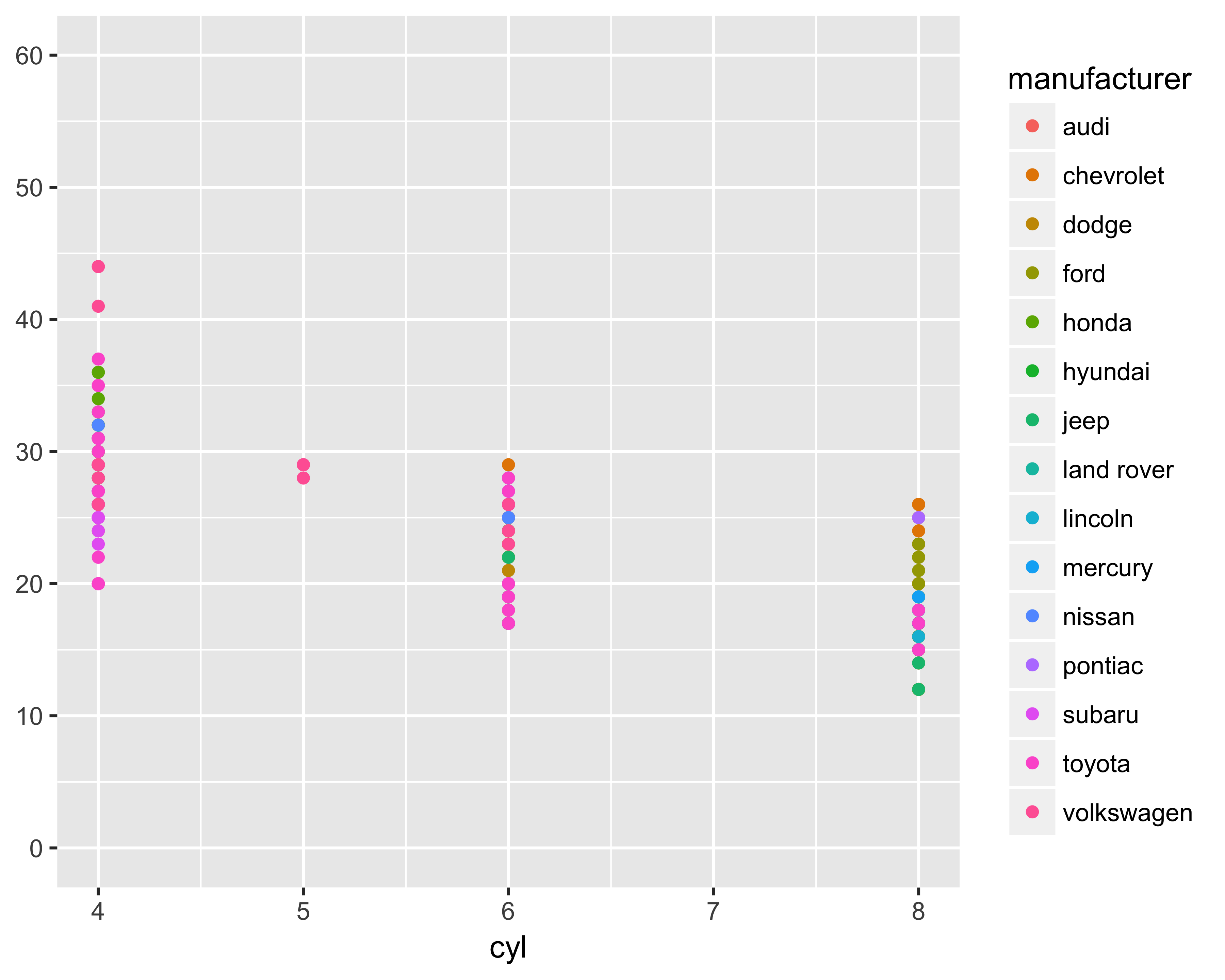
FIGURE 10.21: Y-axis label removed
Figure 10.22 shows the increased font sizes for both axis labels.
ggplot(data = mpg, aes(x = cyl, y = hwy, color = manufacturer)) +
  geom_point() +
  scale_y_continuous(limits = c(0, 60),
                     breaks = seq(from = 0, to = 60, by = 10)) +
  theme(axis.text = element_text(size = rel(1.2), face = "bold"))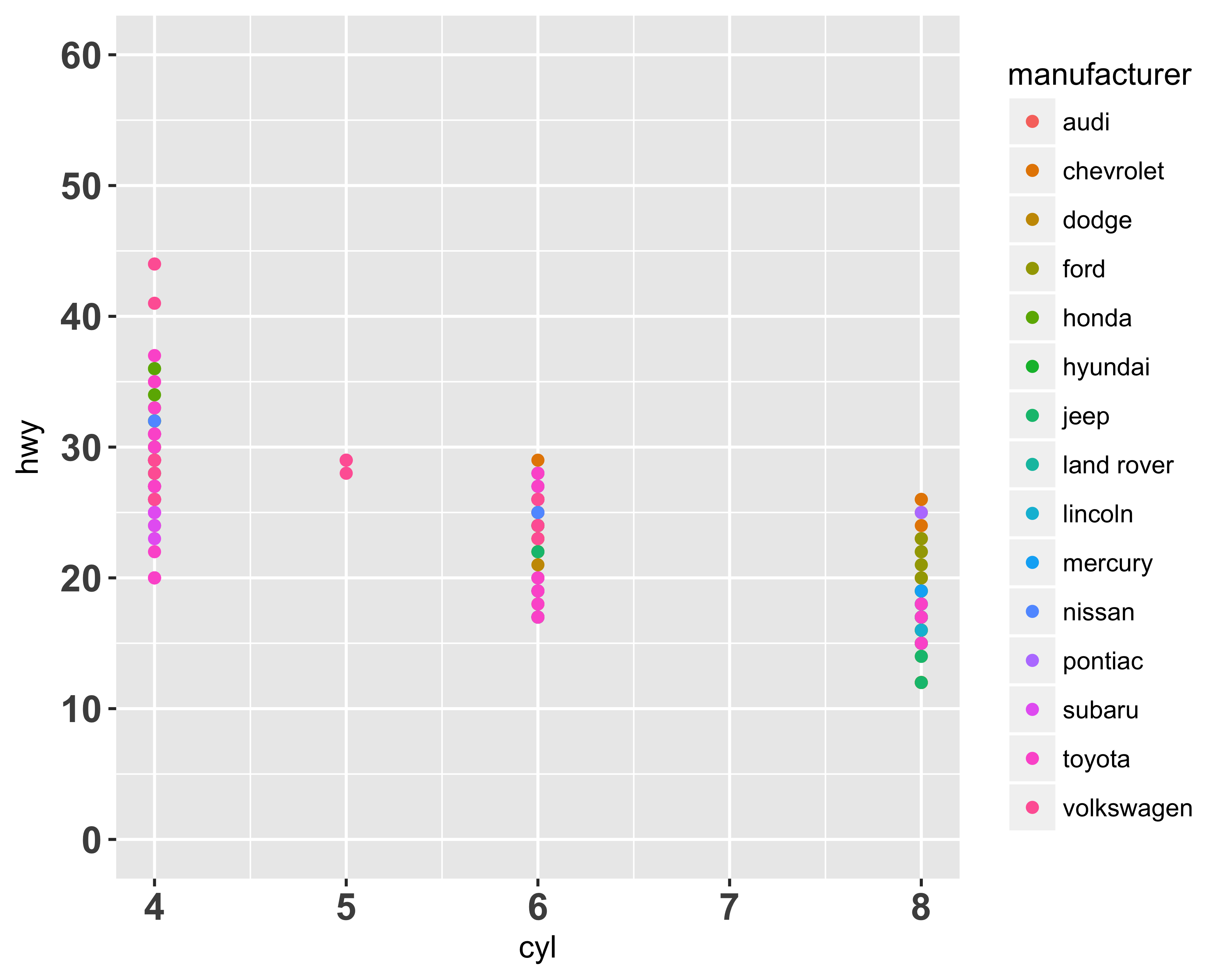
FIGURE 10.22: Axis labels modified
Check out the complete list of arguments for the theme function on the ggplot site or by running ?theme in your console after loading the ggplot2 library.
These arguments and options will become clearer when you see real examples of modifications.
10.7 Creating Bar Charts
Creating bar charts is straightforward using ggplot. Let’s say, using our sample donor data, we want to plot how many prospects we have at each of the wealth ratings. Figure 10.23 shows this count.
require(readr)
require(ggplot2)

donor_data <- read_csv('data/DonorSampleData.csv')
ggplot(data = donor_data, aes(x = WEALTH_RATING)) + geom_bar()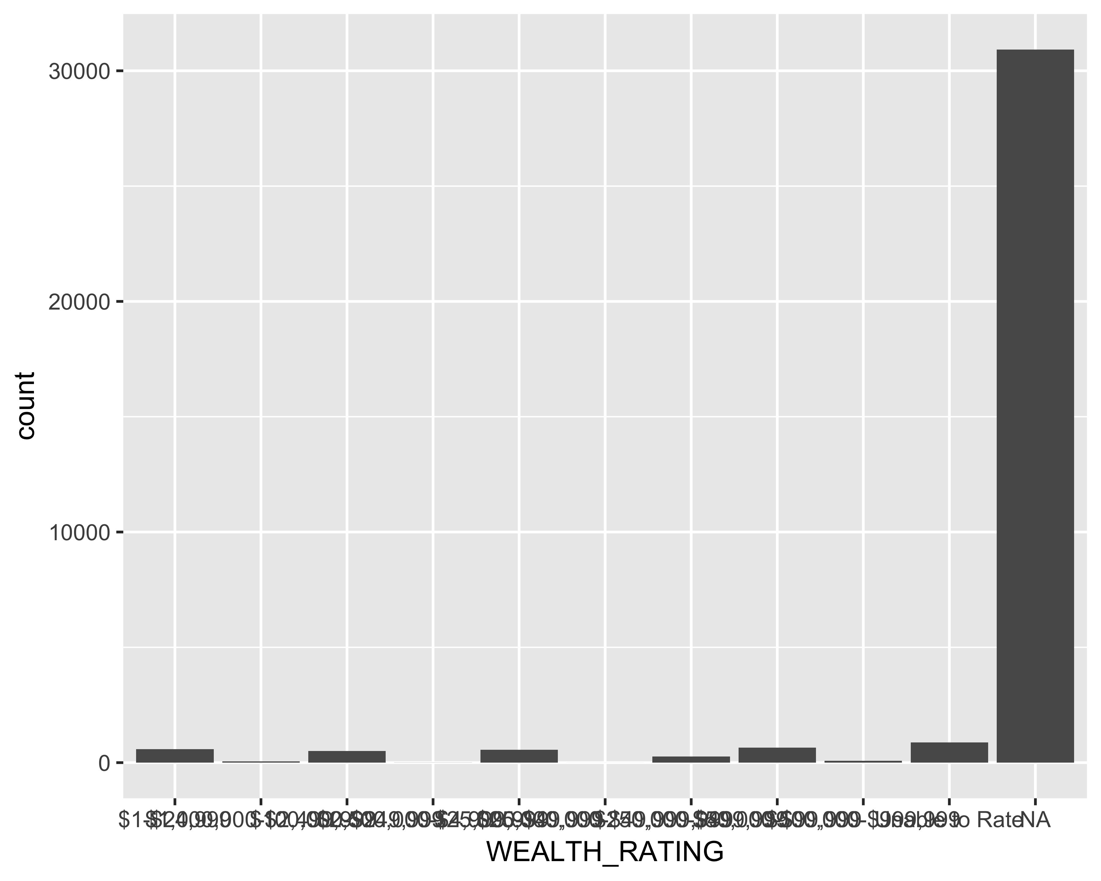
FIGURE 10.23: Bar graph of number of prospects by wealth ratings
Pretty easy, right? Not very pretty though. Let’s change a few things:
Flip the bar: Since the X-axis labels are hard to read, let’s flip the axes and make the bars horizontal.
ggplot(data = donor_data, aes(x = WEALTH_RATING)) +
  geom_bar() + coord_flip()
FIGURE 10.24: Horizontal bar graph of number of prospects by wealth ratings
Change the axis tick label format: Let’s add commas to the axis tick labels. For this you would need the scales library installed.
require(scales)
ggplot(data = donor_data, aes(x = WEALTH_RATING)) +
  geom_bar() + coord_flip() +
  scale_y_continuous(labels = comma)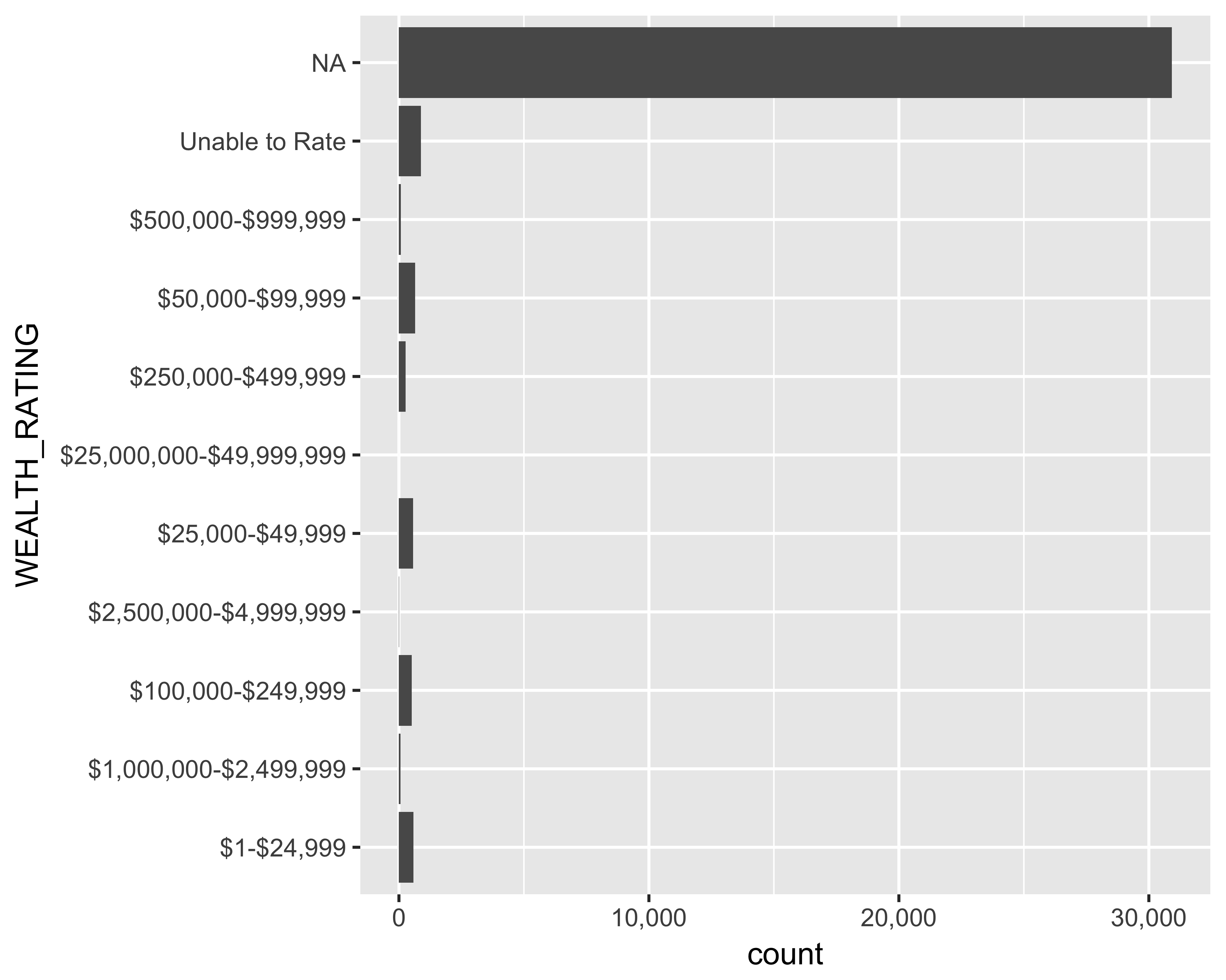
FIGURE 10.25: Horizontal bar graph of number of prospects by wealth ratings with commas
Although the axes are flipped, ggplot still remembers the original Y axis. If you were to use scale_x_continuous instead, you would get this error: Error: Discrete value supplied to continuous scale.
Reorder the wealth ratings: We would like to see the wealth ratings in decreasing order. For discrete variables, ggplot requires the underlying data to be in the same order as you would like to it be plotted. Let’s adjust the WEALTH_RATING column by assigning ordered levels, as seen in Figure 10.26
donor_data$WEALTH_RATING <- with(
  donor_data,
  factor(x = WEALTH_RATING,
         levels = c('Unable to Rate',
                    '$1-$24,999',
                    '$25,000-$49,999',
                    '$50,000-$99,999',
                    '$100,000-$249,999',
                    '$250,000-$499,999',
                    '$500,000-$999,999',
                    '$1,000,000-$2,499,999',
                    '$2,500,000-$4,999,999',
                    '$25,000,000-$49,999,999'),
         ordered = TRUE))
ggplot(data = donor_data, aes(x = WEALTH_RATING)) +
  geom_bar() + coord_flip() +
  scale_y_continuous(labels = comma)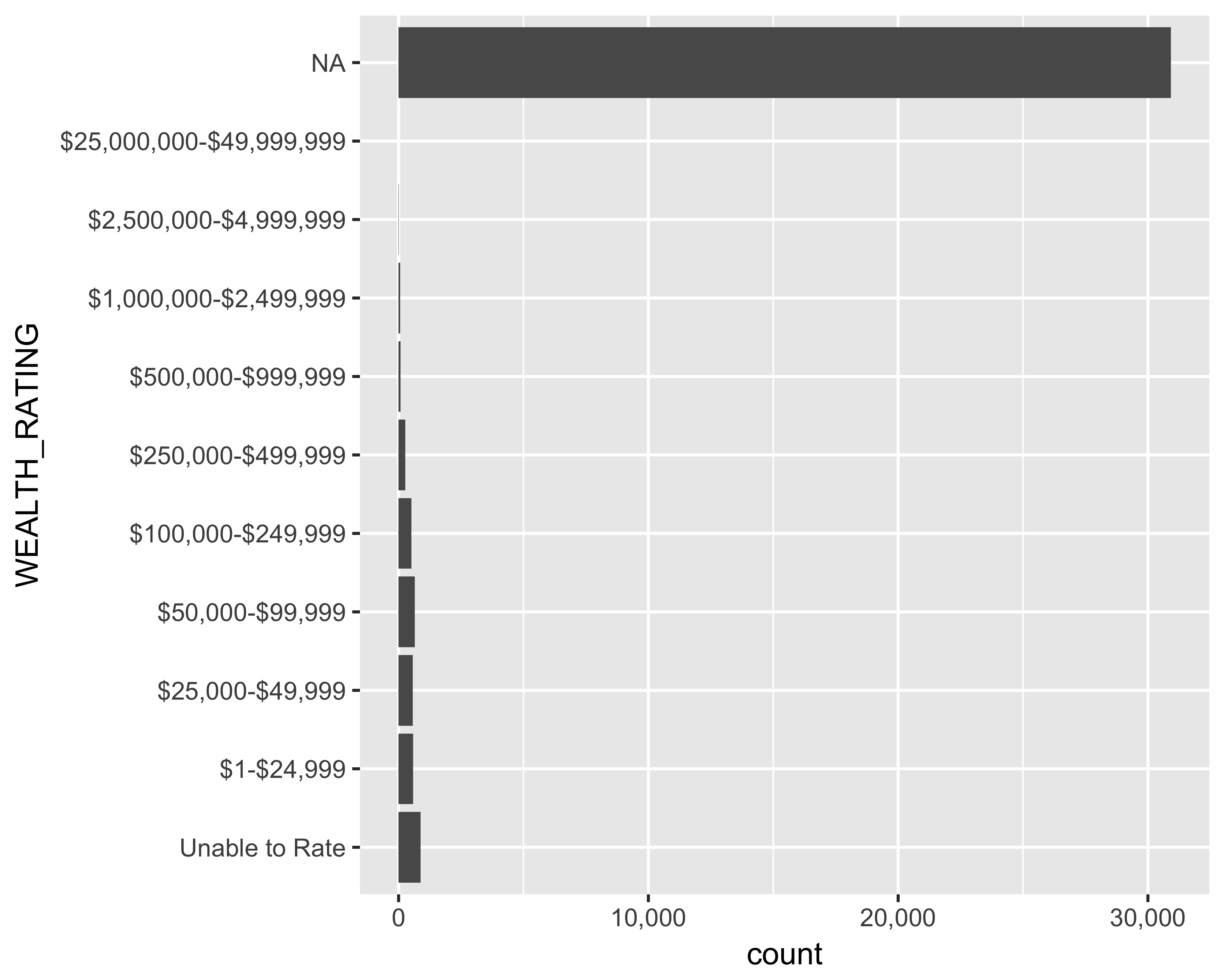
FIGURE 10.26: Horizontal bar graph of number of prospects by ordered wealth ratings
Remove unknown (NA) values: Since the unknown values are the most common, it is hard to see the other wealth ratings. Let’s remove the unknown (NA) values from this plot. Figure 10.27 shows the bar graph with the unknown values removed from the chart.
ggplot(data = subset(donor_data, !is.na(WEALTH_RATING)),
       aes(x = WEALTH_RATING)) +
  geom_bar() + coord_flip() +
  scale_y_continuous(labels = comma)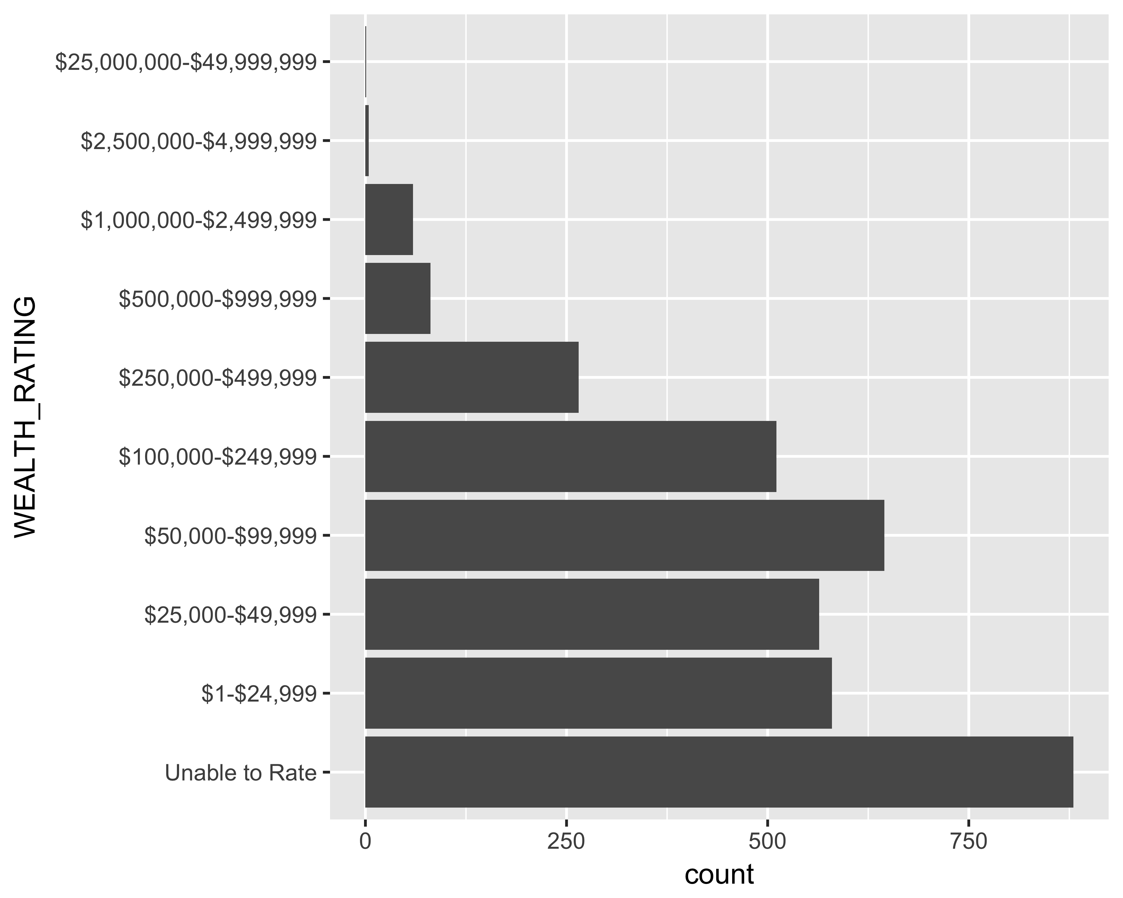
FIGURE 10.27: Horizontal bar graph of number of prospects with unknown values removed
Make the plot cleaner: I like to keep the non-data plot elements to a minimum. I either remove those elements or change the color to a light gray. Since we will be using this configuration for other plots too, let’s define our own theme called theme_bare.
theme_bare <- theme(panel.background = element_blank(),
                    panel.border = element_blank(),
                    axis.title = element_blank(),
                    axis.ticks = element_blank(),
                    panel.grid = element_blank())
Let’s look at these items one by one.
panel.background: This controls the background behind the panel and not the plotpanel.border: This defines the lines bordering the panelaxis.title: This defines the text properties of the title for both the axesaxis.ticks: This defines the line properties of the tick marks along the axespanel.grid: This defines the line properties of the gridlines of the plot
ggplot(data = subset(donor_data, !is.na(WEALTH_RATING)),
       aes(x = WEALTH_RATING)) +
  geom_bar() + coord_flip() +
  scale_y_continuous(labels = comma) + theme_bare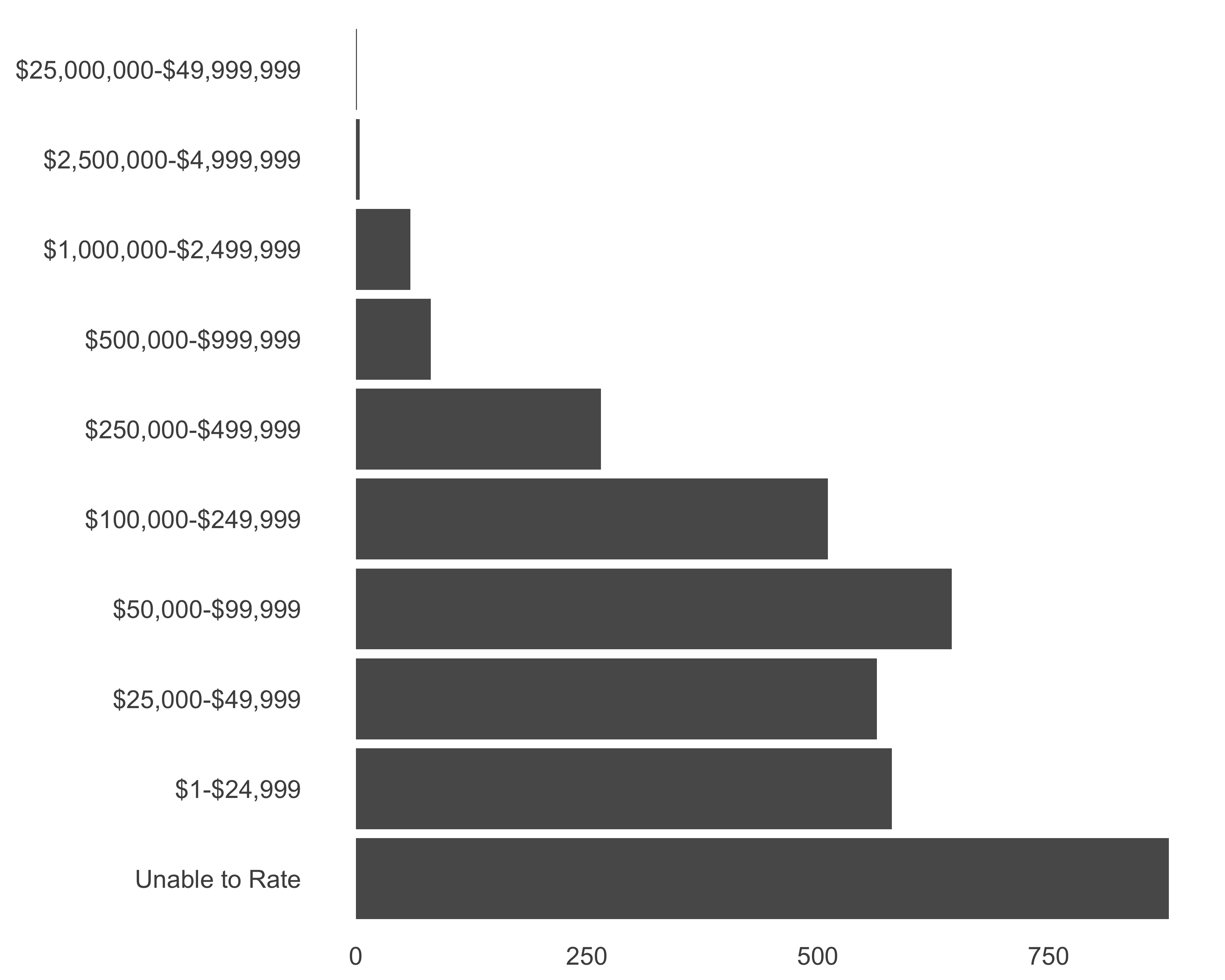
FIGURE 10.28: Horizontal bar graph of number of prospects. Cleaning up
Once I get to a clean, minimal design (Figure 10.28), I start tinkering with the plot to make it more helpful for the reader. You’ll also see that the code becomes longer. You can reduce code repetition by assigning the code to a variable. Since all the additions will still return a ggplot object, we can add more options to the same object. Let’s save the plotting commands to a variable called g.
g <- ggplot(data = subset(donor_data, !is.na(WEALTH_RATING)),
            aes(x = WEALTH_RATING)) +
  geom_bar() + coord_flip() +
  scale_y_continuous(labels = comma) + theme_bare
Add plot titles and caption: It is always a good idea to let a chart speak for itself. Let’s add a title, subtitle, and caption to the chart, as seen in Figure 10.29.
g <- g + labs(title = "Number of Prospects by Wealth Rating",
              subtitle = "Using the highest available ratings",
              caption = paste0("Data as of ", Sys.Date()))

g <- g + theme(plot.title = element_text(hjust = 1),
          plot.subtitle = element_text(hjust = 1),
          plot.caption = element_text(colour = "grey60"))
print(g)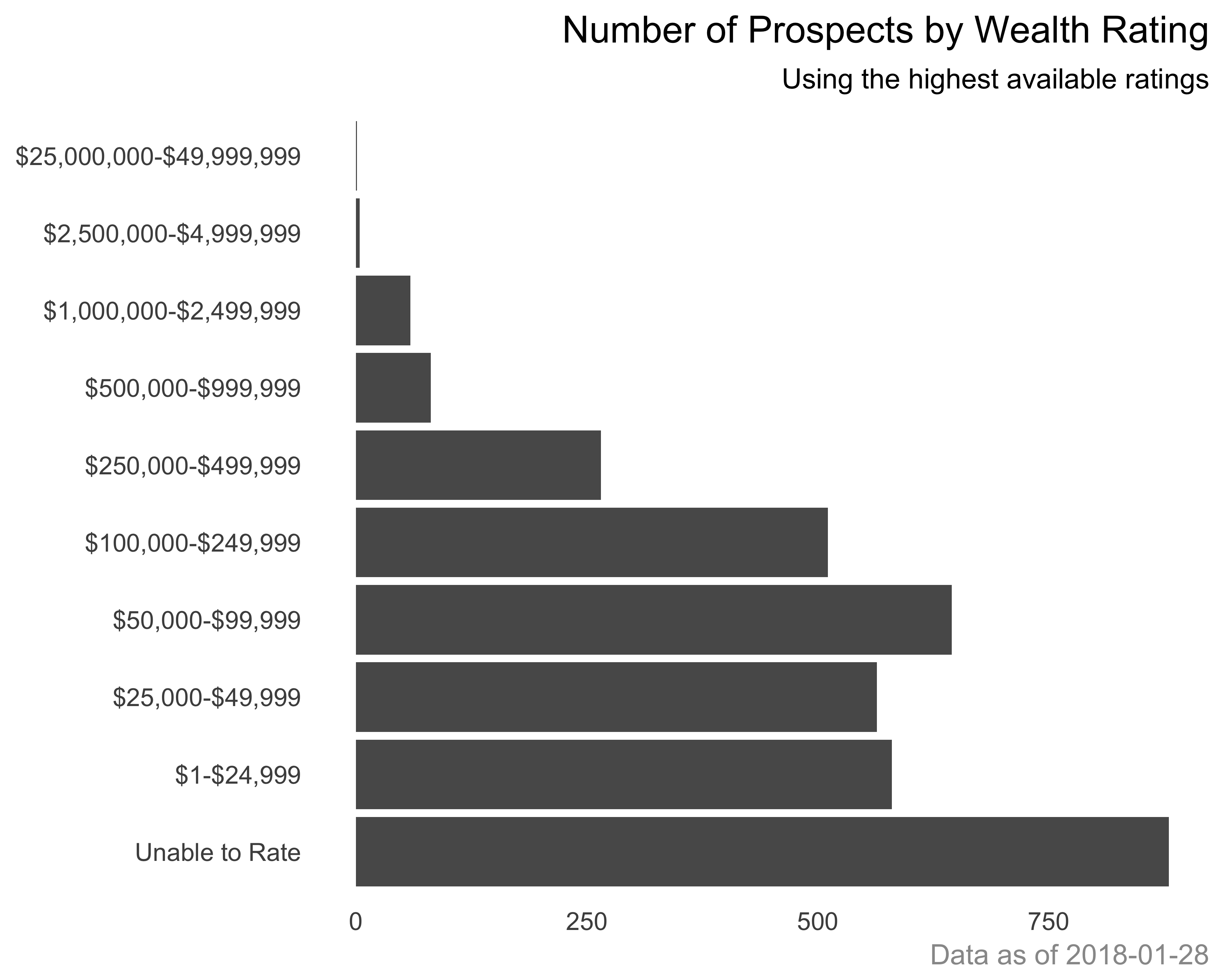
FIGURE 10.29: Horizontal bar graph of number of prospects with added titles
Add light gridlines: Since we removed all the gridlines, we can add light-colored gridlines over the graph, as recommended by Few (2006). We will use geom_hline for this approach, as shown in Figure 10.30.
g <- g + geom_hline(yintercept = c(250, 500, 750),
                    color = "grey96",
                    size = rel(0.2))
print(g)
FIGURE 10.30: Horizontal bar graph of number of prospects with vertical gridlines
Make the axis labels bigger: We can use the theme function and supply values to the axis.text argument to change the formatting of the axis labels, as seen in Figure 10.31.
g + theme(axis.text = element_text(size = rel(0.9),
                                   face = "bold"))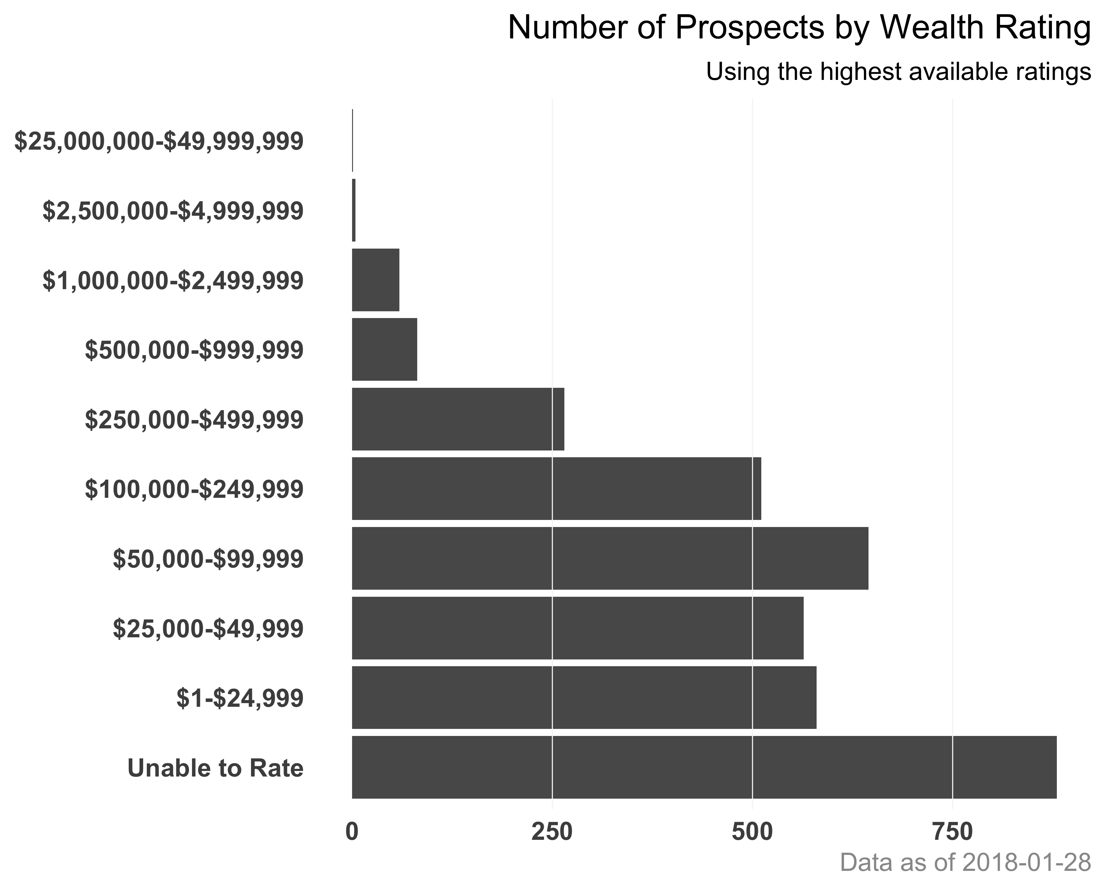
FIGURE 10.31: Horizontal bar graph of number of prospects with axis labels reformatted
To save all your changes, ggplot provides a convenient wrapper function called ggsave. You can save a plot in various formats, including the popular ones: PNG, JPEG, and PDF. Run ?ggsave in your console to see more details about the function.
10.8 Creating Dot Charts
Dot charts are similar to bar charts, but show information with a point or dot rather than a bar. You saw an example of this chart earlier in Figure 10.6. Cleveland and Cleveland (1985) advocated this chart as a superior alternative to circles/shapes or stacked bar graphs. The dotchart function in base R has an advantage over ggplot as it lets you group and color variables to create a nice compact chart. In ggplot, it becomes a little busy. Let’s see this with an example. Let’s recreate the wealth rating prospect count graph from Figure 10.31 using ggplot first. Figure 10.32 shows the dot plot created using ggplot.
require(dplyr)
wealth_rating_cnt <- filter(donor_data, !is.na(WEALTH_RATING)) %>%
  count(WEALTH_RATING)
g <- ggplot(data = wealth_rating_cnt,
            aes(x = WEALTH_RATING, y = n)) +
  geom_point() + coord_flip() +
  scale_y_continuous(labels = comma)
g <- g + theme_bare +
  theme(panel.grid.major.y = element_line(linetype = 2,
                                          size = 0.2))
g <- g + labs(title = "Number of Prospects by Wealth Rating",
              subtitle = "Using the Highest Available Ratings",
              caption = paste0("Data as of ", Sys.Date()))
g + theme(plot.title = element_text(hjust = 1),
          plot.subtitle = element_text(hjust = 1),
          plot.caption = element_text(colour = "grey60"))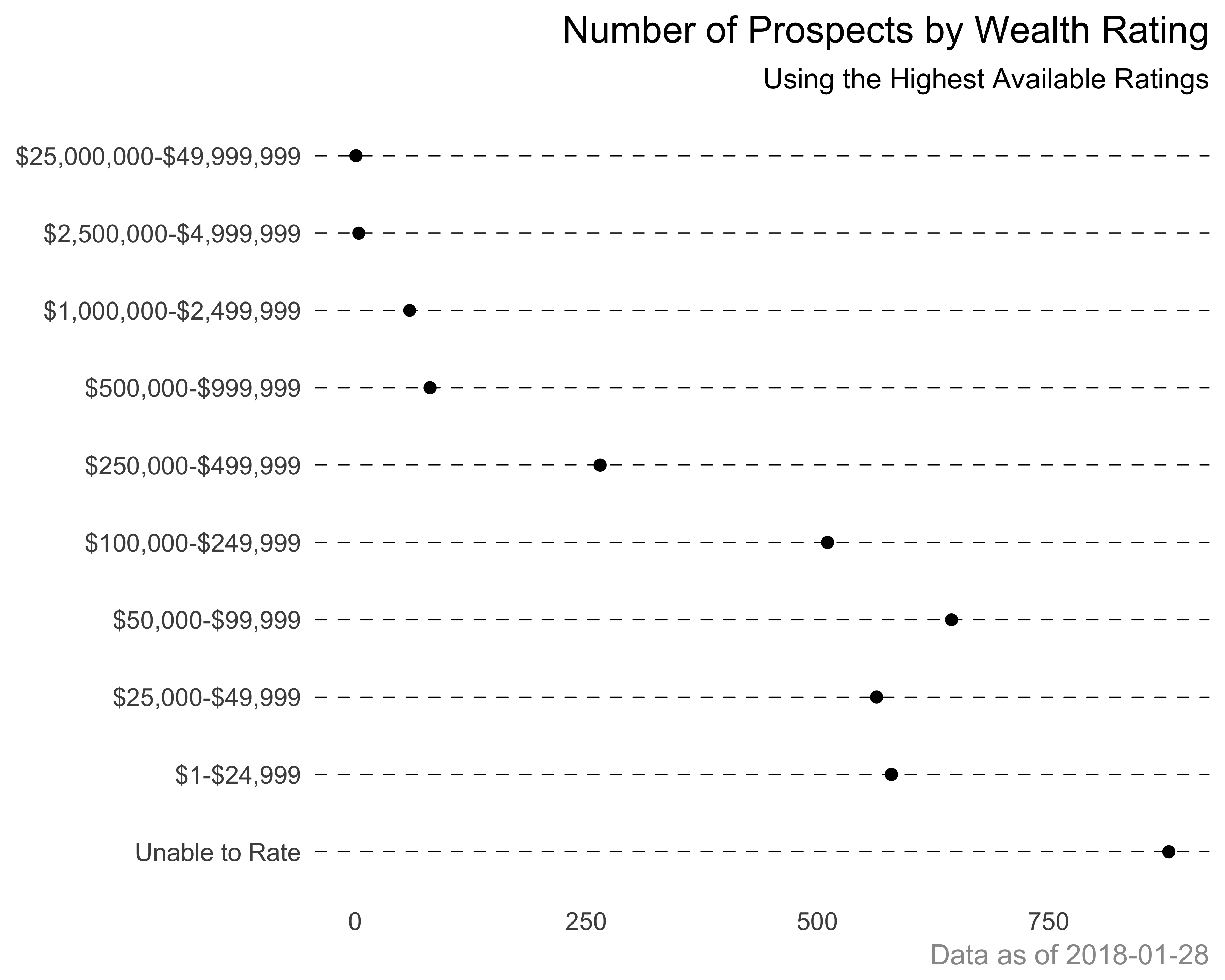
FIGURE 10.32: Wealth rating count. A dot chart example using ggplot
Let’s create the same plot using the built-in dotchart function, as shown in Figure 10.33.
dotchart(x = wealth_rating_cnt$n,
         labels = wealth_rating_cnt$WEALTH_RATING,
         main = "Number of Prospects by Wealth Rating" )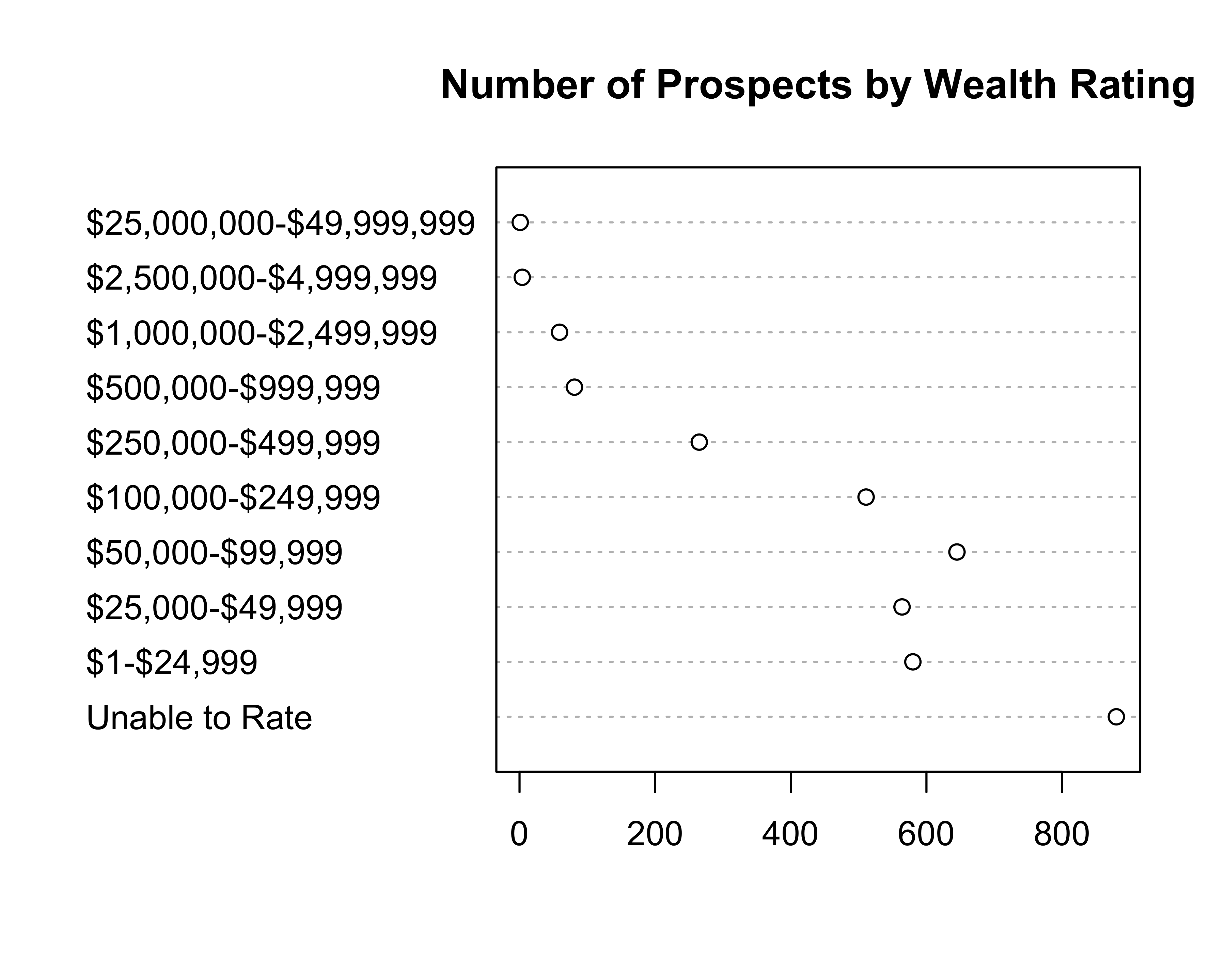
FIGURE 10.33: Wealth rating count. A dot chart example using dotchart
Now, let’s say that we want to see the wealth ratings by the giving status (donor/non-donor). Figure 10.34 shows the dot chart of wealth ratings for donor and non-donor population.
#calculate the summary.
#using base R instead of dplyr to get the 0 values
wealth_rating_cnt <- as.data.frame(xtabs(~WEALTH_RATING +
                                           DONOR_IND,
                                         donor_data))
g <- ggplot(data = wealth_rating_cnt,
            aes(x = WEALTH_RATING, y = Freq)) +
  geom_point() + coord_flip() +
  scale_y_continuous(labels = comma) + facet_wrap(~DONOR_IND)
g <- g + theme_bare +
  theme(panel.grid.major.y = element_line(linetype = 2, size = 0.2))
g <- g + labs(
  title = "Number of Prospects by Wealth Rating and Giving Status",
  subtitle = "Using the Highest Available Ratings",
  caption = paste0("Data as of ", Sys.Date()))
g + theme(plot.title = element_text(hjust = 1),
          plot.subtitle = element_text(hjust = 1),
          plot.caption = element_text(colour = "grey60"))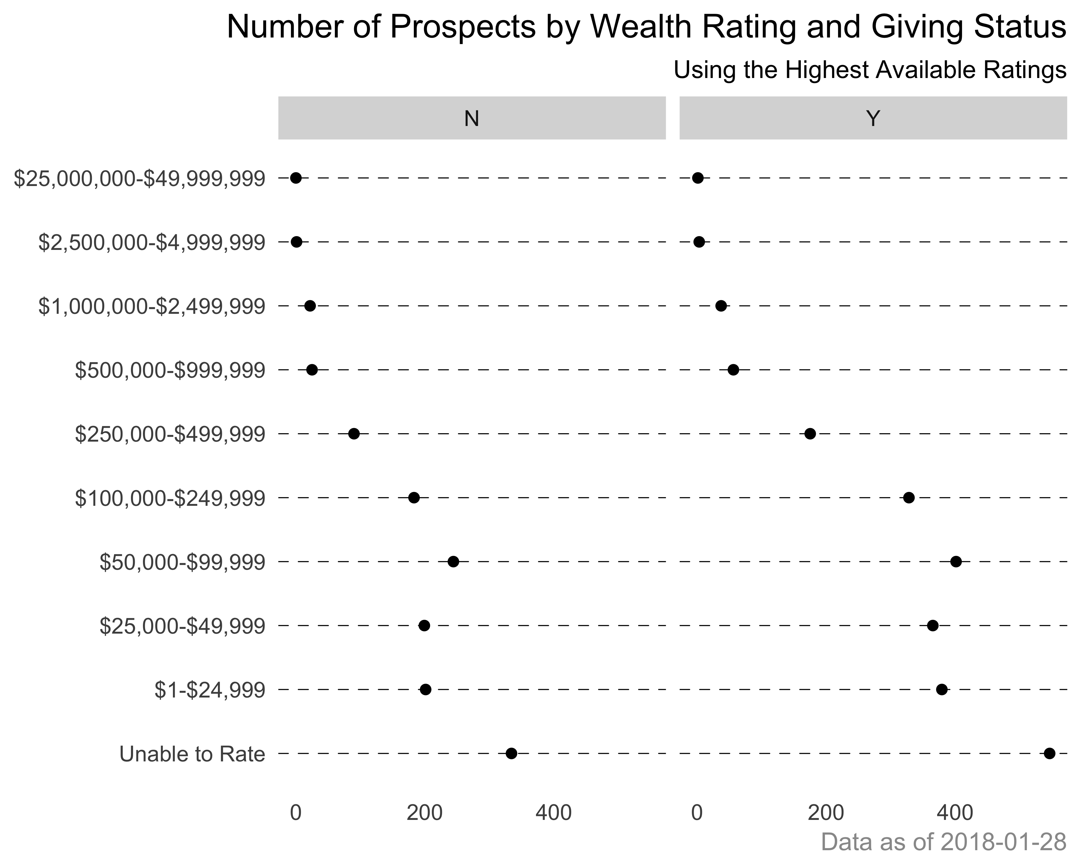
FIGURE 10.34: Wealth rating count. A dot chart example using ggplot
Now let’s see the simplicity and elegance of the built-in dotchart function, seen in Figure 10.35.
donor_colors <- c("Y" = "#FF993F", "N" = "#5870C0")
dotchart(
  x = wealth_rating_cnt$Freq,
  groups = as.factor(wealth_rating_cnt$DONOR_IND),
  labels = wealth_rating_cnt$WEALTH_RATING,
  main = "Number of Prospects by Wealth Rating\nand Giving Status",
  gcolor = donor_colors,
  color = donor_colors[as.factor(wealth_rating_cnt$DONOR_IND)])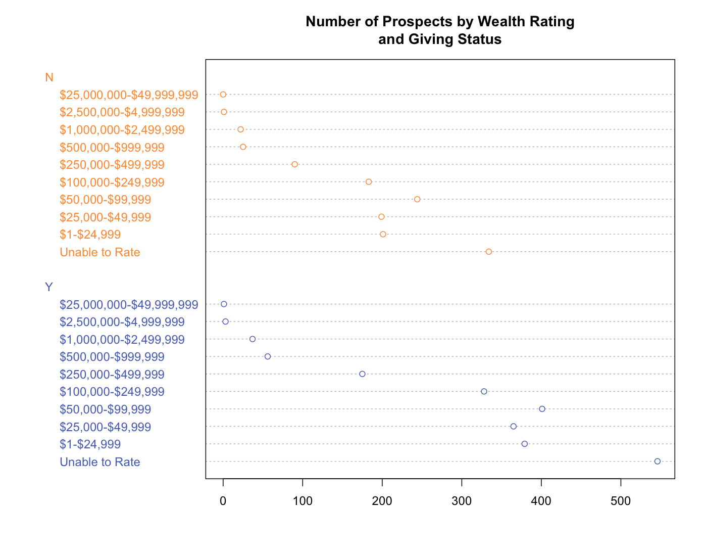
FIGURE 10.35: Wealth rating count. A dot chart example using the dotchart function
10.9 Creating Line Charts
Line charts are best suited for time-series type of data, in which we expect to see trends and changes over time. Let’s say we want to compare the stock performance of Amazon, Google, and Microsoft stocks as shown in Figure 10.36.
require(quantmod)
require(dplyr)

amzn_data <- getSymbols(Symbols = "AMZN",
                        auto.assign = FALSE,
                        from = '2008-05-01',
                        to = Sys.Date())
googl_data <- getSymbols(Symbols = "GOOG",
                         auto.assign = FALSE,
                         from = '2008-05-01',
                         to = Sys.Date())
msft_data <- getSymbols(Symbols = "MSFT",
                        auto.assign = FALSE,
                        from = '2008-05-01',
                        to = Sys.Date())

combined_close <- data.frame(date = index(amzn_data),
                             amzn_data,
                             row.names = NULL) %>%
  select(date, close = AMZN.Close) %>%
  mutate(ticker = 'AMZN') %>%
  bind_rows(.,
            data.frame(date = index(googl_data),
                       googl_data,
                       row.names = NULL) %>%
              select(date, close = GOOG.Close) %>%
              mutate(ticker = 'GOOG')) %>%
    bind_rows(.,
              data.frame(date = index(msft_data),
                         msft_data,
                         row.names = NULL) %>%
              select(date, close = MSFT.Close) %>%
                mutate(ticker = 'MSFT'))

g <- ggplot(data = combined_close,
            aes(x = date, y = close, color = ticker)) +
  geom_line()
g <- g + theme_bare + coord_fixed(ratio = 2) +
  theme(axis.text = element_text(face = "bold", size = rel(1)))
g <- g + labs(title = "Stock Values at Closing",
              caption = "Source: Yahoo Finance")
print(g)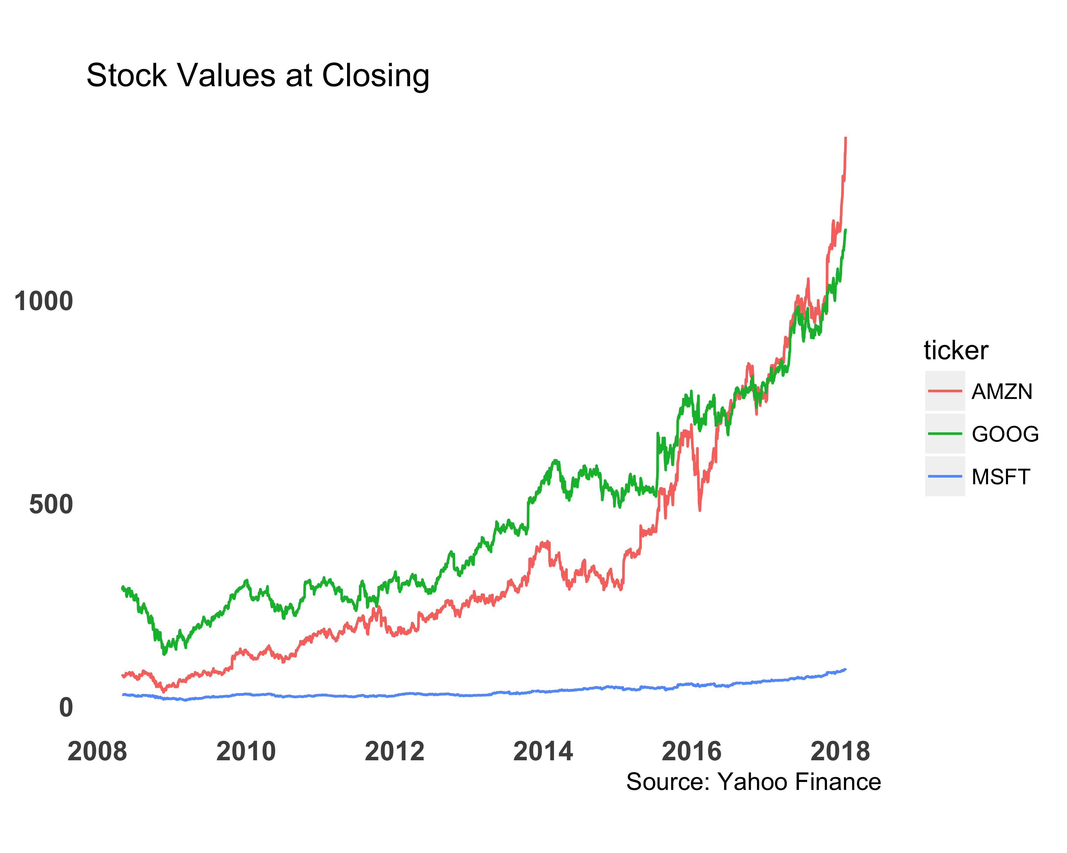
FIGURE 10.36: Comparing stock values with a line chart
We can make this line chart better by removing the legend and placing it directly next to the line. We can use the annotate function to add the labels. Figure 10.37 shows this modification. I picked branded colors using the https://brandcolors.net/ site.
stock_colors <- c("MSFT" = "#00188F",
                  "AMZN" = "#ff9900",
                  "GOOG" = "#34a853")
g <- ggplot(data = combined_close,
            aes(x = date, y = close, color = ticker)) +
  geom_line() + scale_color_manual(values = stock_colors)
g <- g + theme_bare + coord_fixed(ratio = 2) +
  theme(axis.text = element_text(face = "bold", size = rel(1)),
        legend.position = "none")
g <- g + labs(title = "Stock Values at Closing",
              caption = "Source: Yahoo Finance")
g + annotate("text",
             x = as.Date('01/01/2014', "%m/%d/%Y"),
             y = c(80, 420, 650),
             label = c("MSFT",  "AMZN", "GOOG"),
             color = stock_colors)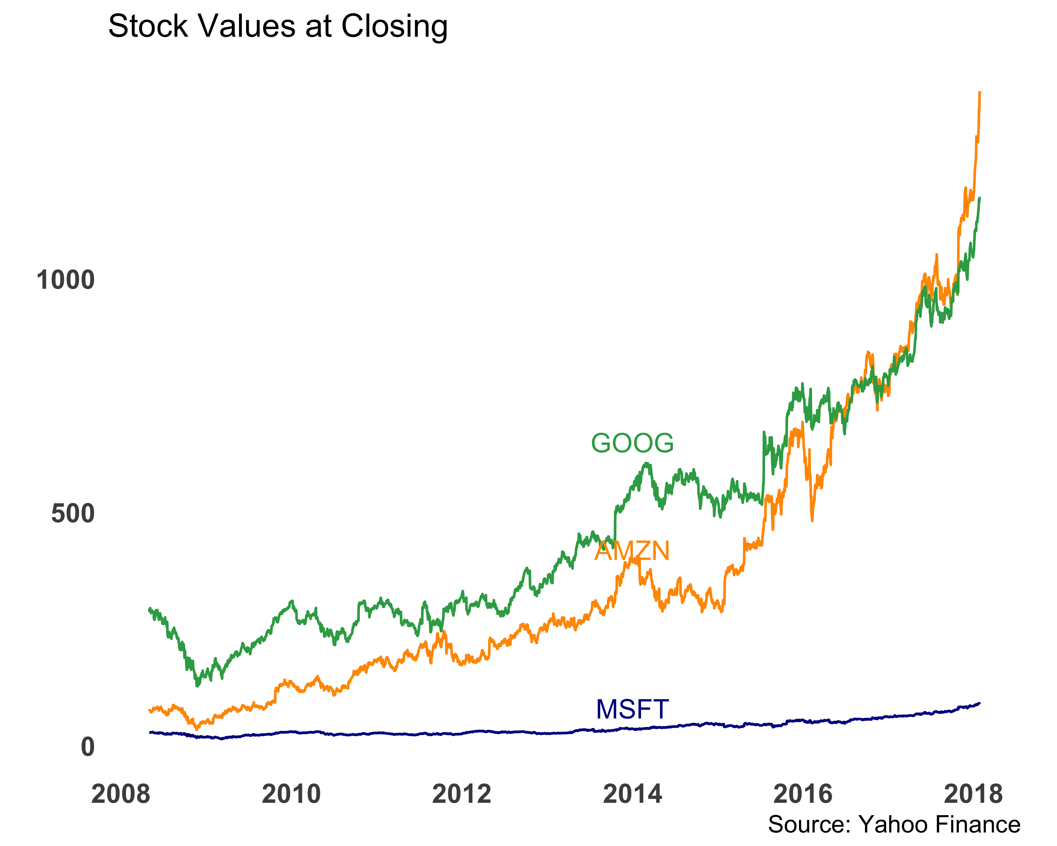
FIGURE 10.37: Comparing stock values with a line chart. Legends on the line.
You may have noticed two new elements, scale_color_manual and annotate, in the code.
How do they work?
scale_color_manual: When a color variable is assigned,ggplotselects its internal color palette, which is not the most visually appealing. We can override those colors using thescale_color_*function, which automatically creates another color palette or manually providing one. In this code, we’ve provided the color palette manually by creating a named vector.ggplotthen knows to match the variable value with the name in the vector.annotate: You can provide differentgeomvalues to this function, but we usedtext. We need to provide thexandyvalues to position the text labels. We also provided the colors for the text labels.
10.10 Creating Scatter/Text Plots
Scatter plots are typically used with two continuous variables. Let’s create a graph with age on the X axis and total giving on the Y axis, as shown in Figure 10.38.
library(dplyr)
library(stringr)
donor_data <- mutate(donor_data,
                     TotalGiving = as.double(
                       str_replace_all(TotalGiving, '[$,]', '')))

g <- ggplot(data = donor_data,
            aes(x = AGE, y = TotalGiving)) +
  geom_point()
g <- g + theme(axis.text = element_text(size = rel(1.2)),
               axis.title = element_text(size = rel(1.2),
                                         face = "bold"),
               axis.title.y = element_text(angle = 0,
                                           vjust = 0.5),
               panel.background = element_blank(),
               axis.ticks = element_blank())
g <- g + labs(x = "Age", y = "Total\nGiving")
print(g)
#> Warning: Removed 21190 rows containing missing values
#> (geom_point).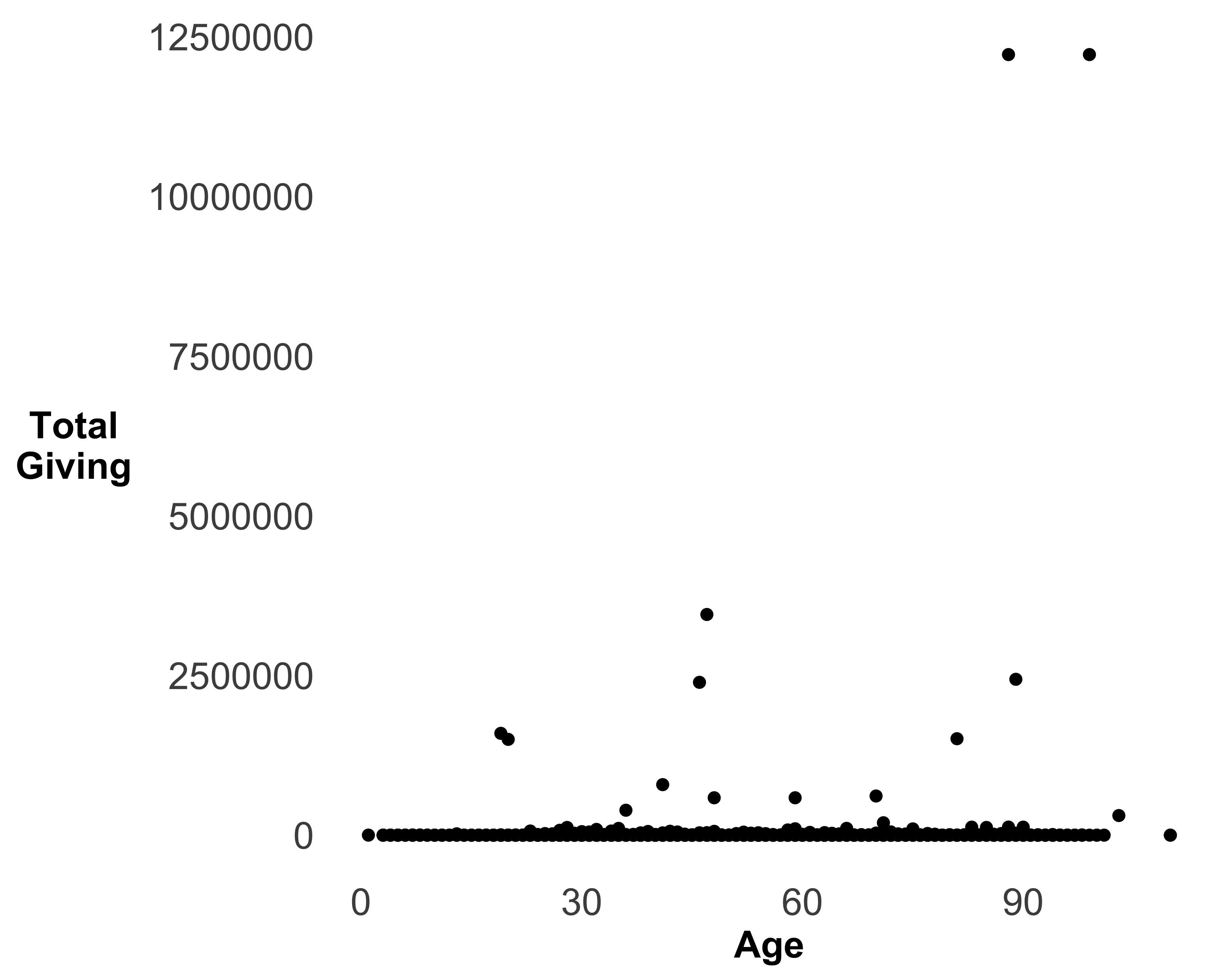
FIGURE 10.38: A scatter plot of age and total giving
We can make the graph in Figure 10.38 a little better by formatting the Y axis to currency, changing its scale to see more data, and adding transparency to the data points.
Format Y axis to currency: Since the data on the Y axis shows the dollar amounts, it makes sense to change the axis labels to currency format. We need to use the scales library to do so. See Figure 10.39 for the changed format.
require(scales)
g <- g + scale_y_continuous(labels = dollar)
print(g)
#> Warning: Removed 21190 rows containing missing values
#> (geom_point).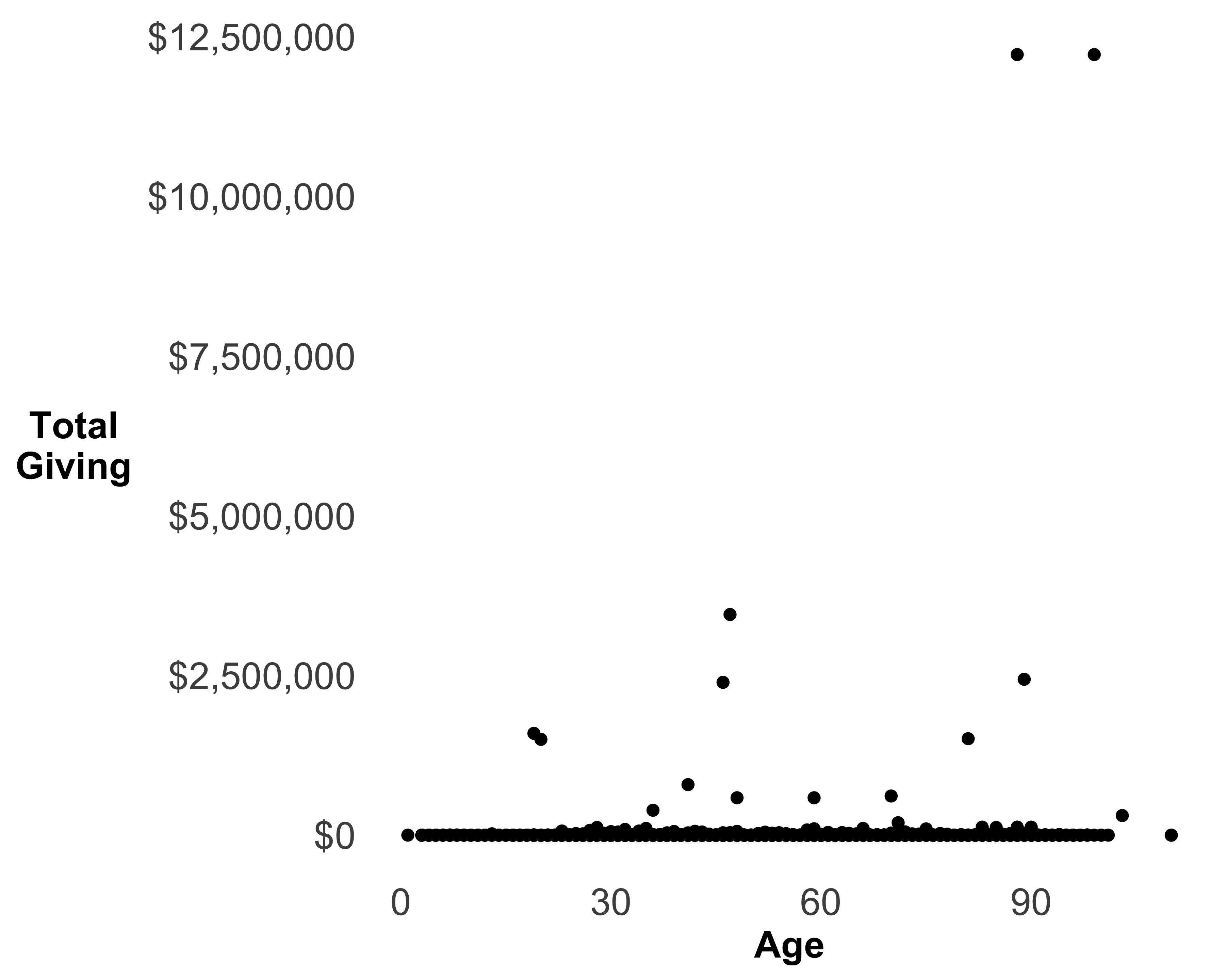
FIGURE 10.39: A scatter plot of age and total giving with currency format
Transform Y axis: Since most of the entities in this sample data file have given zero dollars, all the data points are crowded at the bottom of the X axis. We can’t see any pattern between age and total giving. Let’s try to two different transformations: square root and log. Figures 10.40 show both of these transformations.
g5 <- g + scale_y_sqrt(labels = dollar) + ggtitle(label = 'Square root transformation')
g6 <- g + scale_y_log10(labels = dollar) + ggtitle(label = 'Log Transformation')
grid.arrange(g5, g6, nrow = 2)
#> Warning: Removed 21190 rows containing missing values
#> (geom_point).
#> Warning: Transformation introduced infinite values
#> in continuous y-axis
#> Warning: Removed 21190 rows containing missing values
#> (geom_point).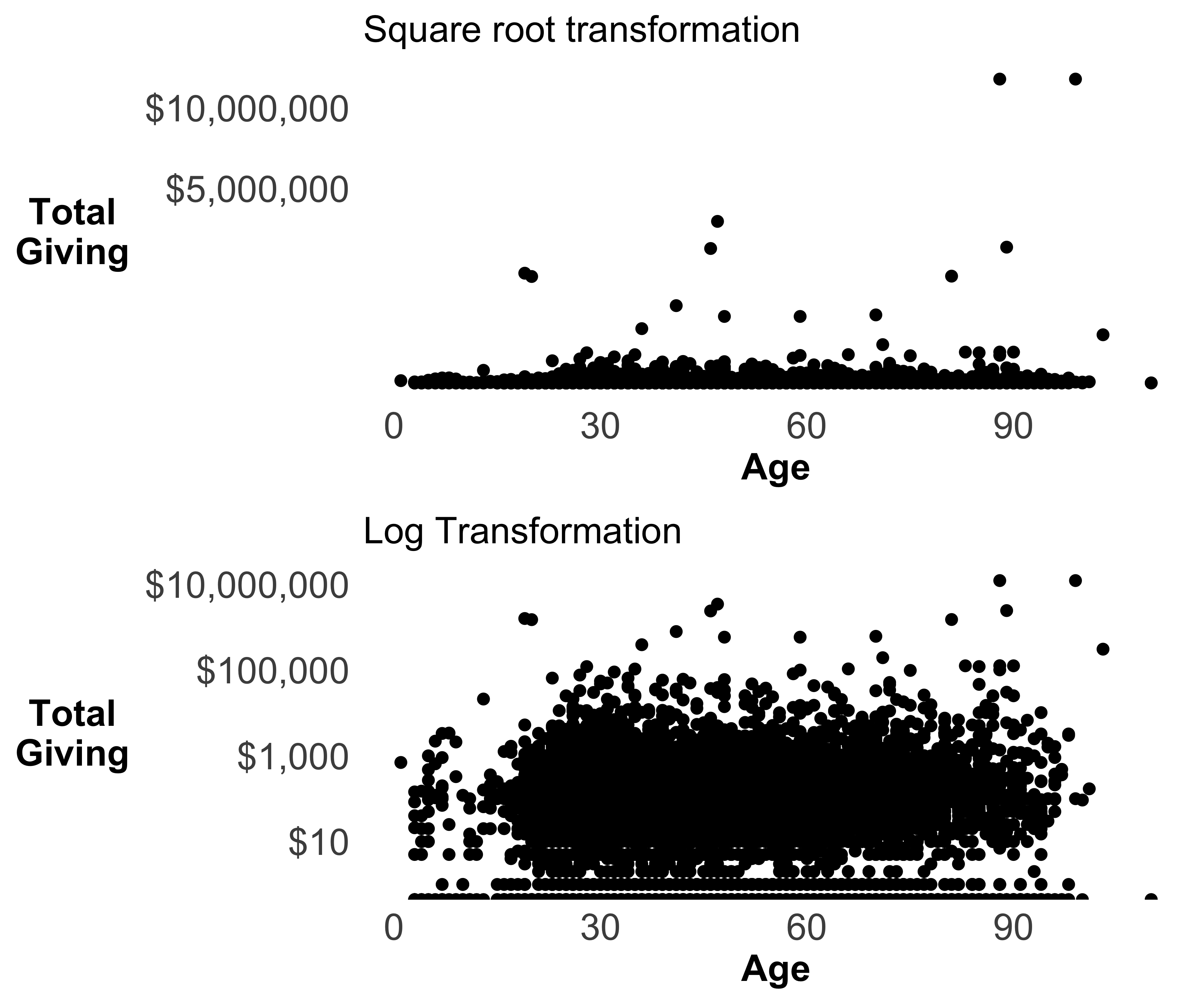
FIGURE 10.40: Scatter plot of age and total giving
Although the log transformation makes more data visible, it hides all the non-donors. This is because log(0) returns -Inf, and you can’t plot infinity!
Add transparency: Since there is an overlap of data, we can add transparency to add visibility to the hidden data points, as seen in Figure 10.41.
g <- ggplot(data = donor_data, aes(x = AGE, y = TotalGiving)) +
  geom_point(alpha = 0.5, size = 4)
g <- g + theme(axis.text = element_text(size = rel(1.2)),
               axis.title = element_text(size = rel(1.2),
                                         face = "bold"),
               axis.title.y = element_text(angle = 0,
                                           vjust = 0.5),
               panel.background = element_blank(),
               axis.ticks = element_blank())
g <- g + scale_y_log10(labels = dollar) +
  labs(x = "Age", y = "Total\nGiving")
print(g)
#> Warning: Transformation introduced infinite values
#> in continuous y-axis
#> Warning: Removed 21190 rows containing missing values
#> (geom_point).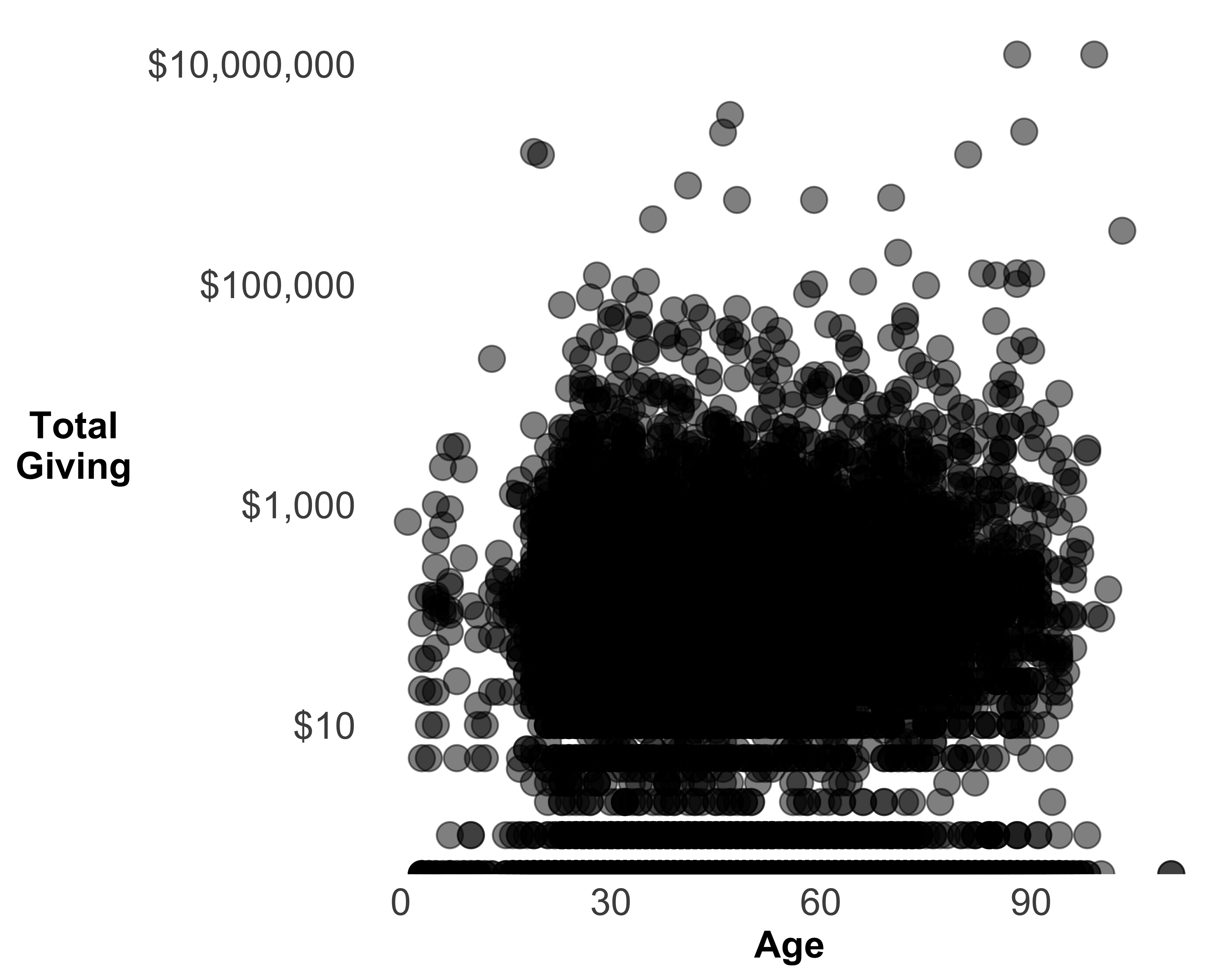
FIGURE 10.41: A scatter plot of age and total giving with transparency
10.10.1 Text Plots
When we replace the points of scatter plots with text, we create text plots. These are useful when you want to see the labels associated with individual data points. Of course, they work best when you have a limited number of data points on the plot. Let’s say that we want to see all the names of all the people who have a wealth rating of $1,000,000–$2,499,999, along with their likelihood of making a major gift. Since we don’t have the likelihood stored as a data point, we will create some random probabilities. Also, since we don’t have any names stored in the sample data set, we will create some fake names using the randomNames library! You can see the results in Figure 10.42.
require(randomNames)
require(dplyr)
require(ggplot2)
require(scales)

donor_data_ss <- filter(
  donor_data,
  WEALTH_RATING == '$1,000,000-$2,499,999') %>%
  mutate(major_giving_likelihood = runif(nrow(.)),
         prospect_name = randomNames(
           nrow(.),
           name.order = 'first.last',
           name.sep = " ",
           sample.with.replacement = FALSE))

g <- ggplot(data = donor_data_ss,
            aes(x = ID,
                y = major_giving_likelihood,
                label = prospect_name)) +
  geom_text()
g <- g + theme_bare +
  theme(axis.text.x = element_blank(),
        axis.text.y = element_text(size = rel(1.3),
                                   face = "bold"),
        axis.line.y = element_line(size = 0.5,
                                   arrow = arrow()))
g <- g + scale_y_continuous(labels = percent) +
  ggtitle(
    label = "Major Giving Likelihood of Rated Prospects",
    subtitle = "Wealth rating between $1,000,000 and $2,499,999")
print(g)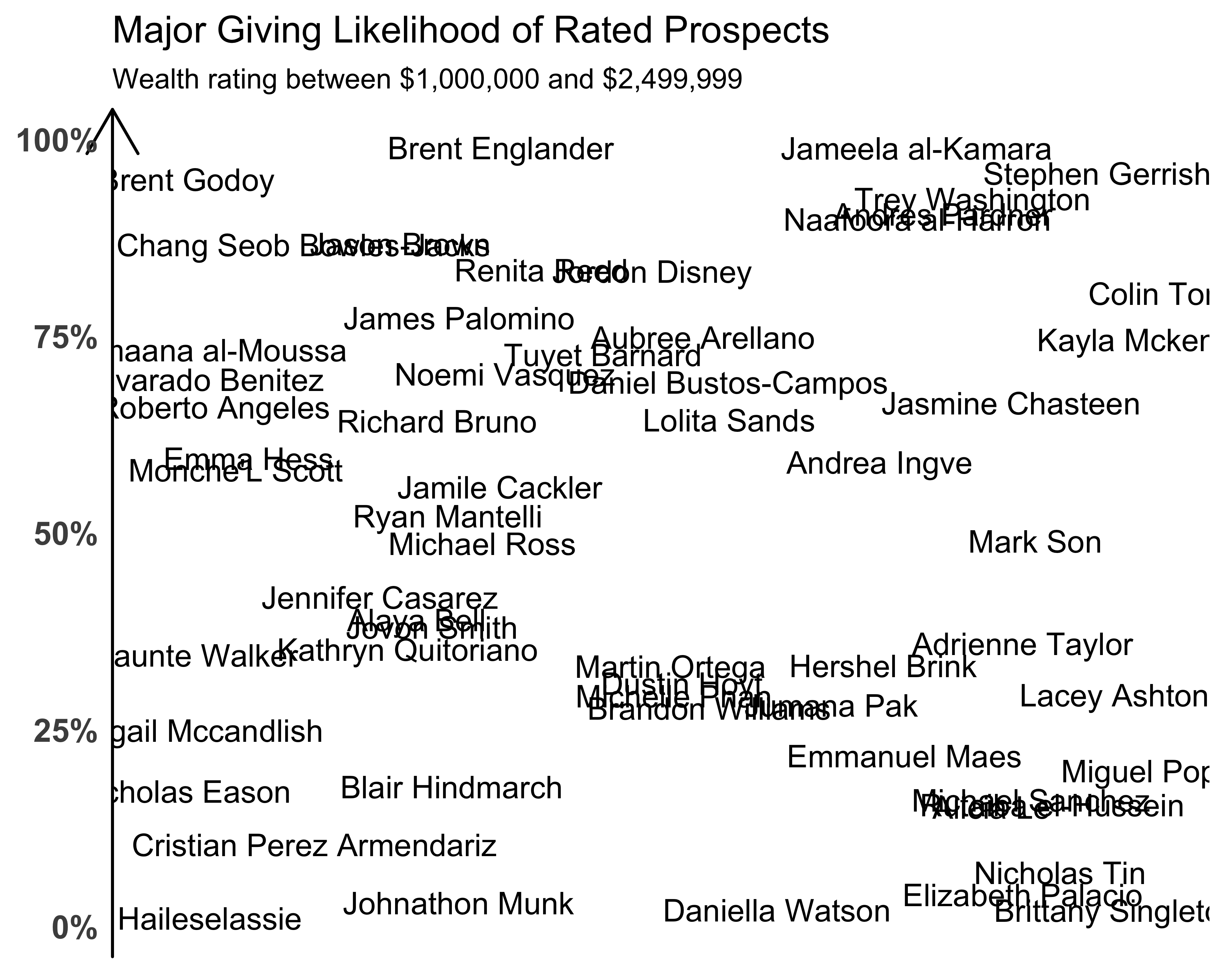
FIGURE 10.42: Fictional name plot
Since there are some overlapping names, we can remove them by adding the optional argument of check_overlap = TRUE to geom_text. We can also add color with a gradient, making it so the names with darker colors have a higher likelihood of giving a major gift, and those with lighter colors have a lower likelihood. You can see the results of using the scale_color_gradient function in Figure 10.43. I selected the colors from the site https://uigradients.com. You can find a better selection of colors for graphs at Cynthia Brewer’s color brewer.
g <- ggplot(data = donor_data_ss,
            aes(x = ID, y = major_giving_likelihood,
                label = prospect_name,
                color = major_giving_likelihood)) +
  geom_text(check_overlap = TRUE)
g <- g + theme_bare +
  theme(axis.text.x = element_blank(),
        axis.text.y = element_text(size = rel(1.3),
                                   face = "bold"),
        axis.line.y = element_line(size = 0.5,
                                   arrow = arrow()))
g <- g + scale_y_continuous(labels = percent) +
  ggtitle(
    label = "Major Giving Likelihood of Rated Prospects",
    subtitle = "Wealth rating between $1,000,000 and $2,499,999")
g + scale_color_gradient(low = "#fffbd5",
                         high = "#b20a2c",
                         guide = "none")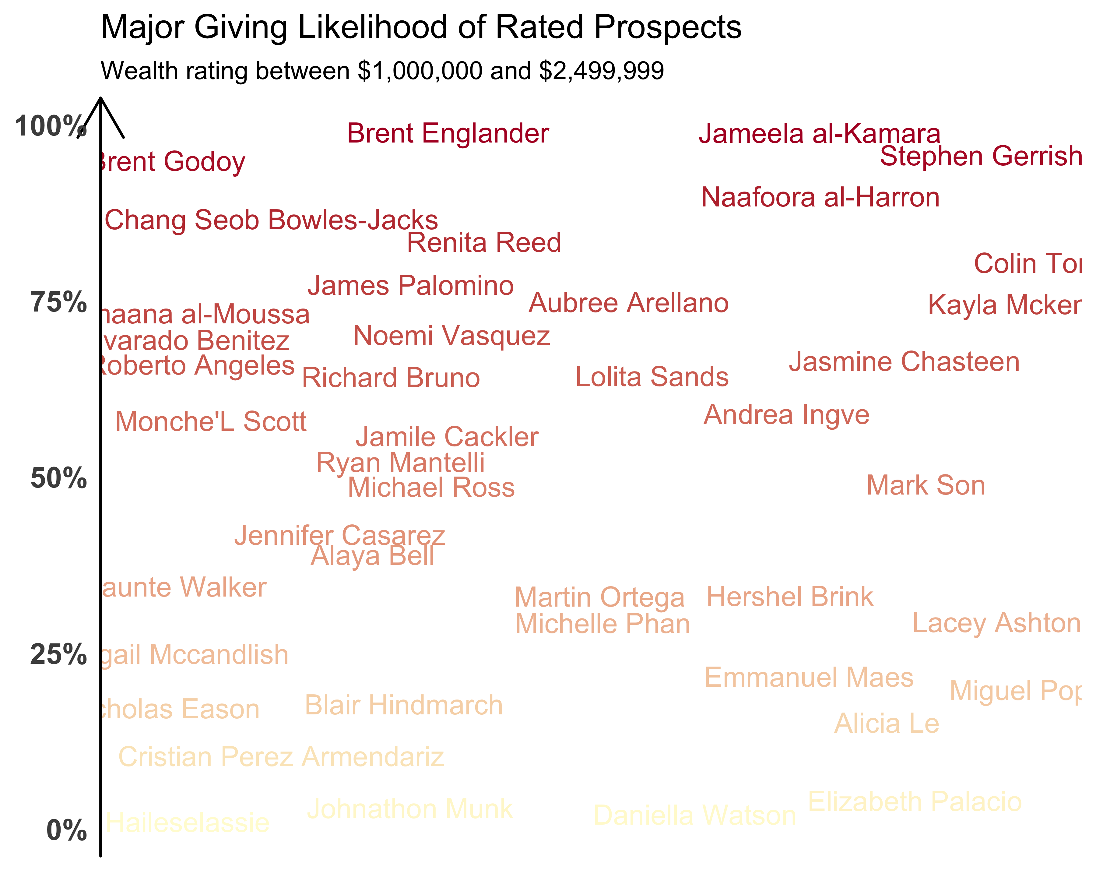
FIGURE 10.43: Fictional name plot with colors
10.10.1.1 Another Example of a Text Plot
Sometimes you have to view data differently to see and notice patterns. My employer, the University of Southern California (USC), has had a high undergraduate participation rate (~40%) for the past three years. You could show this rate by comparing various institutions by line graphs or bubble graphs. But as we found out while developing these charts at USC, when you show the participation rates by institution and its solicitable alumni base, you can clearly see how remarkable USC’s participation rate is. Can you see it in Figure 10.44?
library(readr)
library(dplyr)
library(ggplot2)
library(scales)
library(ggrepel)
alumni_participation <- read_csv(
  file = "data/AlumniParticipationFY11_FY15.csv")
alumni_participation_fy15 <- filter(alumni_participation,
                                    FY == 2015) %>%
  mutate(ugalumnibrks = cut(
    noofugalumni,
    breaks = c(1,10^4,5*10^4,10^5, 10^6),
    labels = c('<10,000','10,000-50,000',
               '50,000-100,000','100,000+'),
    include.lowest = TRUE))

label_colors <- rep("black",
                    length(alumni_participation_fy15$instshortname))
names(label_colors) <- alumni_participation_fy15$instshortname
label_colors["USC"] <- "#990000"

g <- ggplot(data = alumni_participation_fy15,
            aes(x = ugalumnibrks,
                y = ugparticpation,
                label = instshortname,
                color = instshortname)) +
  geom_text_repel(segment.size = 0,
                  force = 0.2,
                  size = 4,
                  point.padding = NA)
g <- g + scale_color_manual(values = label_colors,
                            guide = "none") +
  scale_y_continuous(labels = percent, limits = c(0, 0.7)) +
  scale_x_discrete(expand = c(0, .15))
g <- g + xlab("Number of Undergrad Solicitable Alumni")
g <- g + theme(text = element_text(family = 'sans',
                                   size = 12,
                                   face = "bold"),
               axis.line = element_blank(),
               axis.text = element_text(size = rel(1), colour = NULL),
               axis.ticks = element_blank(),
               panel.grid.major.y = element_line(color = "black",
                                                 linetype = 3),
               panel.grid.major.x = element_blank(),
               panel.background = element_rect(fill = '#f8f2e4'),
               plot.background = element_rect(fill = '#f8f2e4'),
               panel.ontop = FALSE,
               axis.title.y = element_blank(),
               plot.title = element_blank(),
               plot.margin = unit(c(1, 1, 1, 1), "lines"))
g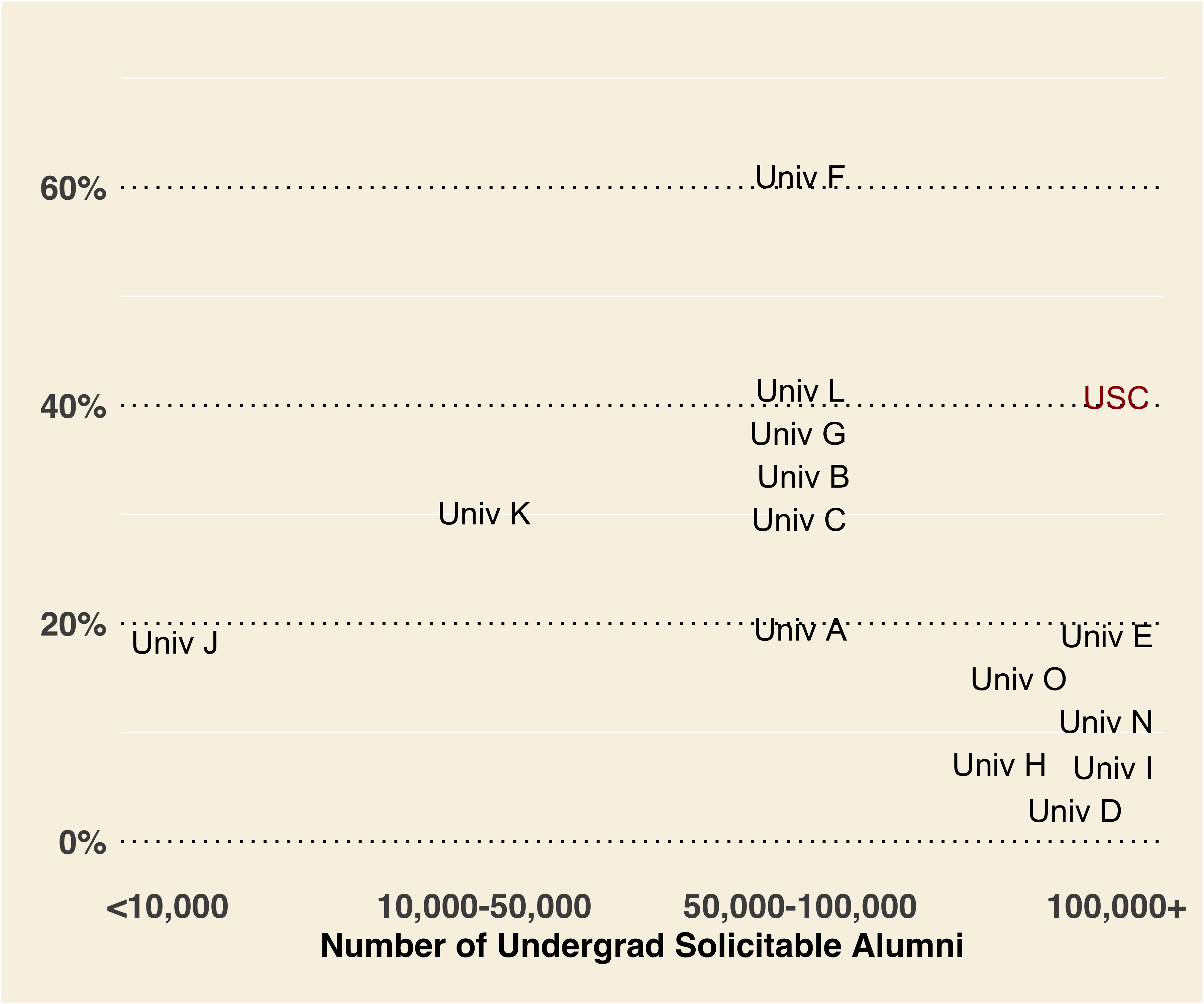
FIGURE 10.44: Alumni size and participation rates (FY15)
10.10.2 Creating Bubble Plots
When you replace the individual data points in a scatter plot with circles proportional to some measure, you create bubble plots. Hans Rosling gave the most wonderful example of a bubble plot in his video. Thanks to the gapminder library we can use the data set to create our own bubble plot, as seen in Figure 10.45.
library(gapminder)
library(dplyr)
library(ggplot2)

plot_data <- filter(gapminder, year == '2007')
g <- ggplot(data = plot_data,
            aes(x = gdpPercap,
                y = lifeExp,
                size = pop,
                color = continent)) +
  geom_point(alpha = 0.4) + theme_bare
print(g)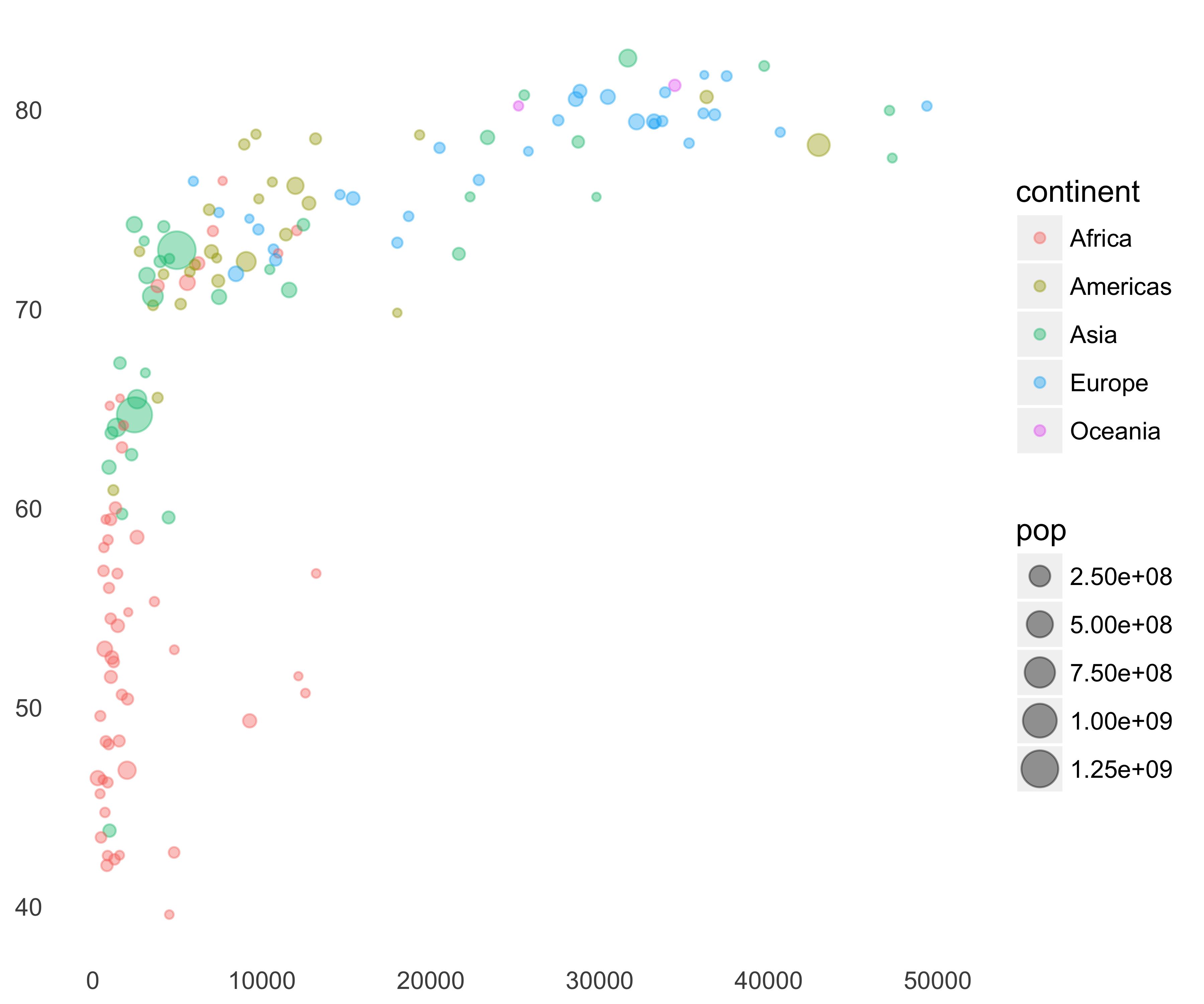
FIGURE 10.45: Gapminder bubble plot
We need to make some changes to make this chart better.
Increase the size of the circles: We can increase the size of the circles by adding the scale_size function, as seen in Figure 10.46.
g <- g + scale_size(range = c(2, 15))
print(g)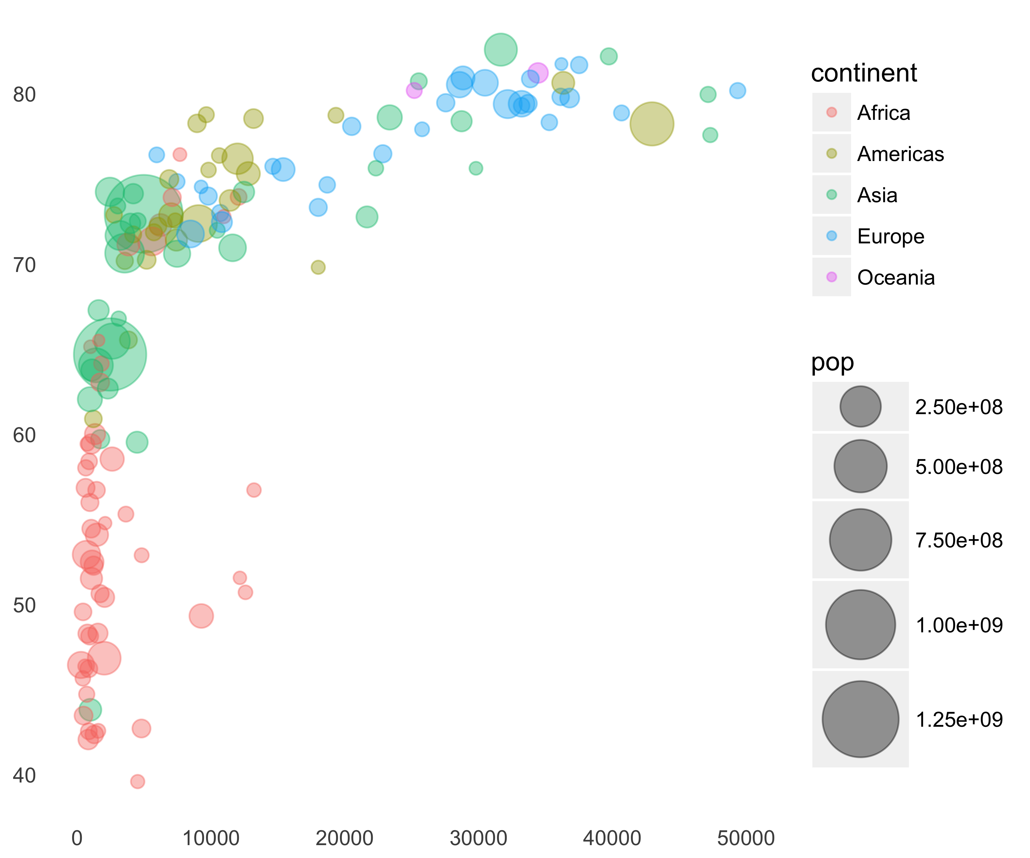
FIGURE 10.46: Gapminder bubble plot with increased size
Adjust Legends: The plot area is small because of the legends on the right. We can remove the circle size legend and place the color legend at the bottom. Jennifer Bryan, the author of this R package, even provided the continent colors to use in this plot. Let’s use those colors.
g <- g + scale_color_manual(values = continent_colors) +
  guides(size = "none") +
  theme(legend.position = "bottom")
print(g)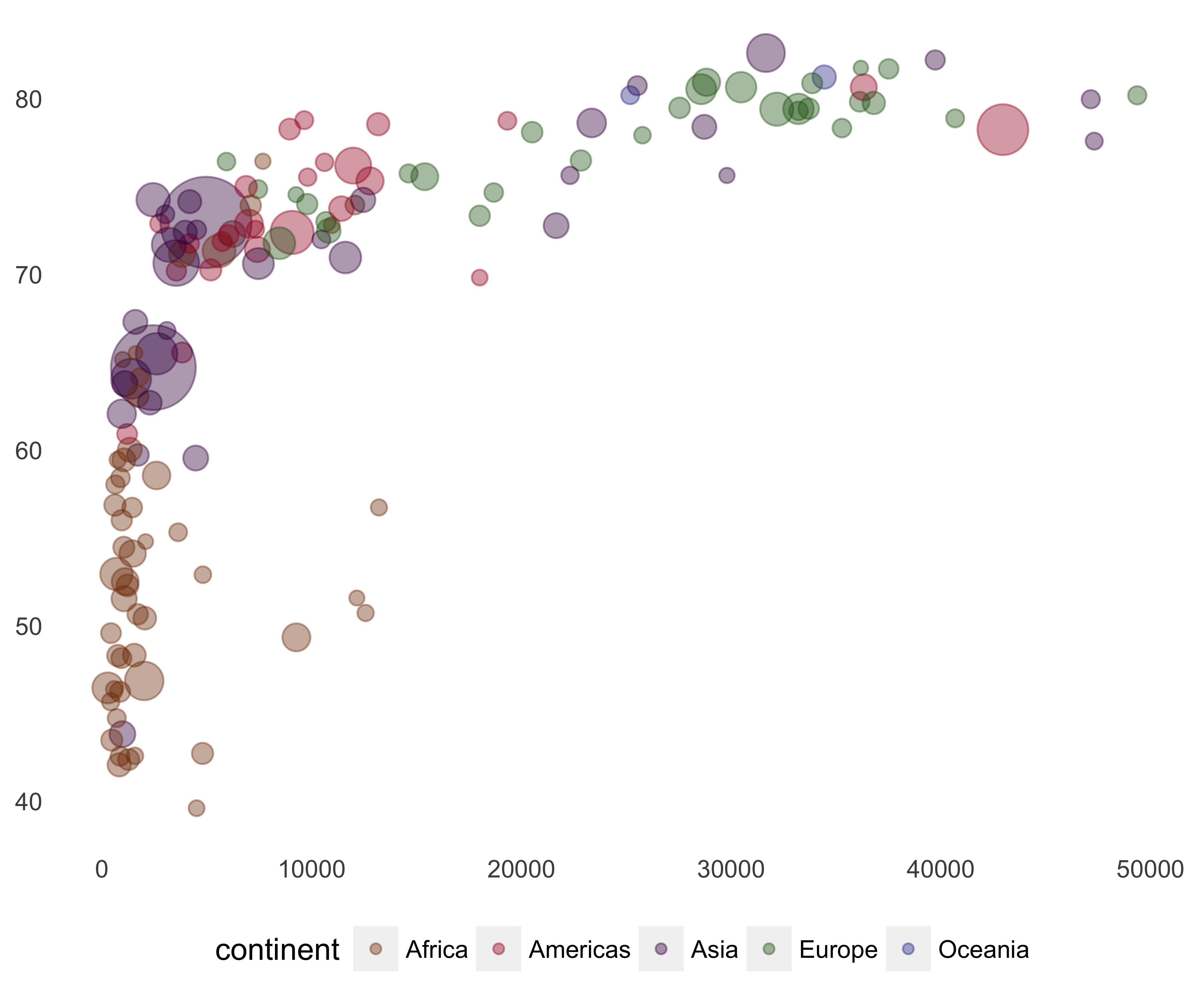
FIGURE 10.47: Gapminder bubble plot with colors
These colors don’t look pretty. I selected the following colors from gapminder’s website. As you can see in Figure 10.48, I also tweaked the legend size and removed the size legend and background color on the legend keys.
continent_colors <- c('Africa' = '#00d5e9',
                      'Americas' = '#7feb00',
                      'Asia' = '#ff5872',
                      'Europe' = '#ffe700',
                      'Oceania' = '#ff5872')
g <- g + scale_color_manual(
  values = continent_colors,
  guide = guide_legend(title = NULL,
                       override.aes = list(size = 5))) +
  guides(size = "none") +
  theme(legend.position = "bottom",
        legend.key = element_rect(fill = "white", colour = NA))
print(g)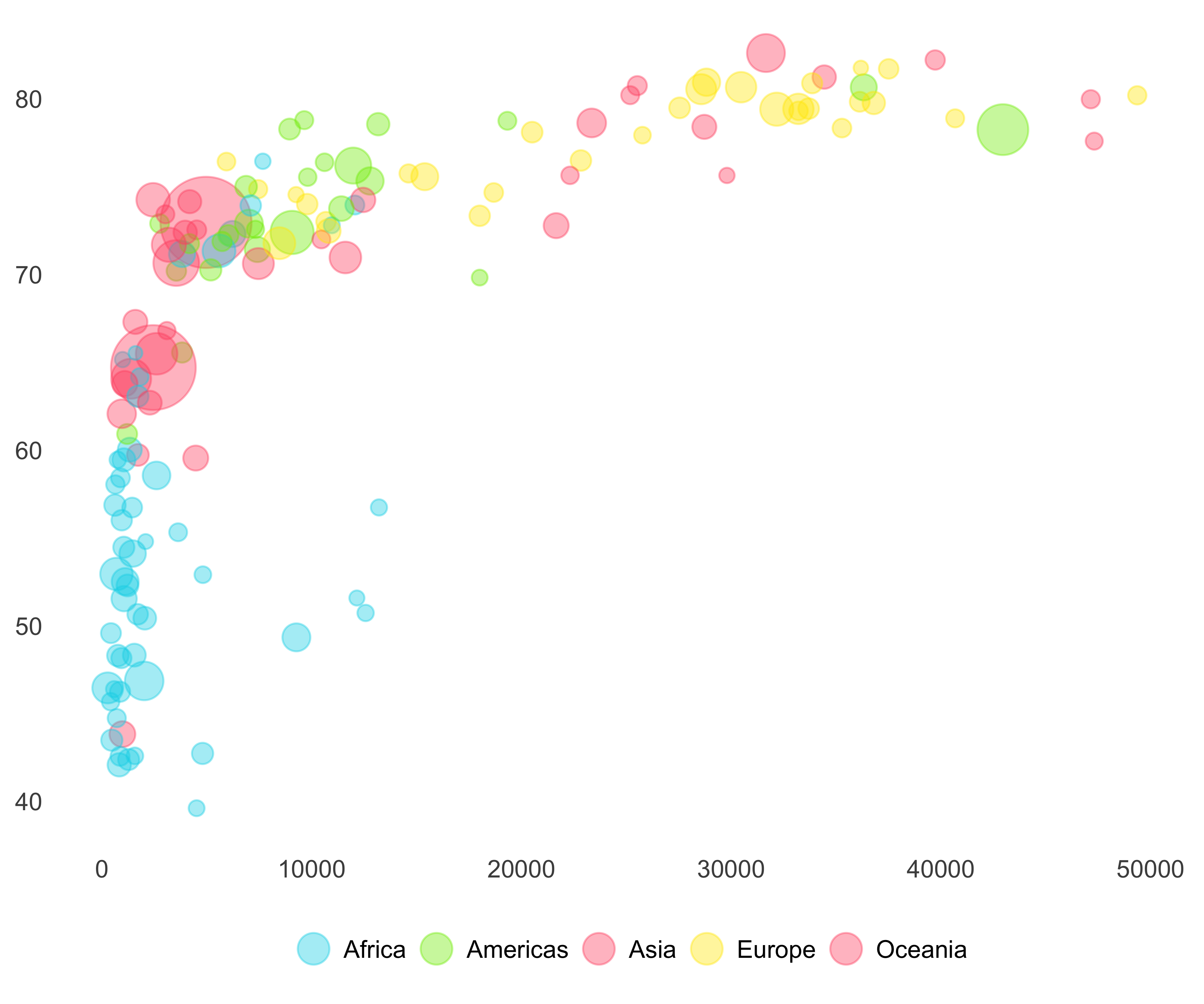
FIGURE 10.48: Gapminder bubble plot with better colors
Increase Visibility of Data Points: Since many countries have low GDP per capita, they are all bunched up in the corner. We will add the log scale with the scale breaks as given in the gapminder chart to the Y axis. We will also add limits to the X axis and fix the aspect ratio using the coord_fixed function.
library(scales)
g <- g + scale_x_log10(breaks = 500*2^(0:8),
                       limits = c(200, 130000), label = dollar) +
  scale_y_continuous(limits = c(20, 90)) +
  coord_fixed(ratio = .02)
print(g)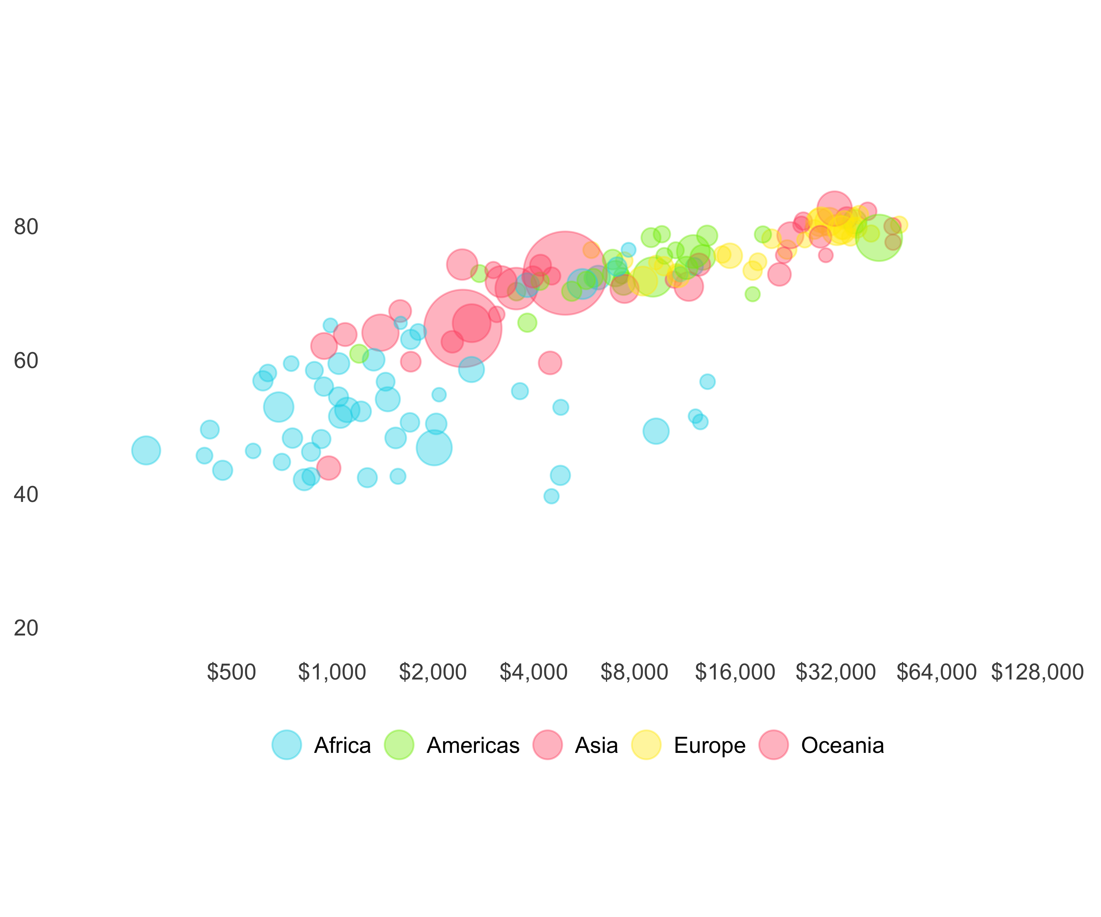
FIGURE 10.49: Gapminder bubble plot with changed scale
Add essential non-plot information: Let’s add axis labels as well as country labels. As you can see in Figure 10.50, the country labels add more clutter, but are necessary for a better understanding of the data. An interactive version, like the one on the gapminder site, is a better choice.
g <- g + labs(x = "GDP per capita", y = "Life\nexpectancy") +
  theme(axis.title = element_text(face = "bold", hjust = 1))
g <- g + theme(axis.title.y = element_text(angle = 0),
               axis.text =  element_text(face = "bold"))
g <- g + geom_text(aes(label = country),
                   size = 3,
                   check_overlap = TRUE,
                   show.legend = FALSE)
print(g)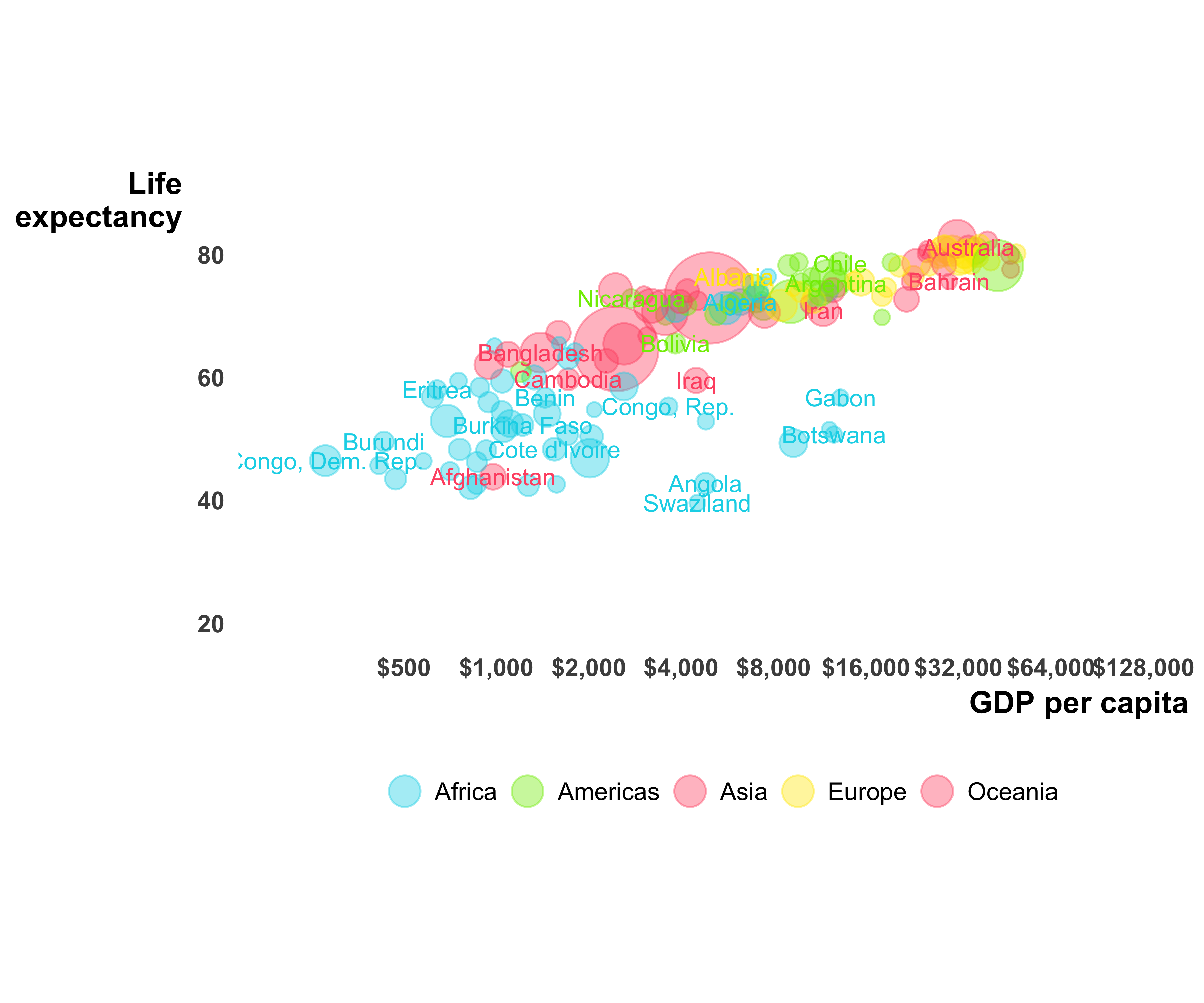
FIGURE 10.50: Gapminder bubble plot with labels
10.11 Creating Slopegraphs
“Slopegraphs” are line graphs with two vertical axes. These are vertical axes that don’t show two different measures. Although using two different measures on two y-axes is somewhat debated (Few 2008), slopegraphs let you see the change of a measure in two different time periods. For example, using the alumni participation data, let’s see the changes in the participation ranking (Figure 10.51).
library(readr)
library(dplyr)
library(ggthemes)
library(directlabels)

alumni_participation <- read_csv(
  file = "data/AlumniParticipationFY11_FY15.csv")

#exclude institutions with only one participation
insts_both <- count(alumni_participation, instshortname) %>%
  filter(n == 2) %>% select(instshortname)

alumni_participation_both <- filter(
  alumni_participation,
  instshortname %in% insts_both$instshortname) %>%
  group_by(FY) %>%
  mutate(partranking = row_number(-ugparticpation),
         revpartranking = row_number(ugparticpation)) %>%
  ungroup()

label_colors <- rep(
  "gray80",
  length(alumni_participation_both$instshortname))
names(label_colors) <- alumni_participation_both$instshortname
label_colors["USC"] <- "#990000"

g <- ggplot(data = alumni_participation_both,
            aes(x = FY,
                y = revpartranking,
                color = instshortname)) +
  geom_line(size = 1.2, alpha = 0.7) + geom_point()
g <- g + scale_color_manual(values = label_colors)
g <- g + scale_x_continuous(breaks = c(2011, 2015),
                            limits = c(2010.9, 2015.5)) +
  theme_wsj()
g <- g + scale_y_continuous(breaks = c(1, 10, 15))
g <- g + theme(axis.text.y = element_blank(),
               panel.grid.major.y = element_blank())
g <- g + theme(legend.position = "none",
               plot.background = element_rect(fill = "white"),
               panel.background = element_rect(fill = "white"))
g <- g + geom_dl(aes(label = instshortname, x = FY + 0.1),
                 method = "last.points",
                 cex = 1)
g <- g + geom_dl(aes(label = partranking, x = 2010.9),
                 method = "first.points",
                 cex = 1,
                 color = "grey90")
g <- g + theme(axis.ticks.x = element_line(size = 1),
               axis.ticks.length=unit(0.2,"cm"))
g <- g + ggtitle("Alumni Participation Ranking Change") +
  theme(plot.title = element_text(size = 14,
                                  face = "bold",
                                  colour = "#990000",
                                  hjust = 0,
                                  family = "Helvetica"))
g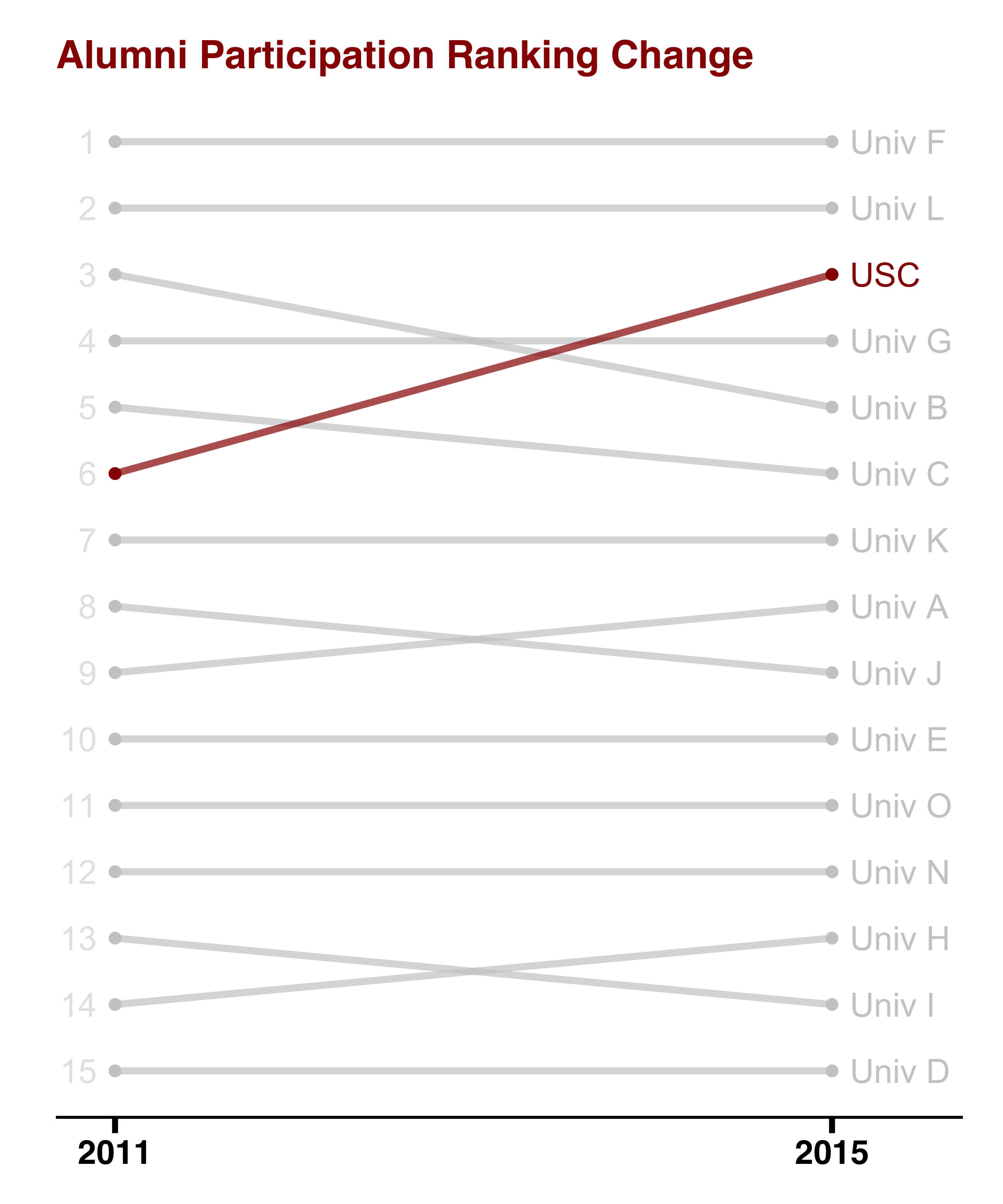
FIGURE 10.51: Changes in alumni participation seen using a slopegraph
10.12 Creating Heat Maps
Heat maps let us see a lot of data quickly using small rectangles and colors. Usually the color changes from light to dark as the measure shown in the plot increases. Let’s say we want to see the visit activity of a fundraiser for the past three years by month. Since we don’t have this data, we will create a data set. You can see the resulting heat map in Figure 10.52.
library(ggplot2)
library(dplyr)
contact_activity <- data.frame(
  month = rep(1:12, 3),
  month_abb = rep(month.abb, 3),
  year = c(rep(2015, 12),
           rep(2016, 12),
           rep(2017, 12)),
  contacts = round(abs(sin(x = 1:36))*10),
  stringsAsFactors = FALSE)

contact_activity <- mutate(contact_activity,
                           date = as.Date(paste(month,
                                                1,
                                                year,
                                                sep = "/"),
                                          "%m/%d/%Y"),
                           month_abb = factor(month_abb,
                                              levels = month.abb))

min_max_activity <- bind_rows(top_n(contact_activity,
                                    n = 1,
                                    wt = contacts),
                              top_n(contact_activity,
                                    n = 1,
                                    wt = -contacts))

g <- ggplot(data = contact_activity,
            aes(x = month_abb, y = year, fill = contacts)) +
  geom_tile(color = "white")
g <- g + scale_fill_gradient(low = "white", high = "orange") +
  scale_y_continuous(expand = c(0, 0), breaks = 2015:2017)
g <- g + theme(axis.ticks = element_blank(),
          panel.background = element_rect(fill = "white"),
          axis.title = element_blank(),
          legend.position = "none",
          axis.text = element_text(size = rel(1.2)))
print(g)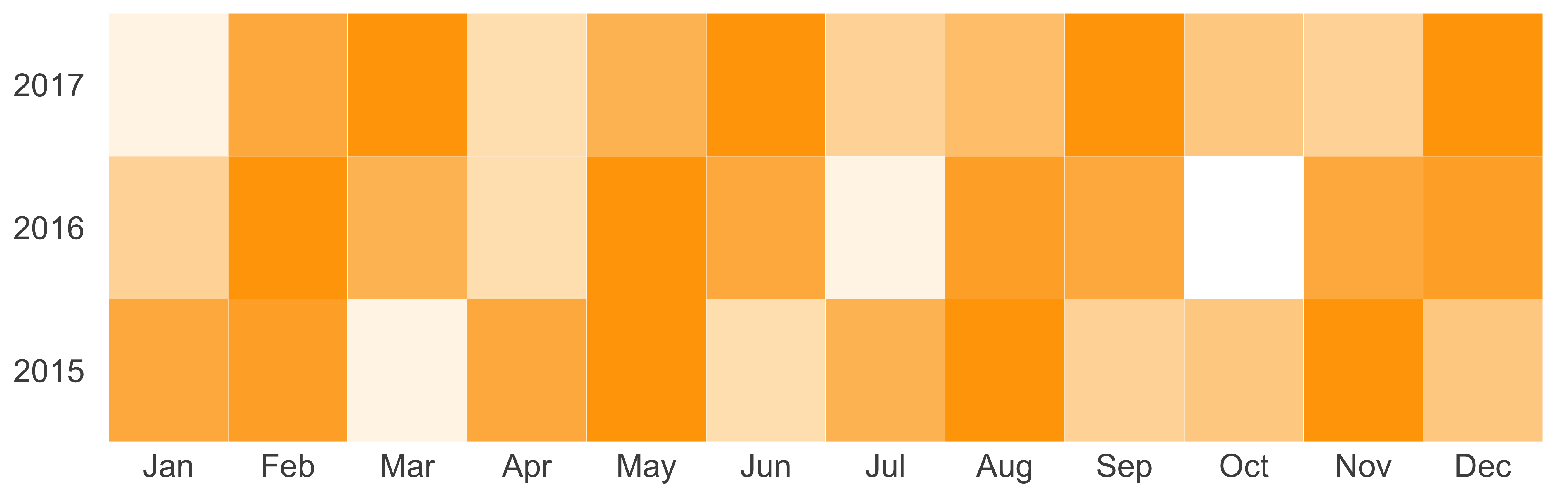
FIGURE 10.52: Contact activity heat map
If we want to show the lowest and highest contact values, we can easily show them by adding geom_text, as seen in Figure 10.53.
g <- g + geom_text(data = min_max_activity,
                   aes(x = month_abb, y = year, label = contacts))
print(g)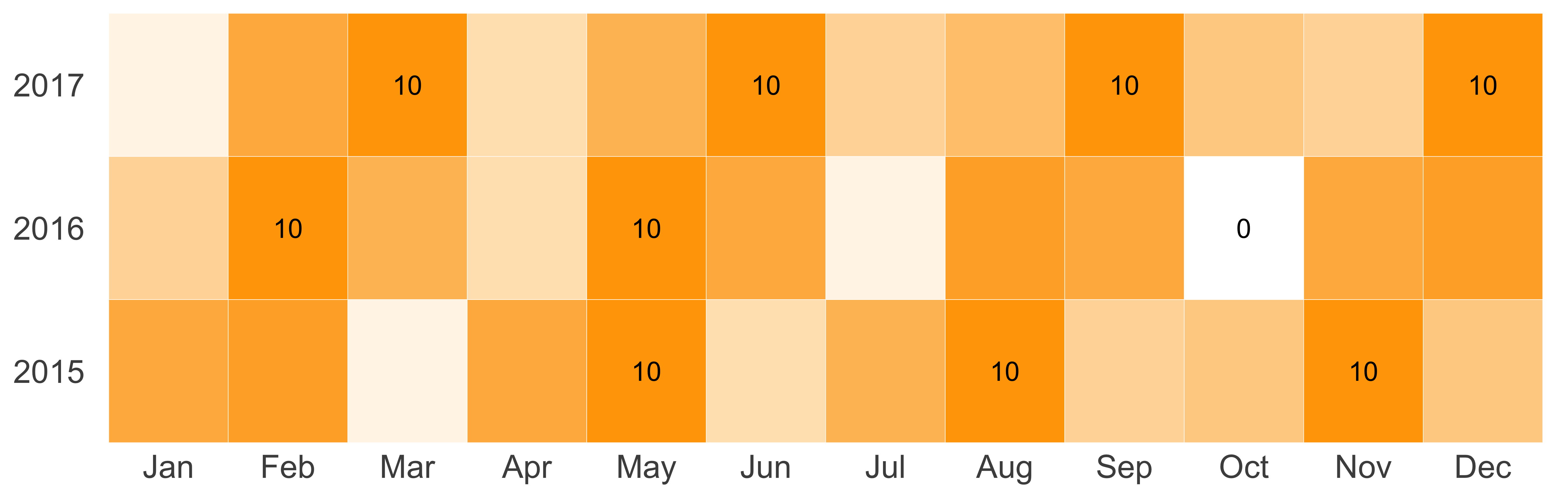
FIGURE 10.53: Contact activity heat map with labels
10.13 Creating Panels/Facets
With a lot of data on a graph, it’s harder for us to distinguish among various data trends. To avoid overcrowding the graph, we can use panels, also known as facets, to study each trend separately. You saw an example of this graph in Figure 10.34, in which we created two panels: one for donors and another for non-donors. Once you have created your plot, you need to pass the faceting variable to one of the facet_* functions. See Figure 10.54 for an example.
library(ggplot2)
library(dplyr)
plot_data <- filter(donor_data,
                    GENDER %in% c('Male', 'Female') &
                      !(is.na(PREF_ADDRESS_TYPE)))
ggplot(data = plot_data,
       aes(x = GENDER, y = TotalGiving)) +
  geom_boxplot() + scale_y_log10() +
  facet_wrap(~ PREF_ADDRESS_TYPE + PARENT_IND,
             labeller = label_both)
#> Warning: Transformation introduced infinite values
#> in continuous y-axis
#> Warning: Removed 10923 rows containing non-finite values
#> (stat_boxplot).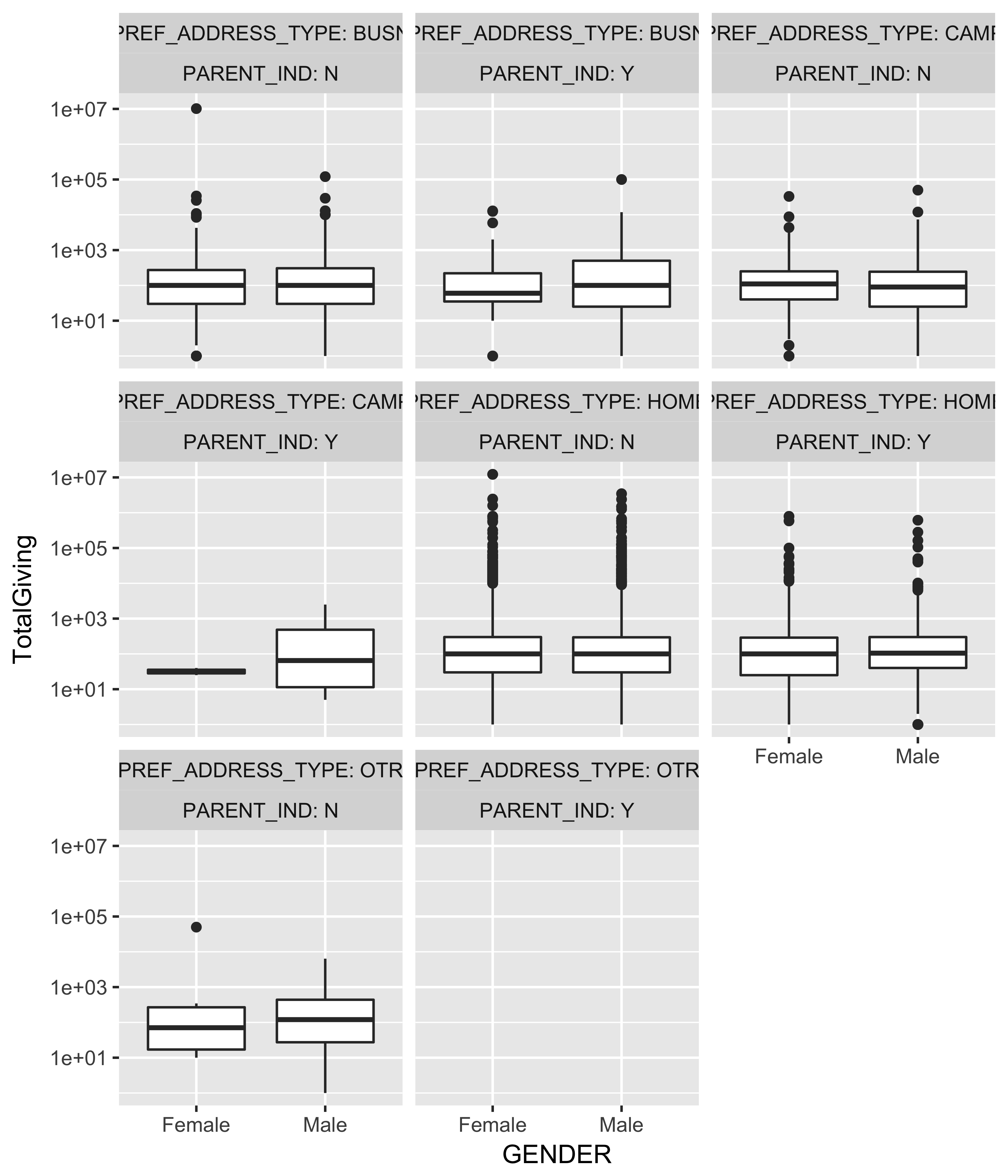
FIGURE 10.54: A faceted box plot
You can supply the optional nrow and ncol arguments to specify the number of rows and columns you would like to see in your plot.
10.14 Geographic Mapping
For reasons unknown, people get excited about maps just like kids get excited about ice cream. We, as data practitioners, can use this excitement to our advantage. Although I dislike creating “interesting” stuff, to increase the adoption of analytics, I am flexible about audience preferences. Also, creating maps in R has become easier. Let’s go through a couple of ways in which we can create maps.
10.14.1 Points on a map
The simplest way of mapping is showing data points on a map. For example, you can show the exact location of prospects on the U.S. map, or you can show the number of prospects in each ZIP code. Let’s show the latter.
First, let’s count all the prospects in each ZIP code and clean them up using the zipcode library:
require(dplyr)
require(zipcode)
zipcode_counts <- count(donor_data, ZIPCODE) %>%
  mutate(ZIPCODE = clean.zipcodes(ZIPCODE))
Now, let’s pull the latitude and longitude for each ZIP code using the data provided in the zipcode package:
data("zipcode")
zipcode_counts_coords <- inner_join(zipcode_counts,
                                    zipcode,
                                    by = c("ZIPCODE" = "zip"))
Now for the fun part. Get the map data from the maps package.
require(maps)
require(ggplot2)
us_map <- map_data(map = "state")
glimpse(us_map)
#> Observations: 15,537
#> Variables: 6
#> $ long      <dbl> -87.5, -87.5, -87.5, -87.5,...
#> $ lat       <dbl> 30.4, 30.4, 30.4, 30.3, 30....
#> $ group     <dbl> 1, 1, 1, 1, 1, 1, 1, 1, 1, ...
#> $ order     <int> 1, 2, 3, 4, 5, 6, 7, 8, 9, ...
#> $ region    <chr> "alabama", "alabama", "alab...
#> $ subregion <chr> NA, NA, NA, NA, NA, NA, NA,...
We have two options: either we join the counts data frame with the map coordinates data, or we draw the map first and then pass the counts as a separate layer. Let’s explore the second option so we can see the power of ggplot’s layering.
ggplot() + geom_polygon(data = us_map,
                        aes(x = long, y = lat, group = group)) +
  coord_quickmap()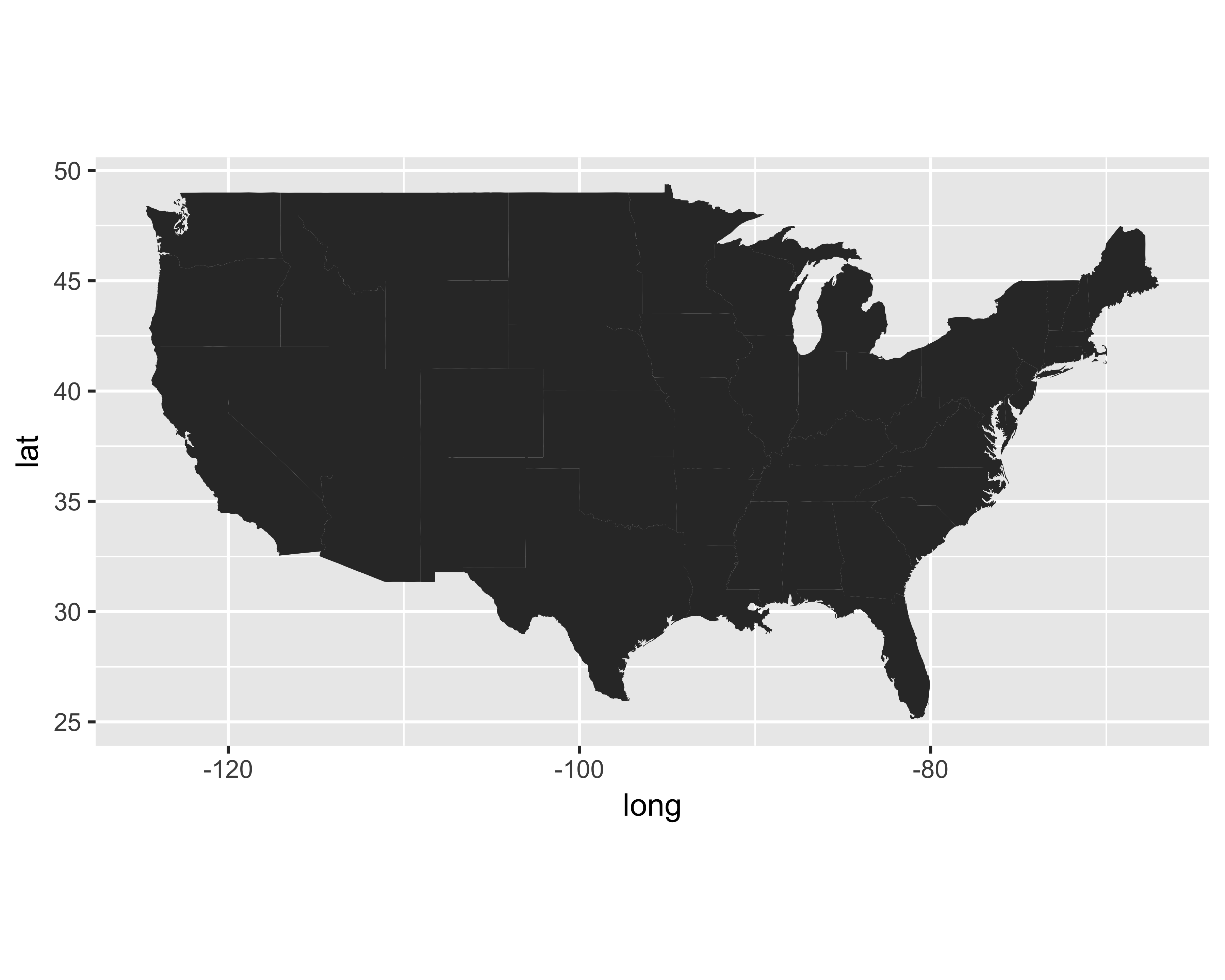
You will see we added the coord_quickmap() function to the plot call. We won’t delve into all the inner workings or uses of this function, but it can be used to preserve the aspect ratio of the map so that the U.S. will look like the U.S.
Since the map is filled with a dark gray color, it is not exactly pleasing to the eye. Also, it will be harder to see the data points once we plot them. Let’s change the background color as well as the border color. Let’s also remove all the extra, non-data related items from the plot using theme_bare.
g <- ggplot() + geom_polygon(data = us_map,
                             aes(x = long, y = lat, group = group),
                             fill = "gray97",
                             color = "#FF993F",
                             size = 0.5) +
  coord_quickmap() + theme_bare +
  theme(axis.text = element_blank())
g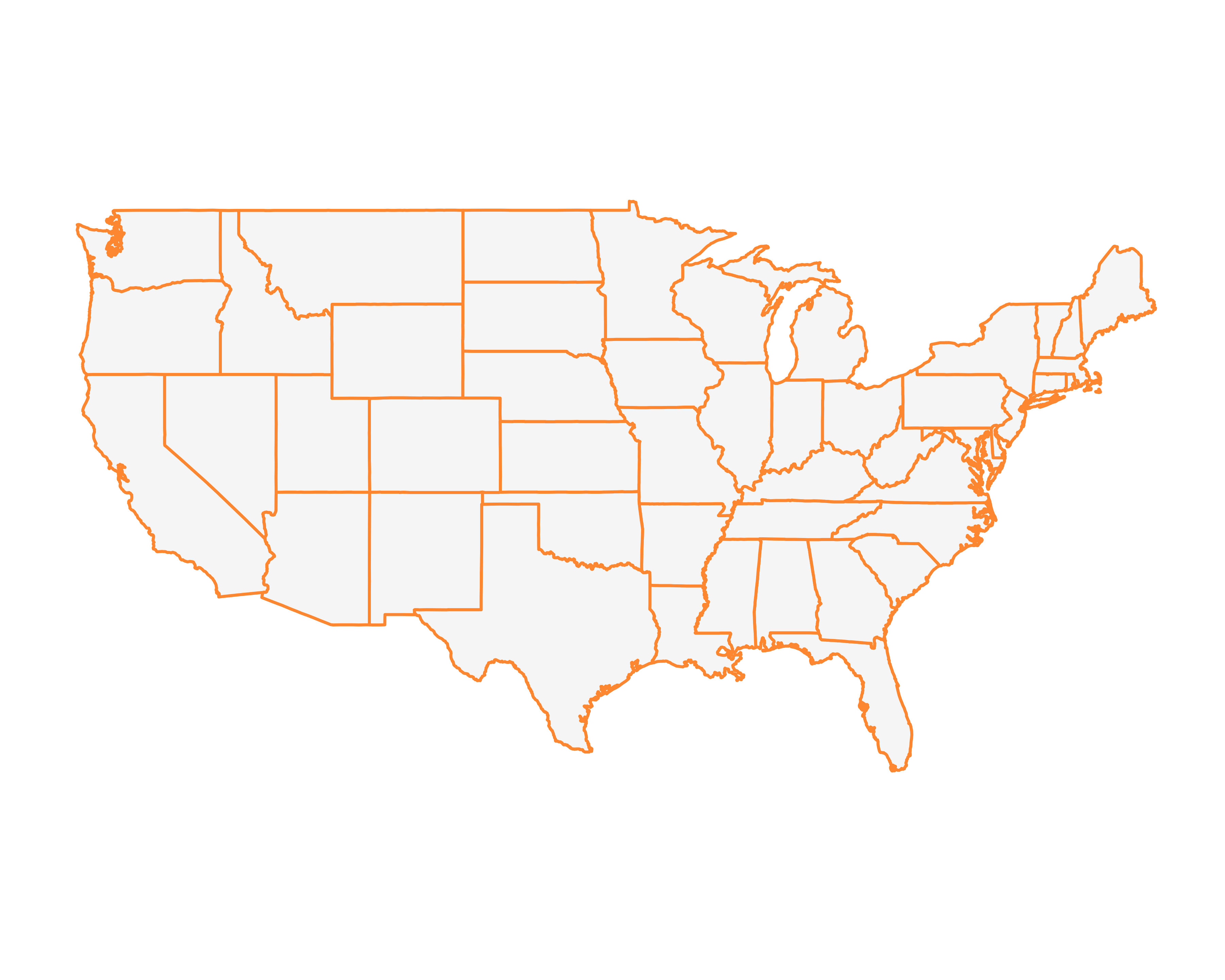
Let’s add a layer of all the counts using geom_point, with the size of the point reflecting the number of prospects in that ZIP code.
g + geom_point(data = zipcode_counts_coords,
               aes(x = longitude, y = latitude, size = n))
#> Warning: Removed 303 rows containing missing values
#> (geom_point).
A couple of things happened.
- We plotted data points that are not in the lower 48 states.
- The point size overwhelmed the map.
Let’s remove the ZIP codes outside of the lower 48 states.
g <- g + geom_point(data = filter(zipcode_counts_coords,
                                  between(longitude, -125,-66),
                                  between(latitude, 25,50)),
                    aes(x = longitude, y = latitude, size = n),
                    alpha = 0.4)
g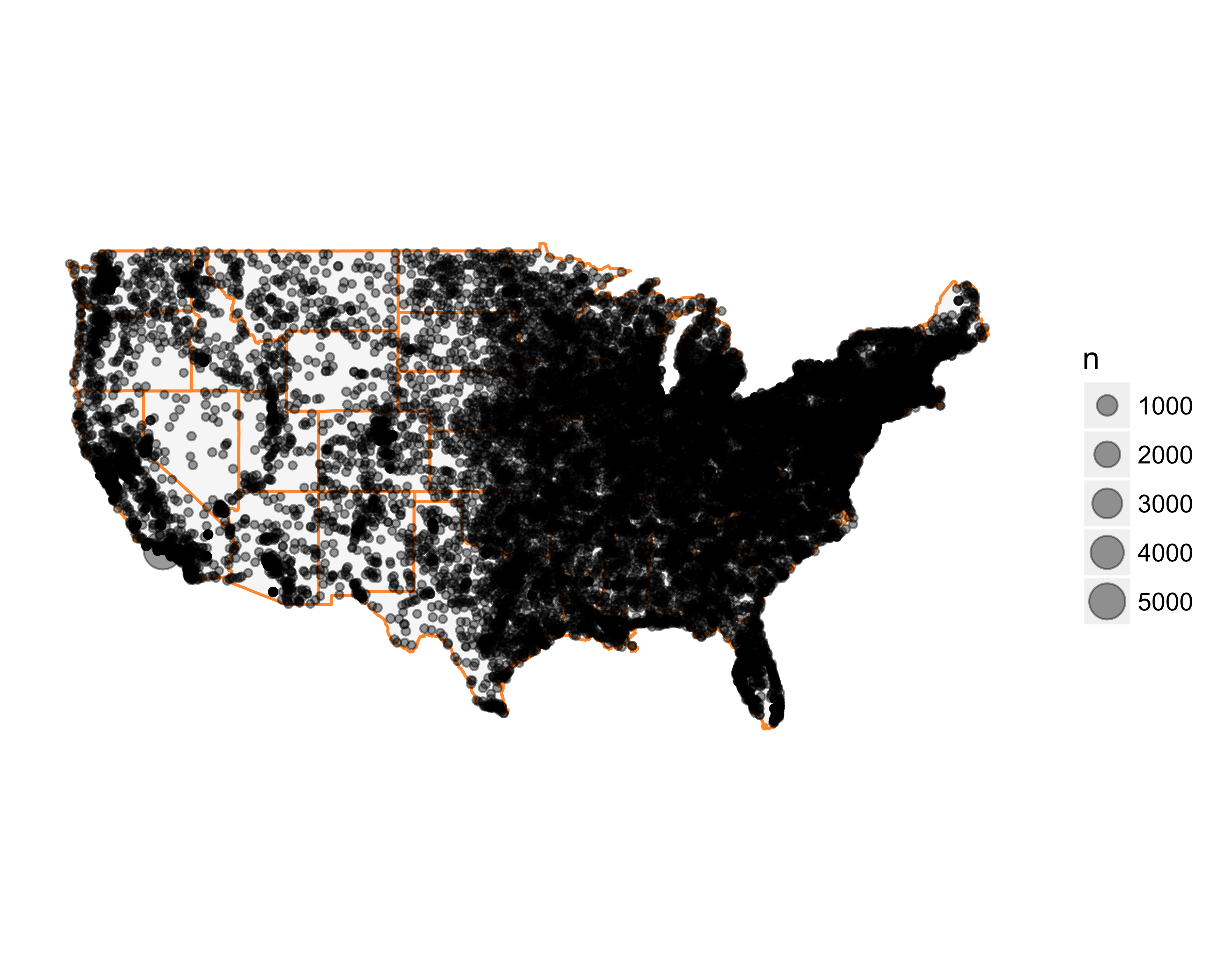
Much better. But the size of the points is still overcrowding the map. Let’s change the size scale. First, let’s see the distribution of the number of prospects in each ZIP code.
summary(zipcode_counts_coords$n)
#>    Min. 1st Qu.  Median    Mean 3rd Qu.    Max.
#>       1       1       1       2       2    5835
It looks like the majority of prospects are spread around the country with the exception of one zip code, (90265. Find out why here). Let’s make the individual data points smaller. The final map is shown in Figure 10.55.
g <- g + scale_size_area(breaks = c(1, 4000),
                         max_size = 8,
                         guide = "none")
g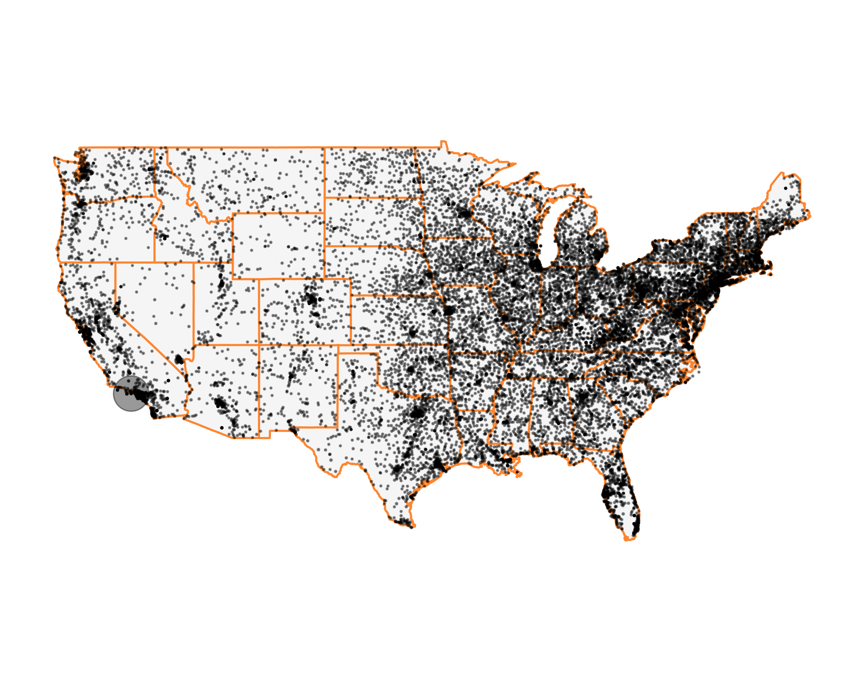
FIGURE 10.55: Number of prospects by ZIP code on the US map
Much better!
We can change the color of points based on the number of prospects in each ZIP code, but we will have to change our initial call to geom_point. We need to add the “color = n” argument. Then we can use the scale_colour_gradient function. You can see the resulting map in Figure 10.56. Since most of the prospects are located in one place, the gradient is really not helping us see anything different. You may want to change the color based on the wealth ratings and explore different patterns. But that’s an exercise for you.
g <- ggplot() + geom_polygon(data = us_map,
                             aes(x = long,
                                 y = lat,
                                 group = group),
                             fill = "gray97",
                             color = "grey80",
                             size = 0.5) +
  coord_quickmap() + theme_bare +
  theme(axis.text = element_blank())
g <- g + geom_point(data = filter(zipcode_counts_coords,
                                  between(longitude, -125,-66),
                                  between(latitude, 25,50)),
                             aes(x = longitude,
                                 y = latitude,
                                 size = n,
                                 color = n),
                    alpha = 0.4)
g <- g + scale_size_area(breaks = c(1, 4000),
                         max_size = 8,
                         guide = "none") +
  scale_colour_gradient(low = "#fc9272",
                        high = "#de2d26",
                        guide = "none")
g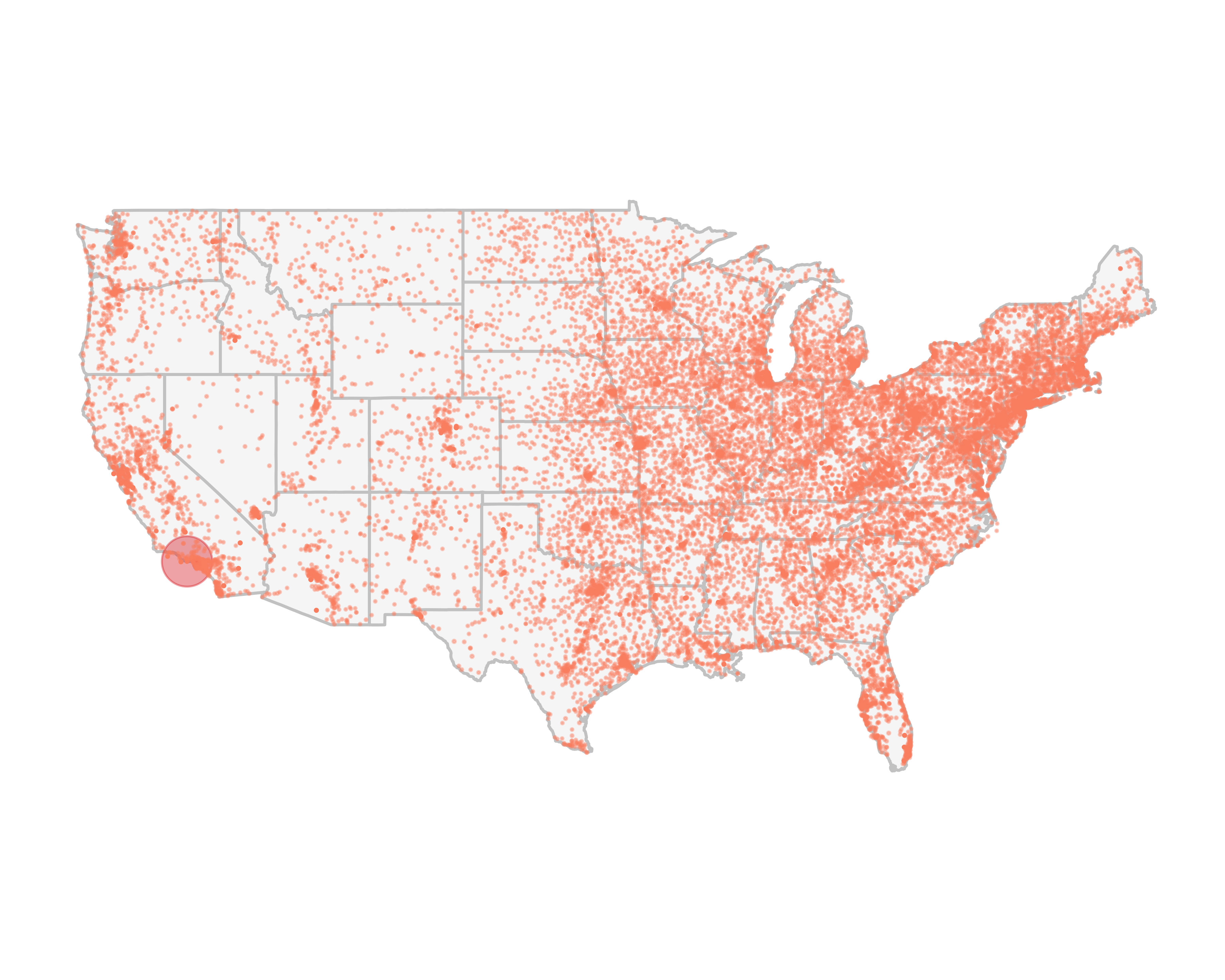
FIGURE 10.56: Number of prospects by ZIP code on the U.S. map, colored by density
What if we want to explore only one specific region, say, the Bay Area in San Francisco. We can use another useful library called ggmap. This library will allow you to download and plot Google Maps®, Stamen Maps®, and OpenStreetMap® maps. See the library’s code and documentation for more details.
This package is very easy to use. For example, let’s download and plot the Bay Area as seen in Figure 10.57.
require(ggmap)
ggmap(get_map("San Francisco Bay Area",
              zoom = 11,
              source = "google"))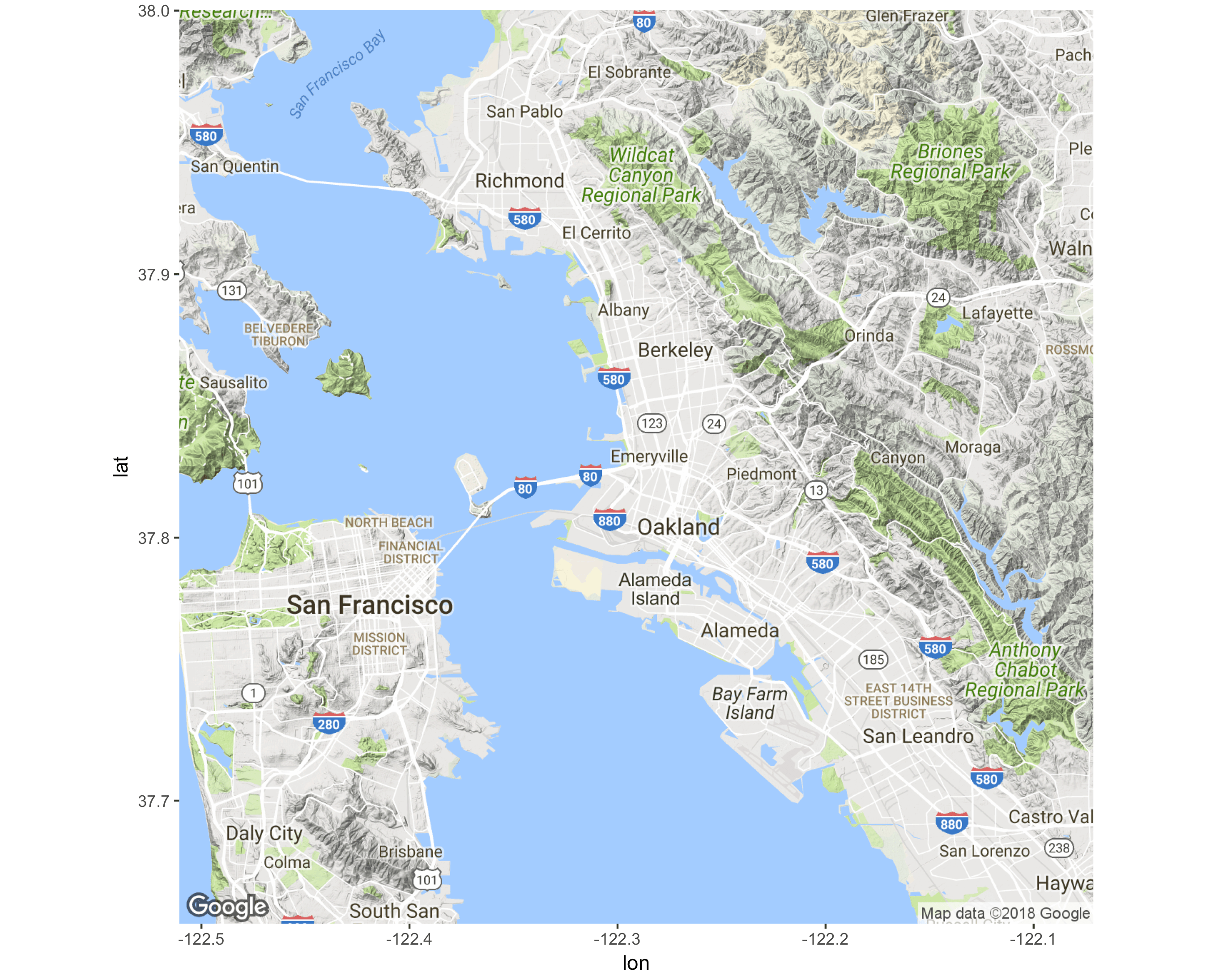
FIGURE 10.57: Bay Area map
You can change various aspects of the map with the get_map function. You can change the zoom level, map types (satellite, watercolor), the source of map, and many other things. Figure 10.58 shows various versions of the Los Angeles map.
require(gridExtra)
g0 <- ggmap(get_map("los angeles", zoom = 10, source = "google"),
            extent = "device") +
  ggtitle(label = 'g0')
g1 <- ggmap(get_map("los angeles", zoom = 10, source = "google"),
            extent = "device", darken = 0.5) +
  ggtitle(label = 'g1')
g2 <- ggmap(get_map("los angeles", zoom = 10, source = "stamen",
                    maptype = "toner"), extent = "device") +
  ggtitle(label = 'g2')
g3 <- ggmap(get_map("los angeles", zoom = 10, source = "stamen",
                    maptype = "toner-lite"), extent = "device") +
  ggtitle(label = 'g3')
g4 <- ggmap(get_map("los angeles", zoom = 10, source = "stamen",
                    maptype = "toner-background"),
            extent = "device") +
  ggtitle(label = 'g4')
g5 <- ggmap(get_map("los angeles", zoom = 10, source = "stamen",
                    maptype = "watercolor"), extent = "device") +
  ggtitle(label = 'g5')
grid.arrange(g0, g1, g2, g3, g4, g5, nrow = 2)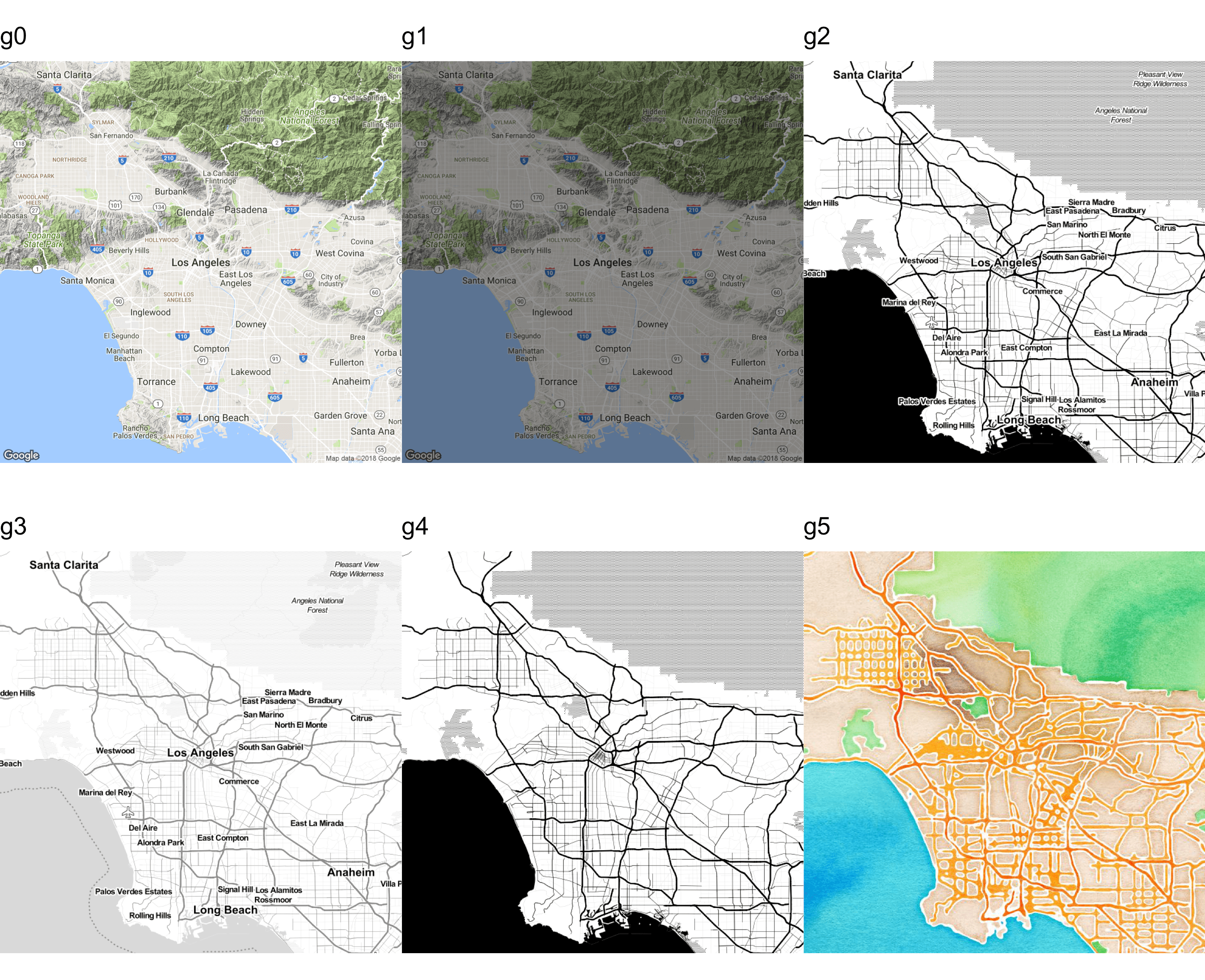
FIGURE 10.58: Various maps of Los Angeles
Let’s plot the prospects in the Bay Area, as seen in Figure 10.59.
require(dplyr)
require(zipcode)
data("zipcode")
bay_area_prospects <- mutate(donor_data,
                             ZIPCODE = clean.zipcodes(ZIPCODE)) %>%
  select(ZIPCODE) %>%
  inner_join(., zipcode, by = c("ZIPCODE" = "zip")) %>%
  filter(between(longitude, -122.391821, -122.2984824),
         between(latitude, 37, 38))

bay_area_map <- get_map(location = "San Fransico Bay Area",
                        maptype = "toner",
                        source = "stamen",
                        zoom = 10)

ggmap(bay_area_map, extent = "device") +
  geom_point(data = bay_area_prospects,
             aes(x = longitude, y = latitude),
             color = "red",
             size = 3)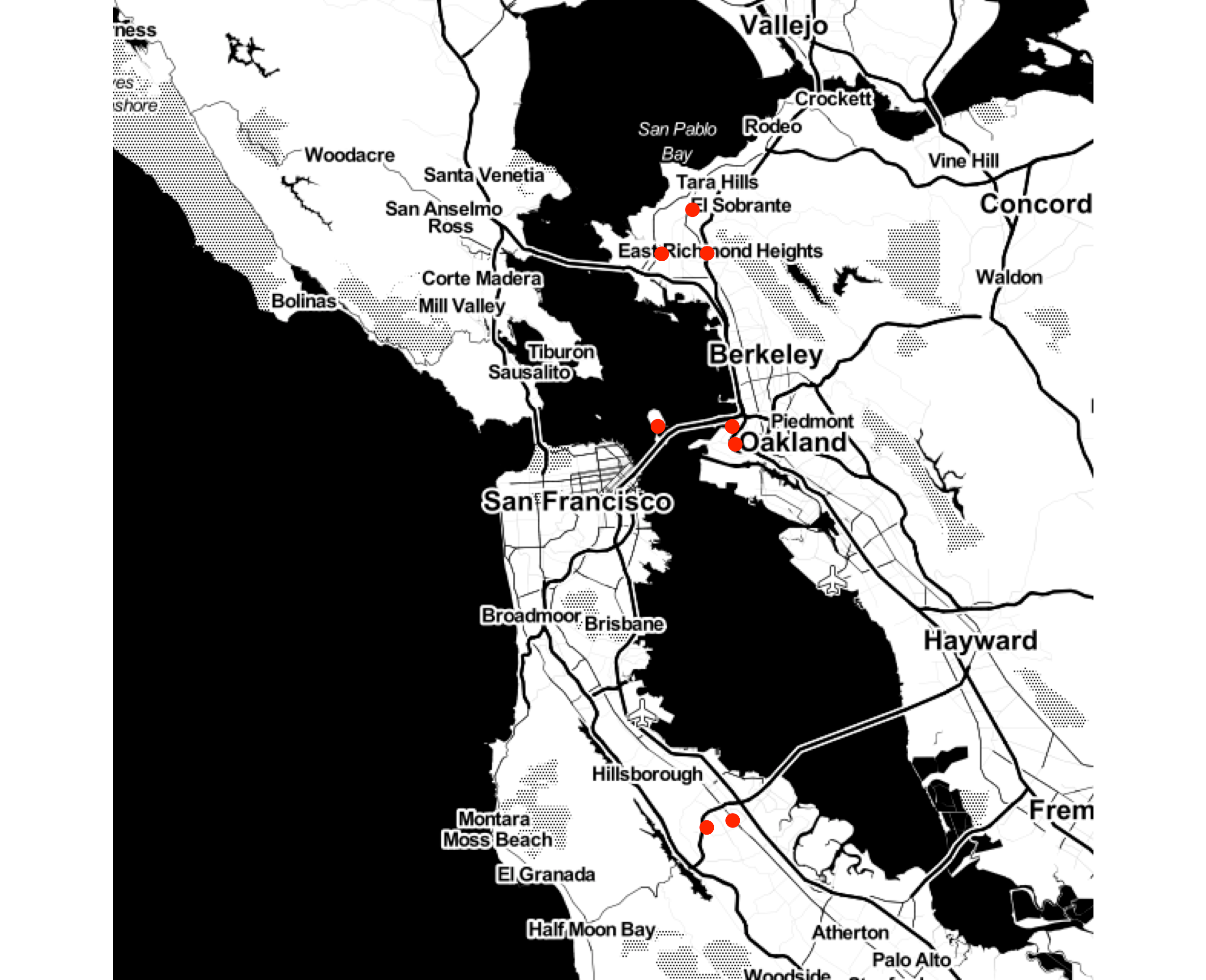
FIGURE 10.59: Prospects in the Bay Area
What if you didn’t have the ZIP code but some malformed address? The ggmap library offers a useful function called mutate_geocode(), which uses Google’s API to give you the longitude and latitude of the address. If you plan to geocode thousands of addresses, get an API key and associate a payment method with your account. You can find more details on Google’s developer pages. I once geocoded more than 50,000 addresses. I believe it was less than $20.
Let’s say we know three prospects who live in a wealthy neighborhood. We want to show them on a map for a meeting. But the addresses are malformed. Note that I just picked these addresses randomly using Google Maps. You can see two addresses have spaces and one doesn’t have the full city name spelled out.
30166 Via Victoria Rancho Palos CA
30288 Via Victoria      Rancho Palos Verdes, CA
30233 Via Victoria Rancho Palos Verdeslibrary(ggmap)
rpv_addr <- data.frame(
addr = c('30166 Via Victoria Rancho Palos CA',
'30288 Via Victoria Rancho Palos Verdes, CA',
'30233 Via Victoria Rancho Palos Verdes'),
name = c('Elizabeth Brown', 'Jeremy Kim', 'Largo Tyler'),
stringsAsFactors = FALSE)
rpv_addr <- mutate_geocode(rpv_addr, addr)
glimpse(rpv_addr)
#> Observations: 3
#> Variables: 4
#> $ addr <chr> "30166 Via Victoria Rancho Palos...
#> $ name <chr> "Elizabeth Brown", "Jeremy Kim",...
#> $ lon <dbl> -118.4106735, -118.4093515, -118...
#> $ lat <dbl> 33.7604280, 33.7588896, 33.7594908You can see that Google geocoded all the addresses and returned the coordinates.
Now the easy part. Let’s map the area.
rpv_coords <- c(lon = -118.4113781, lat = 33.7586502)
rpv_map <- ggmap(get_map(location = rpv_coords,
                         zoom = 16,
                         maptype = "hybrid"),
                 extent = "device")
#> Warning: `panel.margin` is deprecated. Please use
#> `panel.spacing` property instead
rpv_map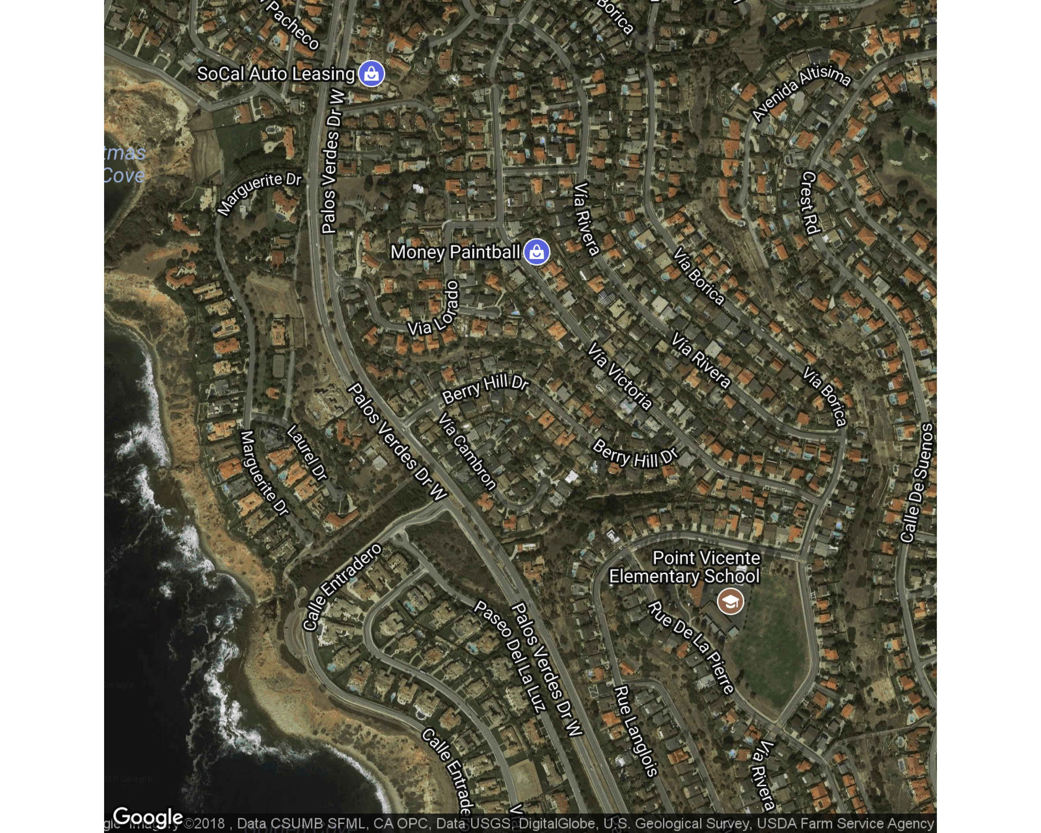
Next, let’s show the houses along with the names of the prospects, as seen in Figure 10.60.
rpv_map + geom_point(data = rpv_addr,
                     aes(x = lon, y = lat),
                     shape = 21,
                     size = 5,
                     stroke = 2,
                     color = "#FF993F") +
  geom_text(data = rpv_addr,
            aes(x = lon, y = lat, label = name),
            hjust = -0.1,
            size = rel(5),
            color = "#FF993F")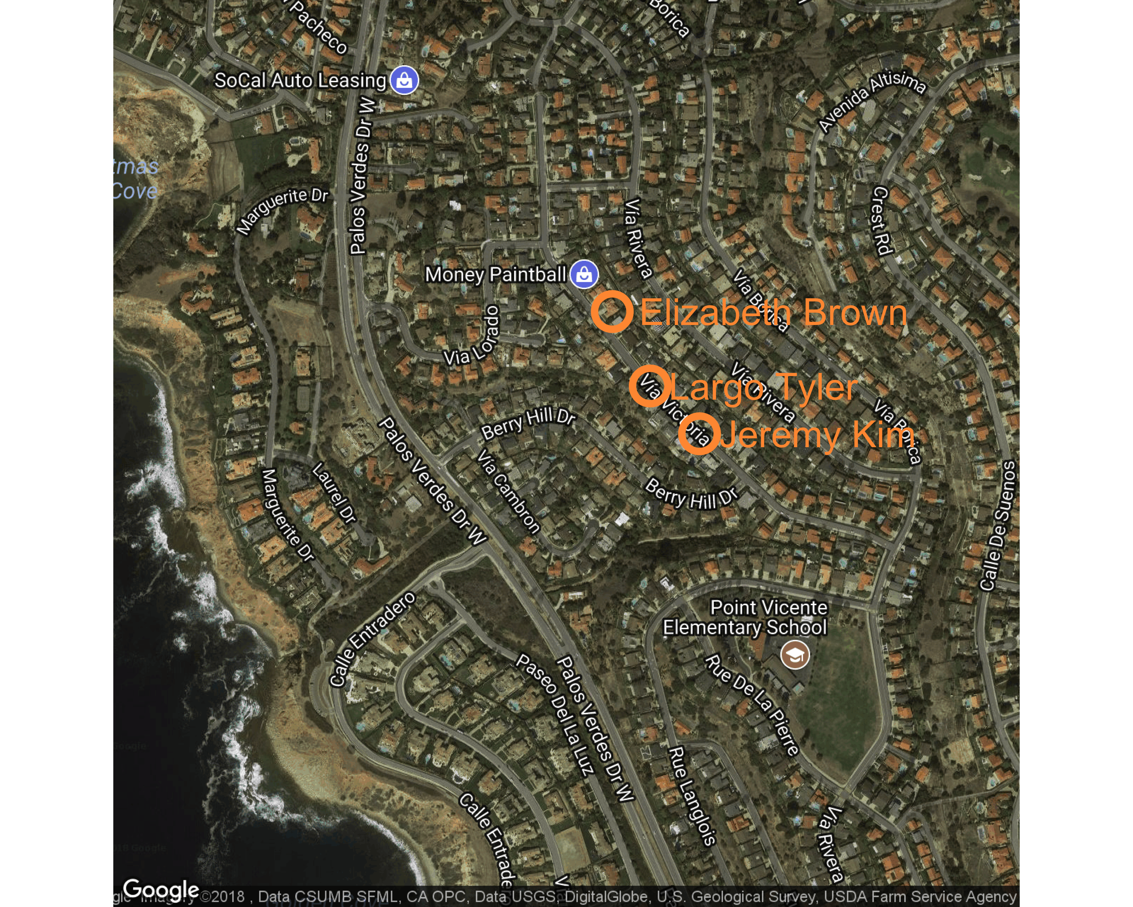
FIGURE 10.60: Prospects mapped on a street
10.14.2 Filled a.k.a. Choropleth Maps
Filled maps, also known as choropleth maps, are perhaps the best-known data-layer added maps. The U.S. general election maps with the red color, for the Republican party and blue for the Democratic party for the state won by the party, is a common example of a filled map. Filled maps quickly let the reader see any big pattern shift. These maps aren’t meant to be read to find micro-patterns, but just to show overall patterns. The key in creating these maps is the availability of the shapes or polygons to be filled in. For example, if you want to fill all the ZIP codes in the state of California by population using colors (darker for dense ZIP codes and lighter for less-dense ZIP codes), you will need a matrix with the location of all the lines of the shape of each ZIP code. Themaps library provides these polygons for all the U.S. states, counties within each state, and for the world.
Let’s create a filled map with the number of prospects for each state.
First, let’s count the number of prospects in each state. Let’s also get the state’s full name using the base R data sets state.abb and state.name. We will use the state names to join with the state map polygon data frame.
state_counts <- group_by(zipcode_counts_coords, state) %>%
  summarize(n = sum(n)) %>%
  ungroup() %>%
  left_join(., data.frame(st_abb = state.abb,
                          st_full = tolower(state.name),
                          stringsAsFactors = FALSE),
            by = c("state" = "st_abb"))
Let’s join the counts data frame with the us_map data frame that we defined in Section 10.14.1. We need to make sure that the order of lines and groups is preserved, and thus, after joining, we use the arrange function to sort those two columns.
filled_states_df <- left_join(us_map,
                              state_counts,
                              by = c("region" = "st_full")) %>%
  arrange(group, order)
Let’s map.
g <- ggplot(data = filled_states_df,
            aes(x = long, y = lat, group = group, fill = n)) +
  geom_polygon(size = 0.3, color = "grey95") + coord_quickmap()
g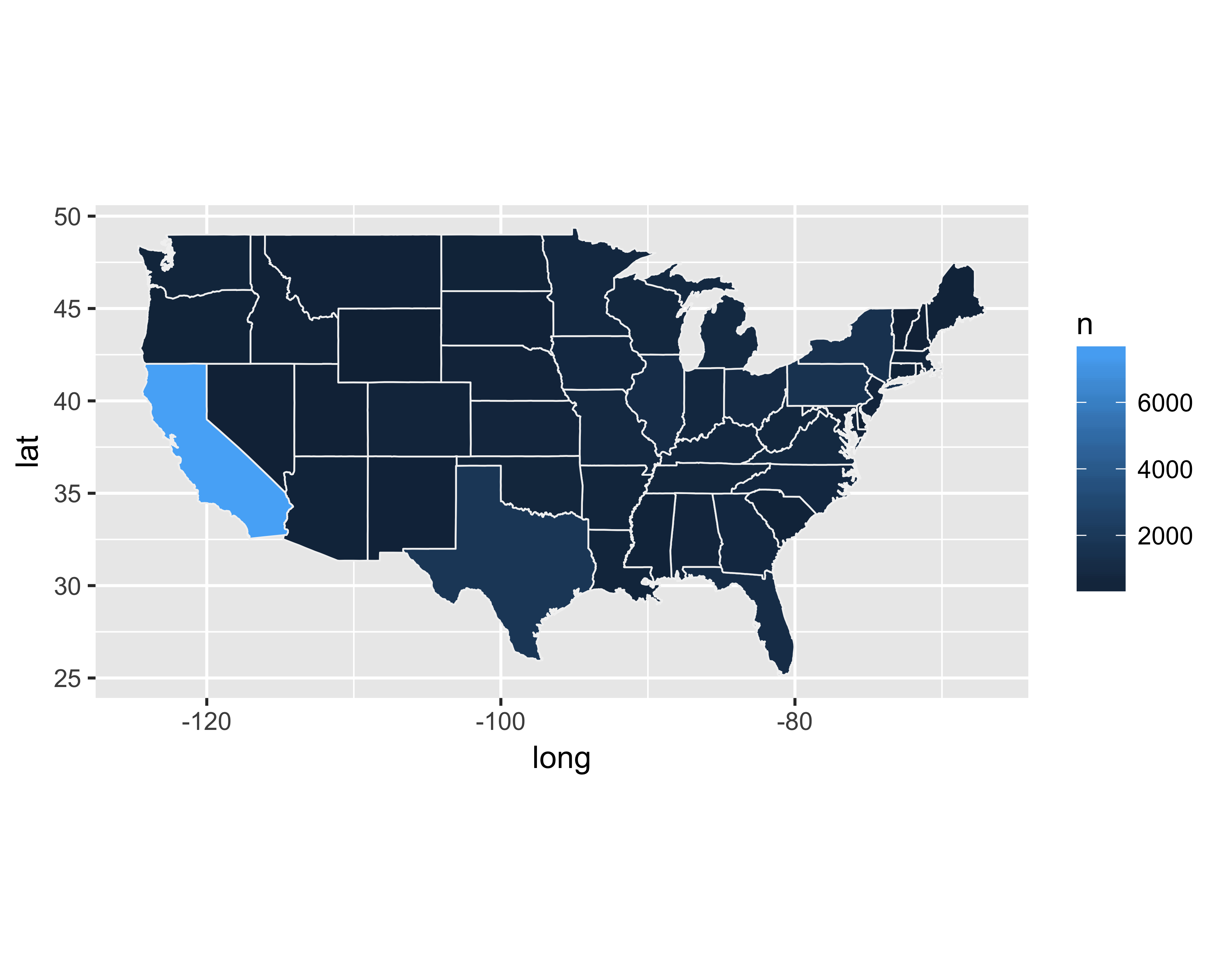
We need to adjust the color scale to better reflect the data, as shown in Figure 10.61.
g <- g + scale_fill_distiller(type = "seq",
                              palette = "Oranges",
                              direction = 1,
                              breaks = c(1, 100, 500, 1000,
                                         5000, 10000),
                              guide = "none") +
  theme_bare + theme(axis.text = element_blank())
g + labs(
  title = 'Number of prospect by each state',
  caption = 'Dark orange color shows states with the most prospects.') +
  theme(plot.caption = element_text(hjust = 0))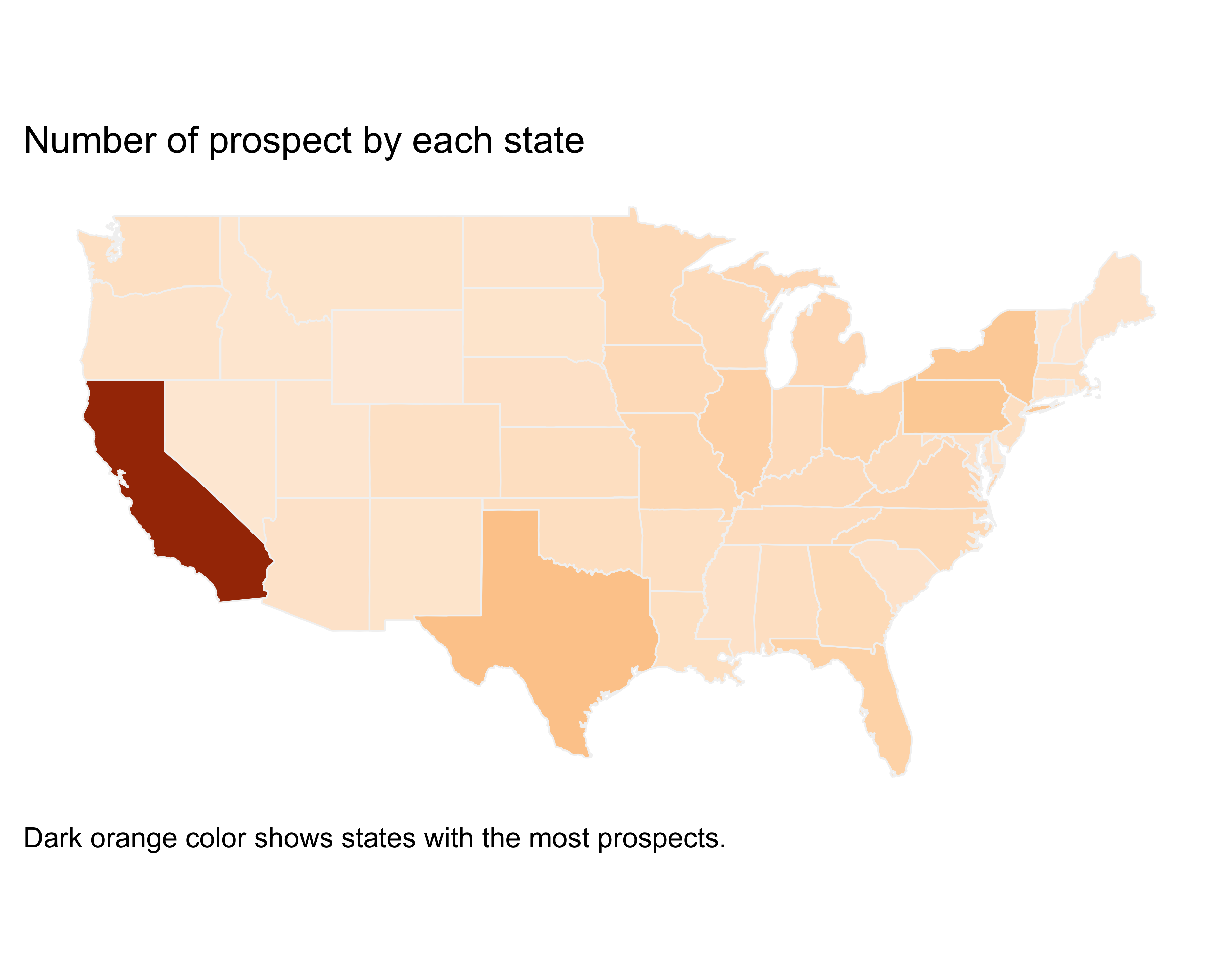
FIGURE 10.61: State filled map
Similarly, we can create a filled map for each county. Since we don’t have data for each county, for learning’s sake, let’s create some fake data.
us_county_map <- map_data("county")

us_county_counts <- distinct(us_county_map, region, subregion) %>%
  mutate(n = rbeta(n = nrow(.), shape1 = 5, shape2 = 2)) %>%
  mutate(n = round(n*100))

us_county_map <- inner_join(us_county_map, us_county_counts) %>%
  arrange(group, order)
Now plot this fake count data by county, as shown in Figure 10.62.
g <- ggplot(data = us_county_map,
            aes(x = long, y = lat, group = group, fill = n)) +
  geom_polygon(size = 0.3, color = "grey95") + coord_quickmap()
g <- g + scale_fill_distiller(type = "seq",
                              palette = "Oranges",
                              direction = 1,
                              guide = "none") +
  theme_bare + theme(axis.text = element_blank())
g + labs(
  title = 'Number of prospects by county',
  caption = 'Dark orange color shows counties
  with the most prospects.') +
  theme(plot.caption = element_text(hjust = 0))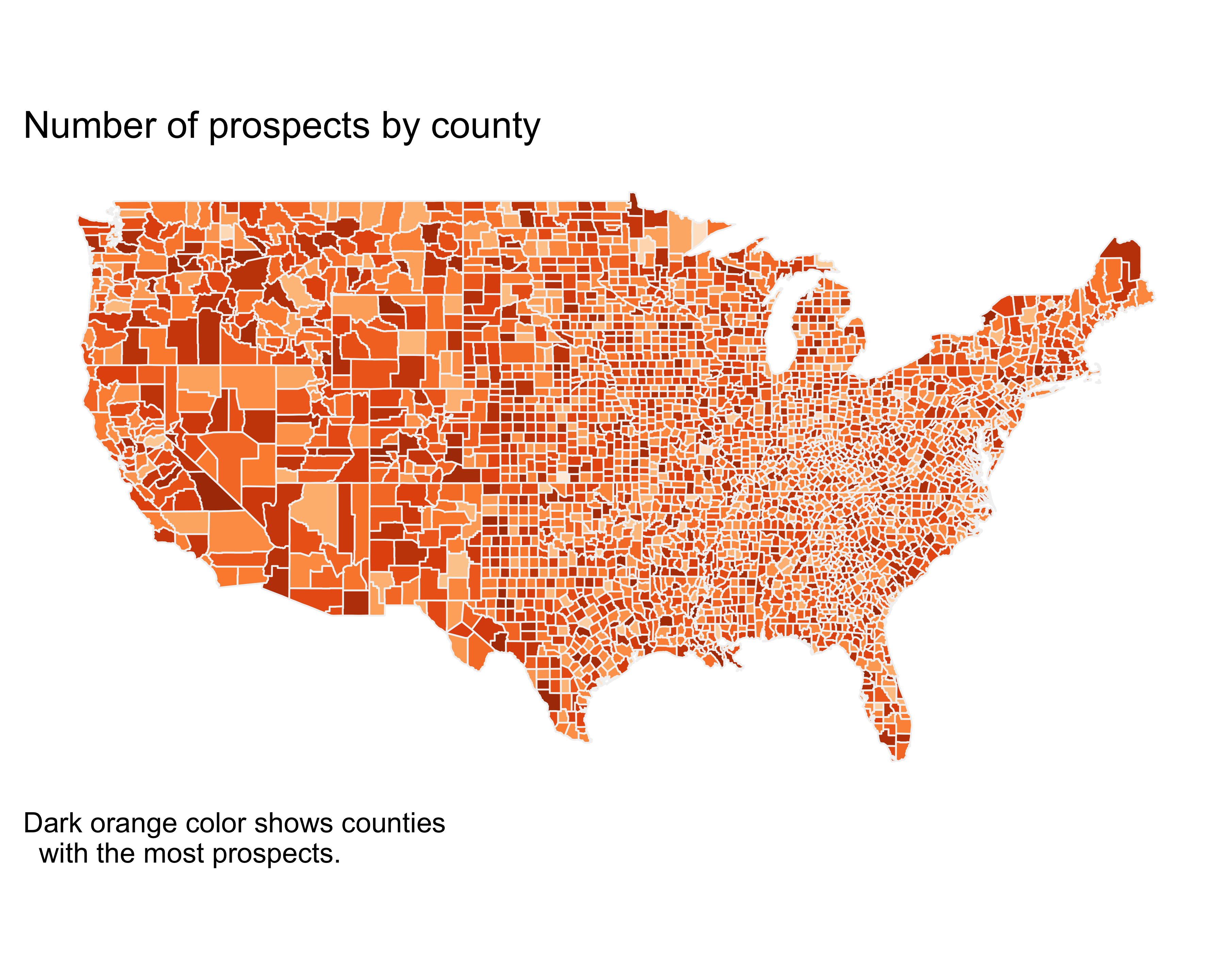
FIGURE 10.62: County filled map
10.15 Creating Dashboards
Dashboards or scorecards show the key measures you like to track regularly. I started on the path to better data visualization when I had to create a dashboard for the first time. Few (2006) gave me the start I needed. Before you can decide the approach for your dashboard design, you need to ask these questions:
- Does the dashboard need to be interactive?
- How frequently do I need to update it?
- Does it need to be print-ready?
- How much time do I need to spend editing?
- Is this an “infographic”?
If you want to create an infographic type of dashboard, you will be better off by selecting online tools, or even PowerPoint or Keynote. If you want the dashboard to be interactive, you can use JavaScript libraries such as D3.js, highcharts, or http://variancecharts.com/. RStudio also offers a package called flexdashboard that lets you create interactive dashboards using rmarkdown. See flexdashboard’s documentation for more details.
In this section, we will see how to create a high-quality, almost print-ready dashboard.
A dashboard is an arrangement of various important measures. Two popular options of arranging such measures are the cowplot package’s plot_grid function and gridExtra package’s arrangeGrob function. The arrangeGrob function offers more flexibility in combining text with plots, whereas, with plot_grid, you can arrange various plots.
Before you jump into the “hows”“, you should figure out the”what" and “why”. What do you want to show? Why does it belong there? What graphical representation do you want for your data? Always start with a few pieces of paper and a pencil. Draw what you would like to see, and then work on the code to get closer to what you have in mind.
For this dashboard example, let’s say we want to see the number of donors, dollar amount, annual giving amount, number of prospects by wealth rating, and ZIP code map. We will draw a grid of two rows. In the first row, we have two columns and, in the second row, we have three. You can see my (really bad) draft sketch in Figure 10.63.
FIGURE 10.63: A quick and dirty mockup of a dashboard
Here’s my attempt seen in Figure 10.64 with the gridExtra package and the grid.arrange function.
First, load all the libraries.
require(grid)
require(gridExtra)
require(ggplot2)
require(scales)
require(dplyr)
Next, prepare the header text.
g1 <- textGrob("Stark\nUniversity",
               gp = gpar(fontsize = 30,
                         col = "#F3790C",
                         fontface = "bold"))
g2 <- textGrob("$250M", gp = gpar(fontsize = 20))
g3 <- textGrob("2,538", gp = gpar(fontsize = 20))

g4 <- textGrob("")
g5 <- textGrob("dollars raised", gp = gpar(fontsize = 10))
g6 <- textGrob("number of donors", gp = gpar(fontsize = 10))
Prepare the “cumulative dollars raised” chart.
g7 <- ggplot(data = data.frame(
  date = seq.Date(from = as.Date("2010-1-1"),
                  to = as.Date("2017-1-1"),
                  by = "year"),
  dollars_raised = c(32, 34, 28, 24, 26, 22, 36, 35)),
  aes(x = date, y = cumsum(dollars_raised))) +
  geom_line(color = "#FF993F") +
  theme_bare +
  theme(axis.text = element_text(size = rel(1.2))) +
  scale_y_continuous(labels = dollar) +
  coord_fixed(ratio = 10)
Get the prospect count by wealth rating. I used a Stackoverflow tip to format the table.
my_table_settings <- ttheme_default(
  base_size = 10,
  core = list(
    fg_params = list(hjust = 1, x = 1),
    bg_params = list(fill = c("grey95", "white"))),
  colhead = list(
    fg_params = list(col = "black"),
    bg_params = list(fill = "white")))

wealth_rating_counts <- count(donor_data, WEALTH_RATING) %>%
  arrange(desc(WEALTH_RATING)) %>%
  mutate(n = comma(n))

g8 <- tableGrob(wealth_rating_counts,
                rows = NULL,
                cols = c("Rating", "#"),
                theme = my_table_settings)
Prepare the map showing the prospect locations by ZIP.
g9 <- ggplot() +
  geom_polygon(data = us_map,
               aes(x = long, y = lat, group = group),
               fill = "gray97",
               color = "grey80",
               size = 0.5) +
  coord_quickmap() + theme_bare +
  theme(axis.text = element_blank())
g9 <- g9 + geom_point(data = filter(zipcode_counts_coords,
                                    between(longitude, -125,-66),
                                    between(latitude, 25,50)),
                             aes(x = longitude,
                                 y = latitude,
                                 size = n,
                                 color = n),
                      alpha = 0.4)
g9 <- g9 + scale_size_area(breaks = c(1, 4000),
                           max_size = 8,
                           guide = "none") +
  scale_colour_gradient(low = "#fc9272",
                        high = "#de2d26",
                        guide = "none")
Prepare the footer text.
g10 <- textGrob("Cumulative dollars raised (in millions)",
                gp = gpar(fontsize = 10))
g11 <- textGrob("number of prospects", gp = gpar(fontsize = 10))
g12 <- textGrob("prospect location", gp = gpar(fontsize = 10))
Now, let’s put everything together. The grid.arrange function provides a layout_matrix parameter to control the location of each of the elements. We simply divided the layout into nine cells, but we adjusted the relative heights of each of the rows using the heights parameter. The header text has 20% of the vertical space, the graphs have 60%, and the other text labels get 10% each. Check out more layout options in the gridExtra documentation.
grid_layout <- rbind(c(1,2,3),
                     c(4,5,6),
                     c(7,8,9),
                     c(10,11,12))

grid.arrange(g1,g2,g3,g4,g5,g6,g7,g8,g9,g10,g11,g12,
             layout_matrix = grid_layout,
             heights = c(0.2, 0.1, 0.6, 0.1),
             padding = unit(0.01, "line"))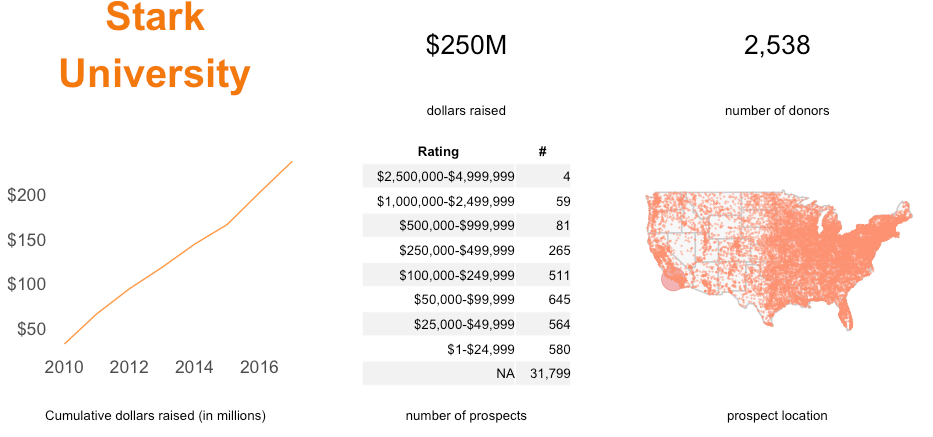
FIGURE 10.64: Dashboard using gridextra
You may say, “This seems really complicated. Why should I go through this hassle?” The short answer is: When you get used to this code, you gain control over highly dynamic, repeatable, and reproducible documents. Your manager asks for a change, you change the code, and future documents are ready. The dashboard itself may not be worth the effort, but when you combine your analysis with your programming to create documents (also known as literate programming), you unleash the power of R.
rmarkdown, and knitr in R. Follow Yihui Xie’s examples to create your own dynamic, reproducible analysis: https://yihui.name/knitr/demo/minimal/
10.16 Creating Animated Charts
Animated charts are fun and sometimes tell stories that static charts can’t. In this section, we will see an example of such charts through the growth of Walmart locations across the U.S. You clearly see the explosion of stores in this animated version. Once you can run this code without R giving you headaches, you can adapt it to show prospect or giving data across the U.S.
Let’s get started by loading the necessary libraries.
library(ggplot2) #for plotting, of course
library(ggmap) #to get the US map
library(dplyr) #for data manipulation like a ninja
library(readr) #to read the data in csv
library(lubridate) #to play with dates
library(scales) #for number labeling
library(stringr) #to play with strings
library(Cairo) #for anti-aliasing images on Windows
library(zipcode) #to clean up and geocode zipcodes
10.16.1 Gathering, Cleaning-Up, and Summarizing Data
Let’s load the ZIP code data using the following command.
data(zipcode)Next, use the ggmap library to get the US map. Here, I’m using the toner-lite type of map from Stamen Maps, a great resource for fantastic maps.
us_map <- get_stamenmap(c(left = -125,
                          bottom = 25.75,
                          right = -67,
                          top = 49),
                        zoom = 5,
                        maptype = "toner-lite")
10.16.2 Get the Store Openings Data
Holmes (2011) has provided Walmart data used in their paper. We will load the store openings data set, which has the opening dates as well as the zipcode of the location.
walmart_op_data <- read_csv(
  "http://users.econ.umn.edu/~holmes/data/WalMart/store_openings.csv")
Let’s wrap up with a couple of cleanup items.
- Convert the date column data to date format
- Create opening year and month columns.
I also created another date column to loop through and create maps for each month. You may ask, “Why did you not use the opening date?” Good question. I am not using the opening date because after creating a map, I am saving the map using the date as the filename. We are using ffmpeg to create a movie out of the map images, and ffmpeg likes sequential numbering of files. If we were to use the opening date, the maps would be out of order. For macOS, the file name is irrelevant because we can use the glob argument of ffmpeg.
walmart_op_data <- walmart_op_data %>%
                    mutate(
                      OPENDATE = as.Date(OPENDATE, '%m/%d/%Y'),
                      OpYear = year(OPENDATE),
                      OpMonth = month(OPENDATE),
                      ZIPCODE = clean.zipcodes(ZIPCODE))
Now, calculate the number of monthly openings and cumulative openings by month and year.
wm_op_data_smry <- walmart_op_data %>%
                    count(OpYear, OpMonth) %>% ungroup() %>%
                    arrange(OpYear, OpMonth) %>%
                    mutate(cumm_n = cumsum(n),
                           OpDate = as.Date(paste(.$OpMonth,
                                                  1,
                                                  .$OpYear,
                                                  sep = "/"),
                                            '%m/%d/%Y'))
Join the data with the ZIP code data to pull the latitude and longitude for each one.
walmart_op_data <- left_join(walmart_op_data,
                             select(zipcode,
                                    zip,
                                    latitude,
                                    longitude),
                             by = c("ZIPCODE" = "zip"))
Get all the ZIP codes for each month’s Walmart opening.
wm_op_data_smry <- inner_join(wm_op_data_smry,
                              select(walmart_op_data, ZIPCODE,
                                     latitude, longitude,
                                     OpYear, OpMonth),
                              by = c("OpYear" = "OpYear",
                                     "OpMonth" = "OpMonth"))
10.16.3 Creating Maps
Now the fun part: To actually see the data on the U.S. map. Since we have to create a map for each month, we are using a function for repetition and ease of use.
#this function has three arguments.
#' df: a dataframe used for plotting
#' plotdate: date used for splitting the data frame
# into before and after
#' mapid: a number for naming the final map file
my_zip_plot <- function(df, plotdate, mapid){
  # create the background map.
  # using the darken argument to make the map filled with black color.
  g <- ggmap(us_map, darken = c("0.8", "black"))
  # split the data frame for all Walmarts
  # before a plot date i.e. a month
  old_df <- filter(df, OpDate < plotdate)
  # split the data frame for all Walmarts for the plot date
  # i.e. during a month
  new_df <- filter(df, OpDate == plotdate)
  # plot all the Walmarts before the current opening month.
  # Make all the older store locations as shown in circles smaller
  g <- g + geom_point(data = old_df,
                      aes(x = longitude, y = latitude),
                      size = 5,
                      color = "dodgerblue",
                      alpha = 0.4)
  #plot all the Walmarts during the current opening month.
  # Make all the newer store locations as shown in
  # circles bigger to get the "pop" effect
  g <- g + geom_point(data = new_df,
                      aes(x = longitude, y = latitude),
                      size = 8,
                      color = "dodgerblue",
                      alpha = 0.4)
  # remove axis marks, labels, and titles
  g <- g + theme(axis.ticks = element_blank(),
                 axis.title = element_blank(),
                 axis.text = element_blank(),
                 plot.title = element_blank())
  # place the label for year
  g <- g + annotate("text",
                    x = -75,
                    y = 34,
                    label = "YEAR:",
                    color = "white",
                    size = rel(5),
                    hjust = 0)
  # place the value of for year
  g <- g + annotate("text",
                    x = -75,
                    y = 33,
                    label = unique(new_df$OpYear),
                    color = "white",
                    size = rel(6),
                    fontface = 2,
                    hjust = 0)
  # place the label for stores opened
  g <- g + annotate("text",
                    x = -75,
                    y = 32,
                    label = "STORE COUNT:",
                    color = "white",
                    size = rel(5),
                    hjust = 0)
  # place cumulative store openings
  g <- g + annotate("text",
                    x = -75,
                    y = 31,
                    label = comma(unique(new_df$cumm_n)),
                    color = "white",
                    size = rel(6),
                    fontface = 2,
                    hjust = 0)
  # generate the file name for the map.
  # Using str_pad to make the filename same length and prefixed with zeroes.
  # create a maps directory inside the directory of this script.
  #browser()

  #create the maps directory if doesn't exist
  if (!dir.exists("maps")) {dir.create("maps")}
  filename <- paste0("maps/img_" ,
                     str_pad(mapid, 7, pad = "0"),
                     ".png")
  # save the map as a png using Cairo for anti-aliasing on Windows.
  ggsave(filename = filename,
         plot = g,
         width = 13,
         height = 7,
         dpi = 150,
         type = "cairo-png")
}
A note about color: I played with a few tools, such as paletton, to find good contrasting colors for the individual dots. After spending a lot of time trying different combinations, I picked one of the blue shades from the named colors in R.
Loop through the data frame for each month and create a map for that month. Warning: these commands will take about 5 minutes and create a lot of maps (see Figure 10.65 for an example). Make sure that you’ve created a directory named maps inside the directory of this file and that you have enough space to store all the maps.
wm_op_data_smry %>%
  mutate(id = row_number()) %>%
  group_by(OpDate) %>%
  # create a group id for each group defined using OpDate i.e. a month
  mutate(mapid = max(id)) %>%
  # note when you are using user-defined functions in dplyr,
  # you have to use do
  ## pass the summary data frame, the date, and map number to the function
  do(pl = my_zip_plot(wm_op_data_smry,
                      unique(.$OpDate),
unique(.$mapid))) 
FIGURE 10.65: Walmart locations
10.16.4 Creating the Walmart Growth Movie
This is the fun part in which we put all the images together to make a “motion picture.” For this to work, you will need ffmpeg installed on your computer. On Windows, for ease of use, install it on the C drive.
# prepare the command for execution
# the framerate argument controls how many frames per second
# we want to see.
# Increase that number for a faster transition between months.
# since we used 7 digits as the fixed length of filenames,
# %7d pattern will match those filenames.
makemovie_cmd <- paste0("C:/ffmpeg/bin/ffmpeg -framerate 5 -y -i ",
                        paste0(getwd(), "/maps/img_%7d.png"),
                        " -c:v libx264 -pix_fmt yuv420p ",
                        paste0(getwd(), "/maps/"), "
                        movie.mp4")
# for mac os, you can use the glob argument
# and obviate the need for sequential numbering of files.
# uncomment for mac
# makemovie_cmd <- paste0("ffmpeg -framerate 5 -y -pattern_type glob -i '",
#                         paste0(getwd(), "/maps/"),
#                         "*.png'",
#                         " -c:v libx264 -pix_fmt yuv420p '",
#                         paste0(getwd(), "/maps/"),
#                         "movie.mp4'")
system(makemovie_cmd)
# the system command will execute the ffmpeg command and create the final movie.
Watch the final video on YouTube: https://youtu.be/adm3RB4ieXU.
10.17 Summary
In this chapter, we explored many design principles of effective data visualizations, learned their importance, and executed recipes to create them. We learned different types of charts and when to use them. We saw ggplot’s various chart creation and customization options. We hope that your charts look elegant and guide readers to insight.
If you’re enjoying this book, consider sharing it with your network by running
source("http://arn.la/shareds4fr")in yourRconsole.— Ashutosh and Rodger
References
Zacks, Jeff, and Barbara Tversky. 1999. “Bars and Lines: A Study of Graphic Communication.” Memory & Cognition 27 (6): 1073–9.
Chua, Hannah Faye, J Frank Yates, and Priti Shah. 2006. “Risk Avoidance: Graphs Versus Numbers.” Memory & Cognition 34 (2). Springer: 399–410.
Matejka, Justin, and George Fitzmaurice. 2017. “Same Stats, Different Graphs: Generating Datasets with Varied Appearance and Identical Statistics Through Simulated Annealing.” In Proceedings of the 2017 Chi Conference on Human Factors in Computing Systems, 1290–4. ACM.
Steele, Julie, and Noah Iliinsky. 2010. Beautiful Visualization: Looking at Data Through the Eyes of Experts. O’Reilly Media.
Tufte, Edward R. 2001. The Visual Display of Quantitative Information. Graphics Pr.
Golombisky, Kim, and Rebecca Hagen. 2016. White Space Is Not Your Enemy: A Beginner’s Guide to Communicating Visually Through Graphic, Web & Multimedia Design. A K Peters/CRC Press.
Wong, Dona M. 2013. The Wall Street Journal Guide to Information Graphics: The Dos and Don’ts of Presenting Data, Facts, and Figures. W. W. Norton & Company.
Croxton, Frederick E, and Roy E Stryker. 1927. “Bar Charts Versus Circle Diagrams.” Journal of the American Statistical Association 22 (160). Taylor & Francis Group: 473–82.
Ashton, Nick, Simon G Lewis, Isabelle De Groote, Sarah M Duffy, Martin Bates, Richard Bates, Peter Hoare, et al. 2014. “Hominin Footprints from Early Pleistocene Deposits at Happisburgh, Uk.” PLoS One 9 (2). Public Library of Science: e88329.
Wickham, Hadley. 2009. Ggplot2: Elegant Graphics for Data Analysis. Springer-Verlag New York. http://ggplot2.org.
Wilkinson, Leland. 2006. The Grammar of Graphics. Springer Science & Business Media.
Few, Stephen. 2006. Information Dashboard Design: The Effective Visual Communication of Data. O’Reilly Media.
Cleveland, William S, and William S Cleveland. 1985. The Elements of Graphing Data. Wadsworth Advanced Books; Software Monterey, CA.
Few, Stephen. 2008. “Dual-Scaled Axes in Graphs.” http://bit.ly/2e5oZle.
Holmes, Thomas J. 2011. “The Diffusion of Wal-Mart and Economies of Density.” Econometrica 79 (1). Wiley Online Library: 253–302.
Follow this tutorial to create this graphic in
R: http://arn.la/WSJCfA↩